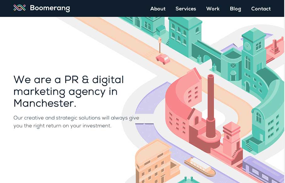
by Gene Crawford | Oct 21, 2014 | Gallery, Marketing Company
The visual style of this site is really slick. I love the colors and vector icon work as well as that main illustration/animation of the factory. Smart, smart work here. Event the pictures have been color corrected to fit into the overall colors of the page, subtle,...
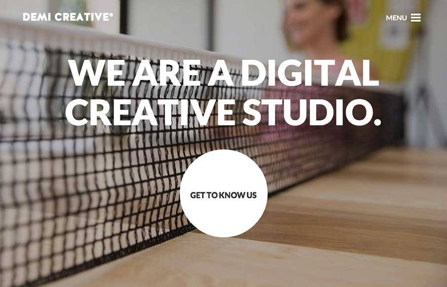
by Gene Crawford | Oct 21, 2014 | Design Firm, Gallery
Big bold visual style for Demi Creative. I dig it. I like the simplicity implied into the site design, the main link is the “get to know us” call to action and it draws you in. The nav under the hamburger icon feels slightly lost but once you dig into the...

by Gene Crawford | Oct 17, 2014 | Gallery
Really sweet, mostly full page width animations here. I really dig the one of the room that swings around as you scroll down. Fun! Submitted by: Yiannis Karas Role: Developer
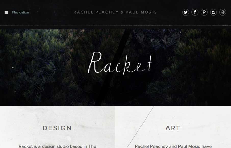
by Gene Crawford | Oct 16, 2014 | Design Firm, Gallery
I love the dark and light mixed on the page here. The hand written type is very nice and makes the work gel as well. Lovely responsive approach finishes off a really nice website. Submitted by: Paul Mosig @r_a_c_k_e_t Role: Designer & Developer Re-design of Blue...
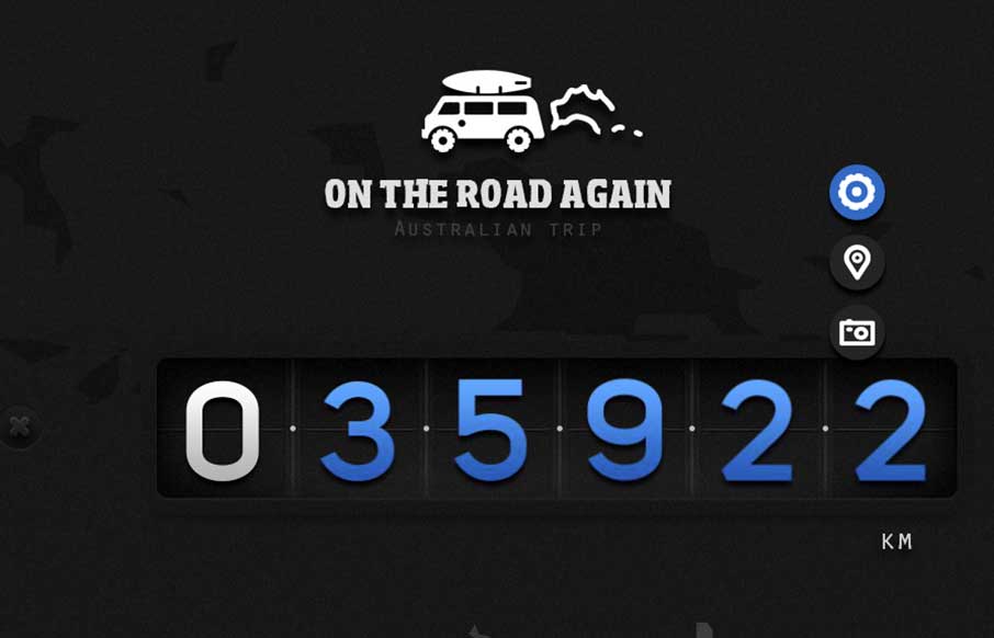
by Gene Crawford | Oct 16, 2014 | Gallery, Travel
Really nice little single page(ish) website for traveling in Australia. Super nice photography and maps and a fun way to explore the page. On The Road Again is a website dedicated our Australian roadtrip done in Van. This presents an overview of our entire journey....