by Aaron Griswold | Nov 25, 2014 | Design Firm, Entertainment, Gallery
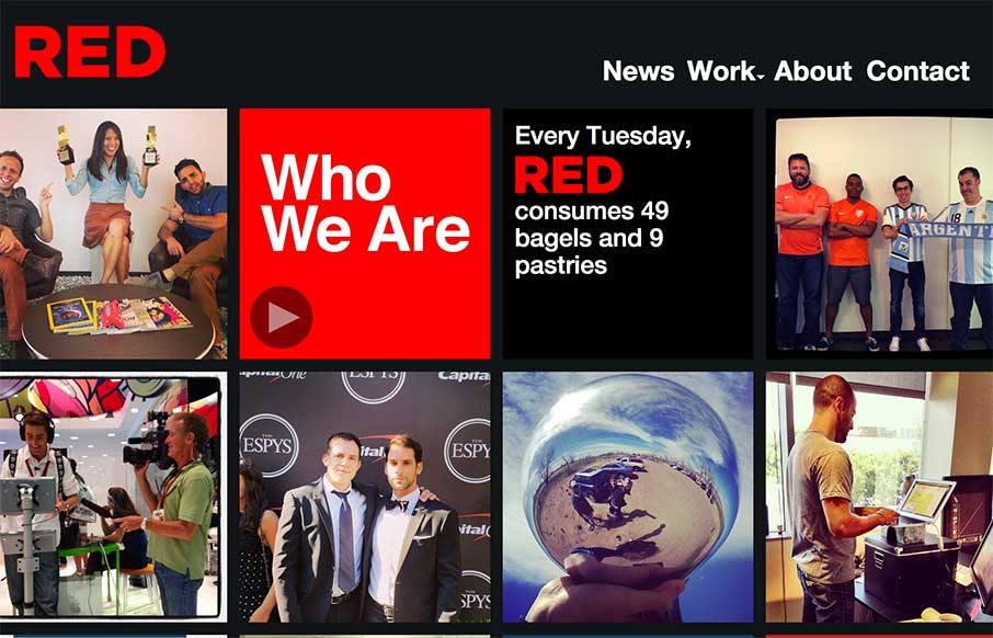
The way the site is built out of squares that adapt to the width of the browser screen (see what I did there?) is really neat. It’s simplicity but not overtly done. The nav reflects the simple approach to the layout too which is nice and clear.
by Aaron Griswold | Nov 24, 2014 | Gallery
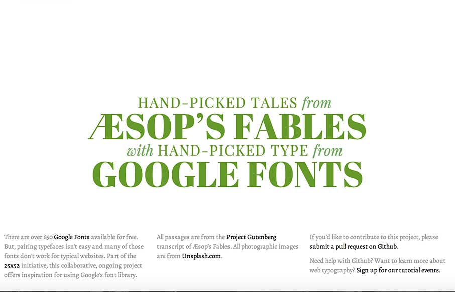
I’m not sure that I can do this site justice with a few short words… but it looks like some cool people got together and are doing some cool things here and in the 25×52 Initiative. Check the page out – and the people that are behind it, and...
by Gene Crawford | Nov 20, 2014 | Gallery, Portfolio
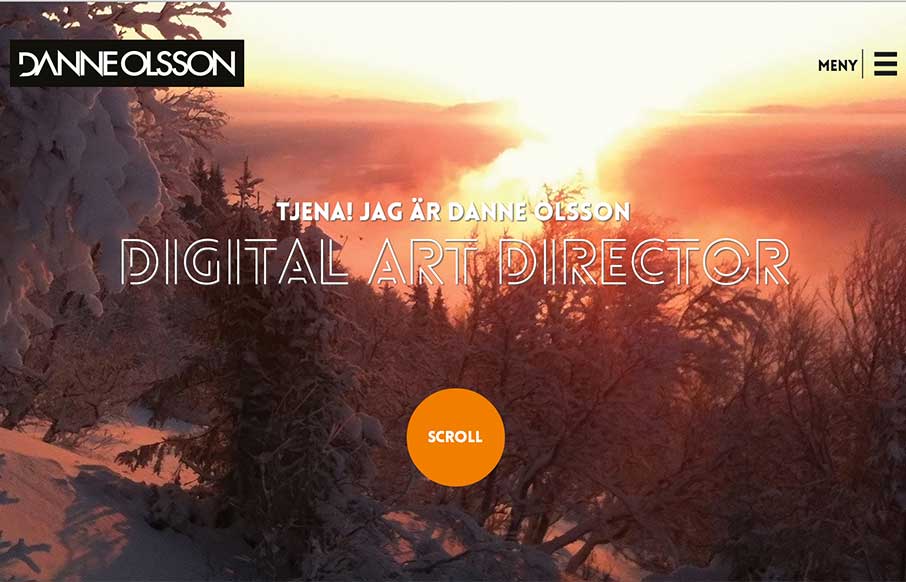
Really like the photography and typography on this portfolio website. It’s smooth feeling to me as I scroll with it. Also, you gotta dig the loch ness monster on the contact page there.

by Gene Crawford | Nov 19, 2014 | Gallery
I really dig the purpose of this app/community. Though first I dig the design of this thing. It’s simple and compact and really feels good as you use it. Give it a try folks.
by Gene Crawford | Nov 18, 2014 | Gallery, Portfolio
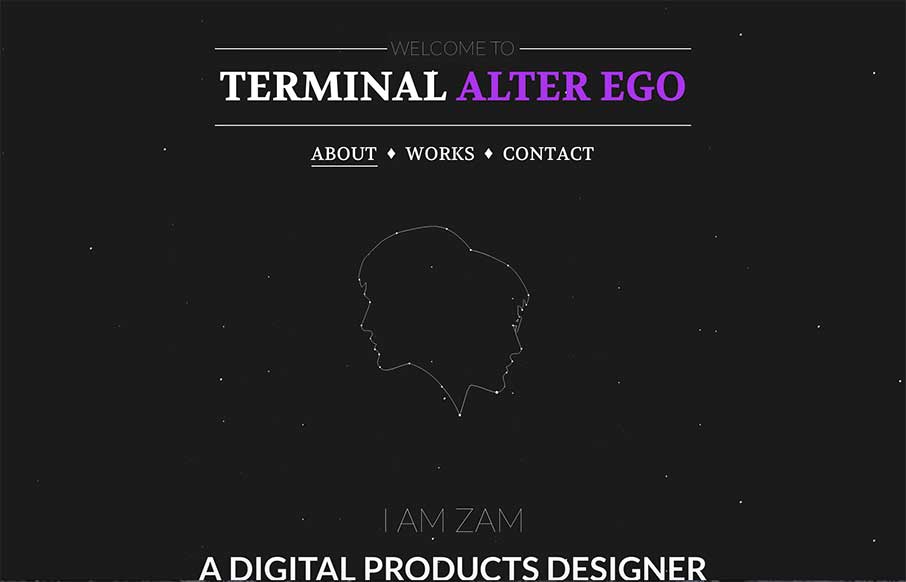
I’m digging how this page scrolls, the way you go from the black background to the white with an angle down the page. Good stuff. Submitted by: Zulficar Ali @zulficar Role: Designer & Developer
