by Gene Crawford | Oct 27, 2014 | Gallery
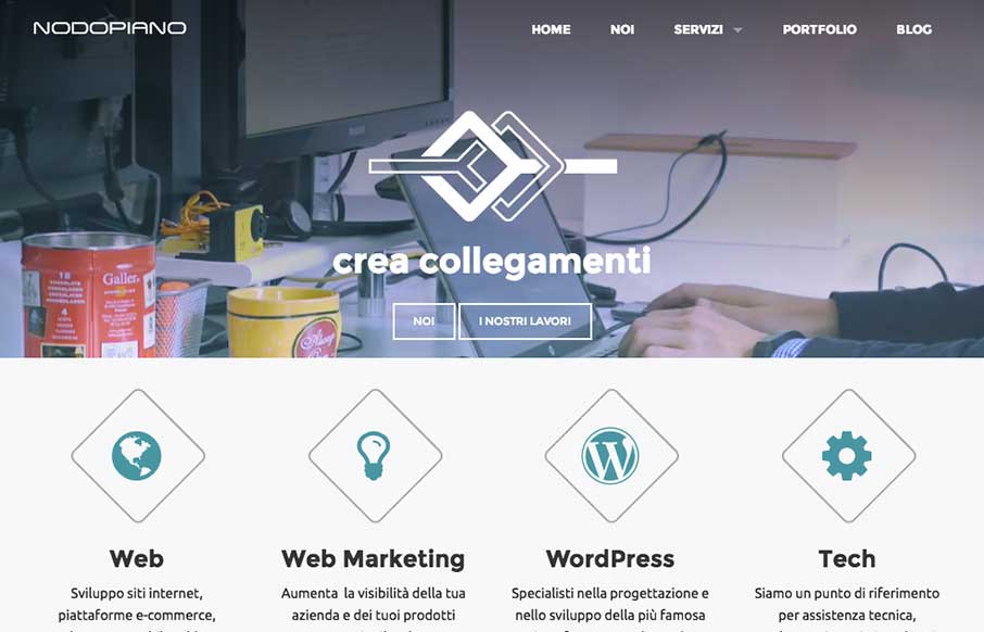
It’s always nice when there’s a strong base to a design and always awesome when you layer good detail work on top of that strong base. That’s what the Nodopiano site design does so well. This is my last work,the website for an italian web agency....

by Gene Crawford | Oct 27, 2014 | Gallery, Music
Man I love guitars. I love gear more. This site is plenty of eye candy and some good interaction design too. I like the big drop down nav design that includes pictures of the gear. You don’t really even need to read to get where you want to go.

by Aaron Griswold | Oct 24, 2014 | Gallery
As you may have guessed by now, we see a ton of websites – good, bad, spam (ugly). We also have seen every “app product page”, that most have never deviated from the structure of the Square Reader product page from 3 years ago… Pixate could...
by Gene Crawford | Oct 23, 2014 | Design Firm, Gallery
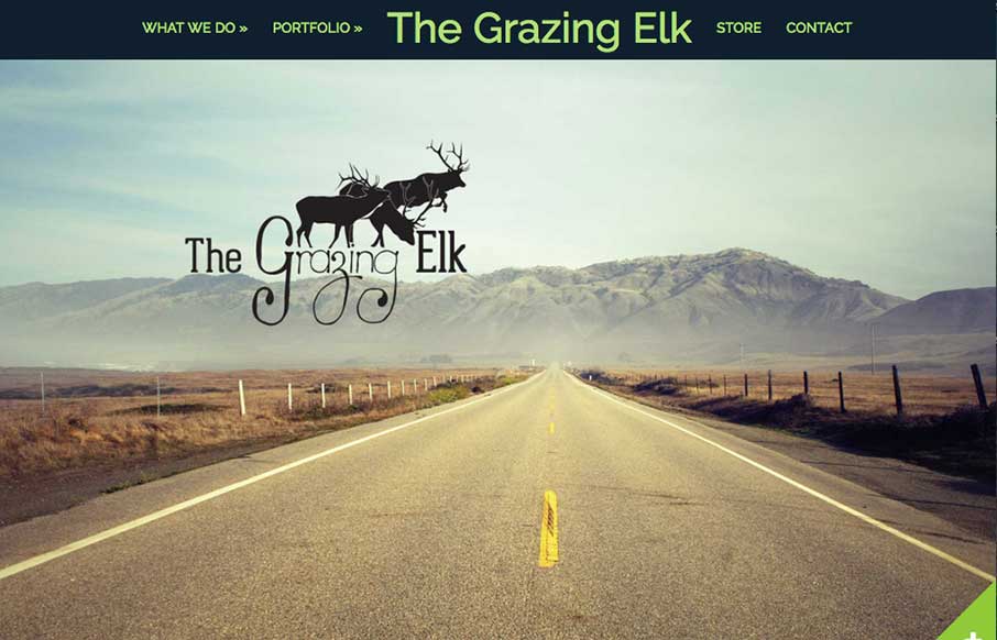
I’m always intrigued when I come across a side scroller website. Rarely are the done well, this one is the exception to that. I totally dig it. Somehow they make it feel like a unique interaction. Good work. Submitted by: Lara Stephenson @thegrazingelk Role:...

by Gene Crawford | Oct 21, 2014 | Gallery, Marketing Company
The visual style of this site is really slick. I love the colors and vector icon work as well as that main illustration/animation of the factory. Smart, smart work here. Event the pictures have been color corrected to fit into the overall colors of the page, subtle,...
