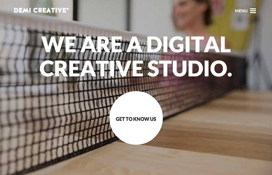
Big bold visual style for Demi Creative. I dig it. I like the simplicity implied into the site design, the main link is the “get to know us” call to action and it draws you in. The nav under the hamburger icon feels slightly lost but once you dig into the about page it’s pretty much downhill for getting into the site.
Submitted by: Dan Spencer @spencerdan
Role: Designer & Developer
This is a well-designed and developed, clean portfolio site that displays nice typography, fullscreen images and is fully responsive.


0 Comments