by Gene Crawford | Oct 9, 2012 | Gallery
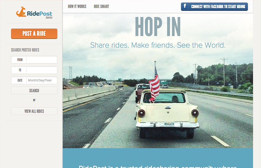
I like the fixed window feel to this design. With the header and sidebar staying put the section that scrolls gives the site a real app-like feel. I do wish it was responsive, it would make a lot of sense too for the site/app I think. My favorite part is the...
by Maria | Oct 1, 2012 | Gallery
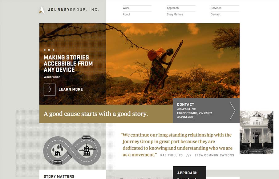
Order yet disorder. That’s how I like to think about this design. It starts off with this really strong grid feel and then the shapes and blocks of copy/images start to feel really asymmetrical and wonderful. I like the blocky vibe with the type and the flat...
by Gene Crawford | Sep 26, 2012 | Gallery
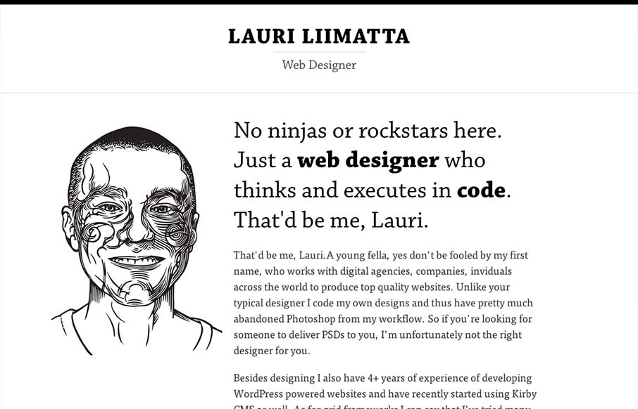
Submitted by: Lauri Liimatta @laurilii Role: Designer & Developer My new redesigned portfolio. Responsive design and powered by Kirby CMS. I like the design approach of going light to dark from top to bottom, or light to dense visually. However you want to look...
by Giovanni DiFeterici | Sep 13, 2012 | Gallery
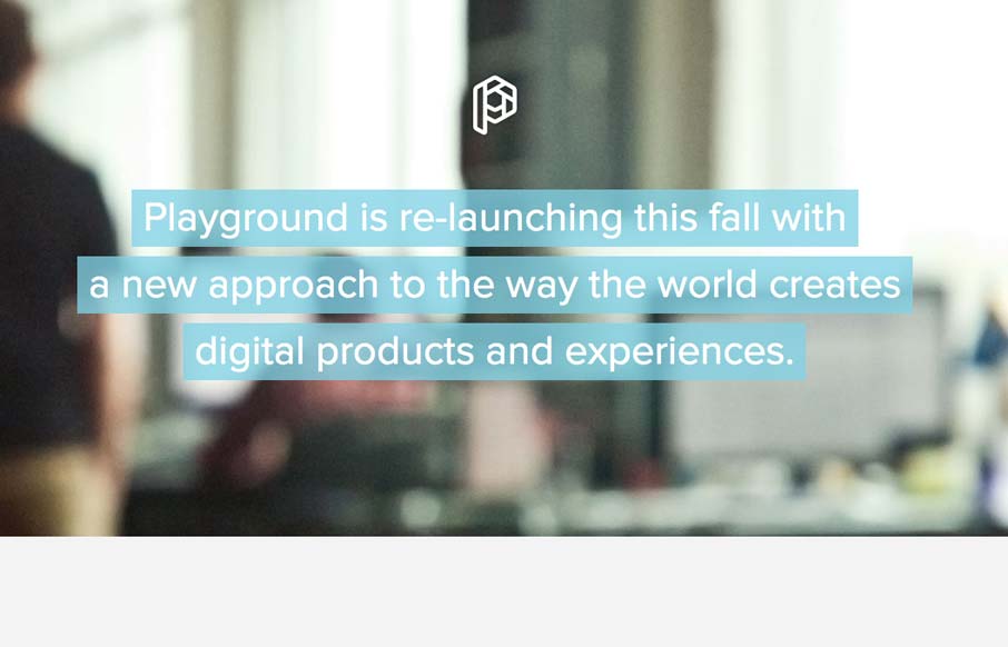
This is how you should post job openings. This is a lovely little site to entice people of the ‘web nerd’ persuasion. I think that the photo animation is a bit much and seems a little out of place in an otherwise tight and professional design, but...
by Maria | Sep 12, 2012 | Gallery
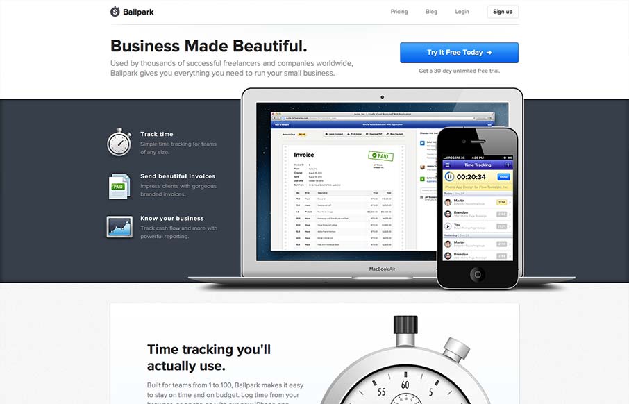
incredibly elegant getballpark.com — Matthew Smith (@whale) August 15, 2012 Take away the beautiful aesthetic and you’re left with a clearly defined product page. The copy is straightforward enough to be informative, and polished enough to be engaging on its...
