by Giovanni DiFeterici | Sep 11, 2012 | Design Firm, Gallery
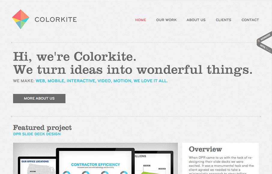
Colorkite is a clean, minimal design that does a great job at getting out of the way of the content. The typography is pretty solid and the color palette is subtle and sophisticated. The site is responsive, though it looks a little disjoint at some screen sizes. The...
by Gene Crawford | Sep 7, 2012 | Gallery, Medical
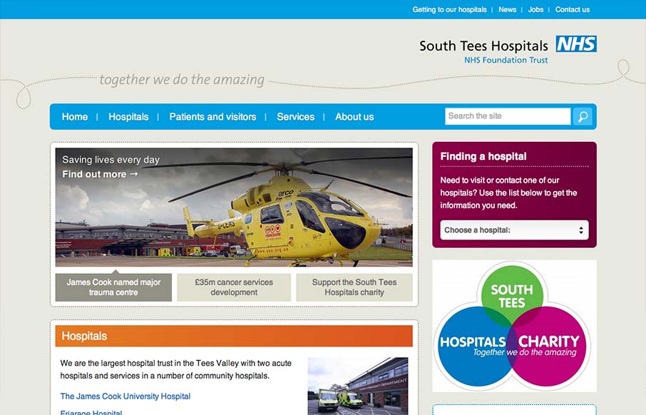
The South Tees Hospital website is a superb example of responsive design for a large organization and not just a personal portfolio or design firm’s website. We always love it when we come across large scale projects like this that utilize a lot of the same...
by Giovanni DiFeterici | Sep 6, 2012 | Conference, Gallery
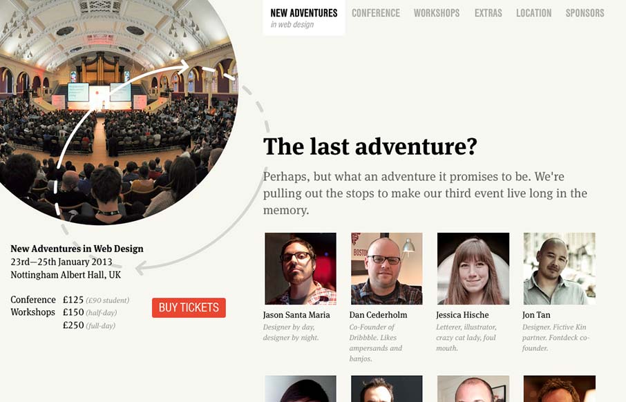
Nice site. I really like the static content on the left. Really, this site is all about selling tickets. It makes sense to keep that button on the page at all times. I think that the collapsed nav is interesting, though I feel that area of the page has room for a...

by Giovanni DiFeterici | Sep 5, 2012 | Design Firm, Gallery
I can really get behind the minimal approach to content that frameinc presents. The site isn’t cluttered up with overblown copy or quirky language and I’m not forced to wade through a huge portfolio to get a sense of what this business does. The design and...

by Gene Crawford | Sep 4, 2012 | Education, Gallery
Really tight design for the Treehouse website. I love the main graphic with the interactions that make the other elements on the illustration disappear. They work really well to pull you in deeper into the chosen section. I equally like the fixed header and how...
