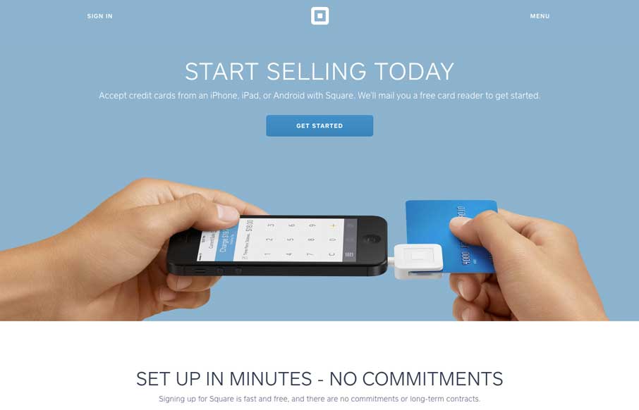
There was a time a couple of years ago that we pointed potential clients to Square's website and said, "hey, here's a great way to showcase one particular product, let's try to get this feel for your site too." Well.. we can say it again. It's clean - flat when it...
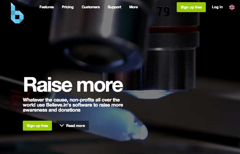
believe.in
Really good use of the video background to tell the story of what types of customers Believe.in are looking for, since it looks like the have about four target audiences. That seems to be a better use of the video background than just, here are our offices or product...
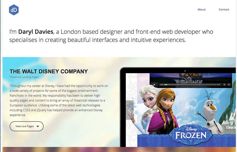
Daryl Davies
Every once in a while, you see a portfolio site and think, "damn... I wish I had that person's job..." - this week, Daryl Davies is that person for me. Between the work for Disney and VGAMR, you (and my kids for that matter) could probably really get into your job....
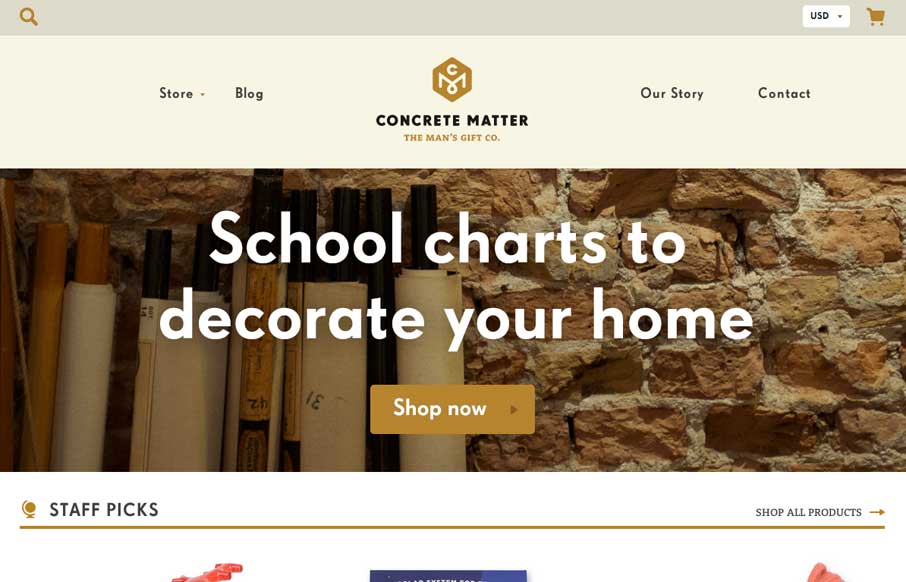
Concrete Matter
Do you remember Yahoo Stores? I had a local client a couple of years ago that I had to move their store from Yahoo Stores, to a different platform. Forget the three databases of information that I had to parse through to get one inventory number, to then match up with...
P’unk Ave
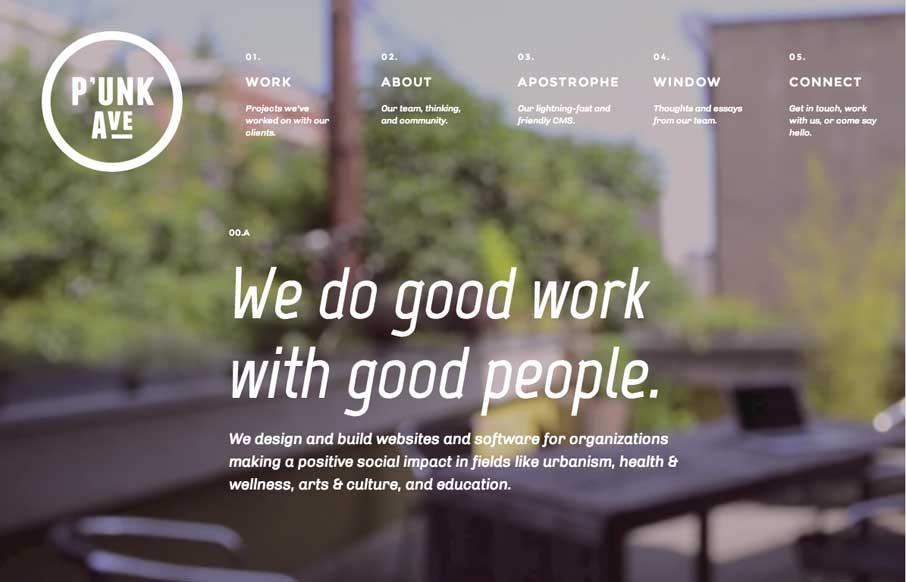
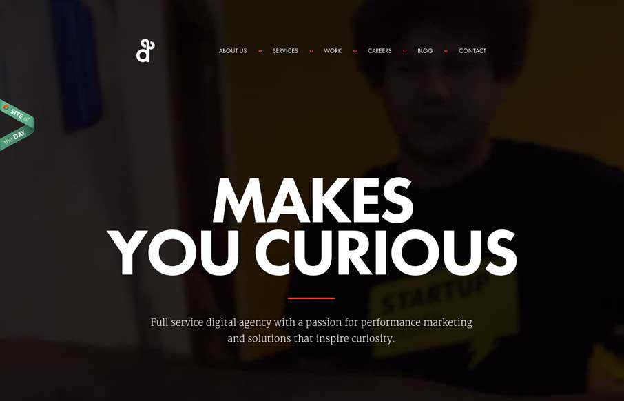
So two things I really like about P'unk Ave's website: First is the video background. What many sites are doing right now is using the video background to show more about their companies / products - but then you kind of get lost in the video, and forget to read the...
Matthew Riches
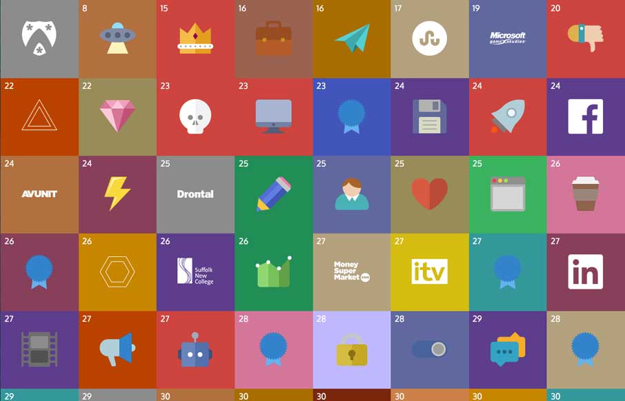
Kudos Matthew! With so many flat icons out in the interwebs, you found a way to make an entire site, with narrative, with flat icons - and make it pretty damn cool. Every once in a while, it is a good thing to trash something, and then do something fun with it. Think...
Unicef Tap Project
A good use of white (blue) space, in order to highlight what matters (on the site, and in life). I like the liquid background, that continues to enforce the theme of providing clean water for children. The "See how people are taking action to help children now" helps...
saussyburbank.com
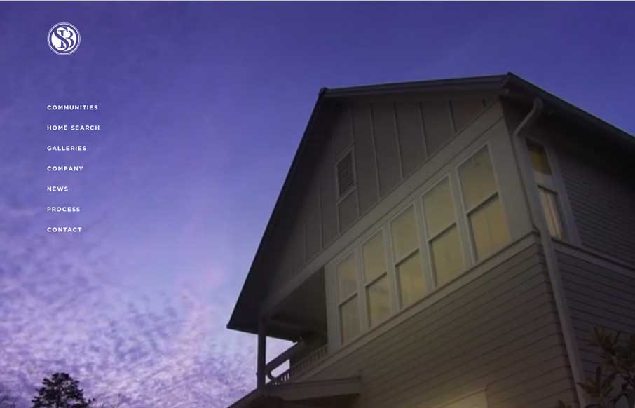
This site is gorgeous. It's oozing with details that exceed any home builder site that I've ever seen. The photography is stunning, the typography is on point, the restraint in use of space feels so right. It's as distinctive as the neighborhoods and homes they build....
keeleux.com
Clean design and some subtle movement here and there. I like the little animations and fade ins the page has as you scroll or shift browser width around, it's subtle but has big impact when you're experiencing it.
Google io
It's kind of funny that we're reviewing the site the day of (well before) the Google I/O conference. The site will change throughout the conference on June 25 - so right now, we just see a bunch of colored blocks. So check it out as they fill out. Comment and let us...
Spartan Race
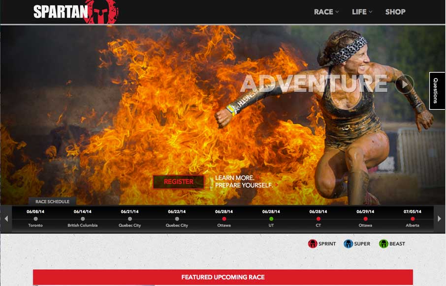
So the Unmatched Style Wrecking Crew just signed up for our second Spartan Race yesterday. We signed up for The Beast - which is the toughest race we've done yet: 12+ miles, 25+ obstacles - most of them involving mud. We have 17 weeks 3 days and 10 hours to get in...
England’s World Cup Squad
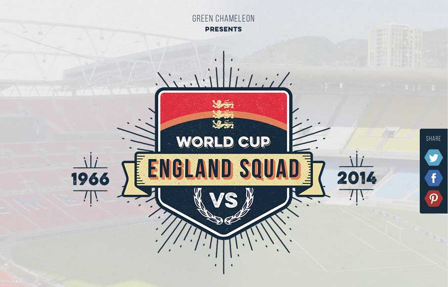
There are infographics - and then there are infographics like this site. It takes a lot of love of country and sport to take the time to build an infographic site devoted to your country's soccer team competing the FIFA World Cup - and it's a nicely constructed, clean...
Learn Git
Learn Git, have fun. I love the page design. Great little illustration work and a solid layout and graphics to boot. Go learn it, now. Submitted by: Fabricio Rosa Marques @fabric_8 Role: Designer We launched our new project "Learn Git" today. It's a learning platform...
Beauty of Brewing
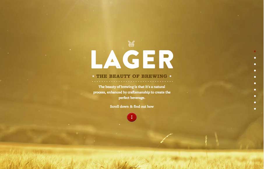
What an excellent way of telling a process story! The clean and simple images combined with cool, and appropriate parallax effects, canvas and video backgrounds make this a beautiful micro-site for Heineken. I might have to cheat on of my gluten-free diet, and enjoy a...
Degordian
I love this site design. It uses some familiar design patterns but I especially like the interactive stuff on the main header/nav. The animated movement is quite nice and the rest of the site as you scroll is great to take in visually. Good stuff. Submitted by: Hrvoje...
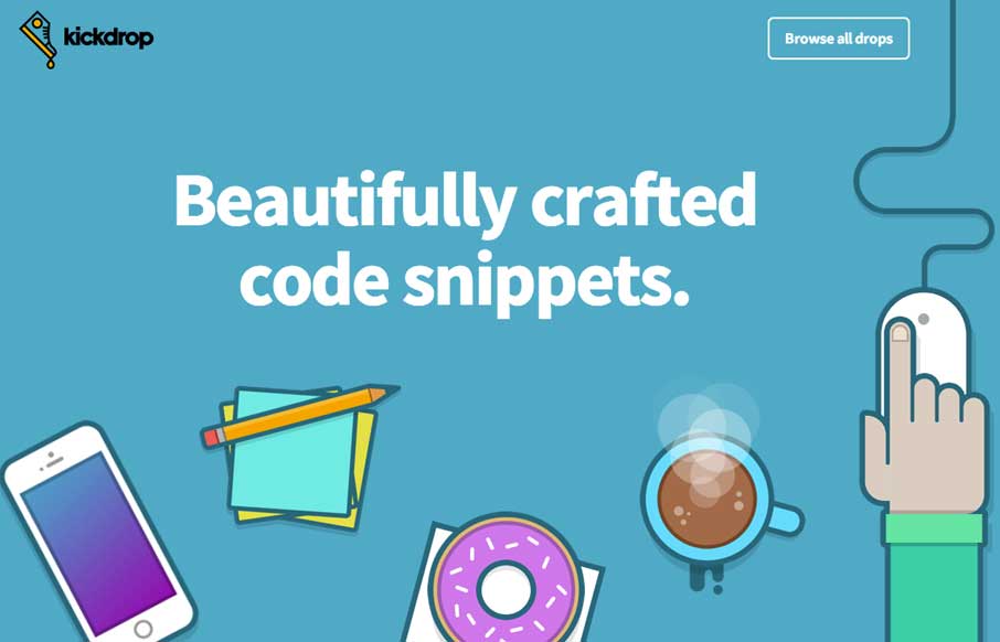
Kickdrop
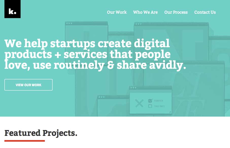
Love the Kickdrop site design. Good illustrations and a nifty little animation of the coffee steam. Great samples too! Submitted by: Andrew Reifman @andrewreifman Role: Designer & Developer Kickdrop is where designers and developers buy and sell resources. It...
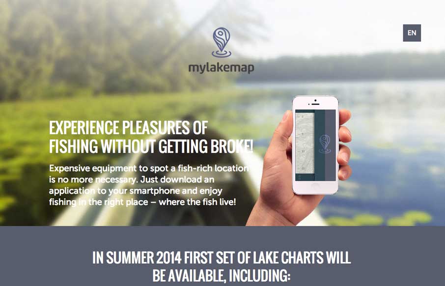
Mylakemap
Simple but effective design for this app. I like how they've handled the big hero image area with the RWD smaller screen widths. The hand holding the iPhone goes away at certain sizes. Smart stuff. Submitted by: Filip Diumont Role: Design, Art direction Mylakemap is a...
thesnippetapp.com
Lots of good design queues in this site. Narrative and good visuals to support it. When that's done well that's all you need folks. 🙂 Submitted by: Ben De Rienzo @derienzo777 Role: Designer
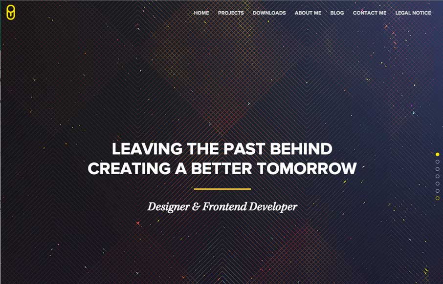
UIX.me
Pretty clean and simple layout. Lots of popular design patterns here but they're all done well and executed precisely.
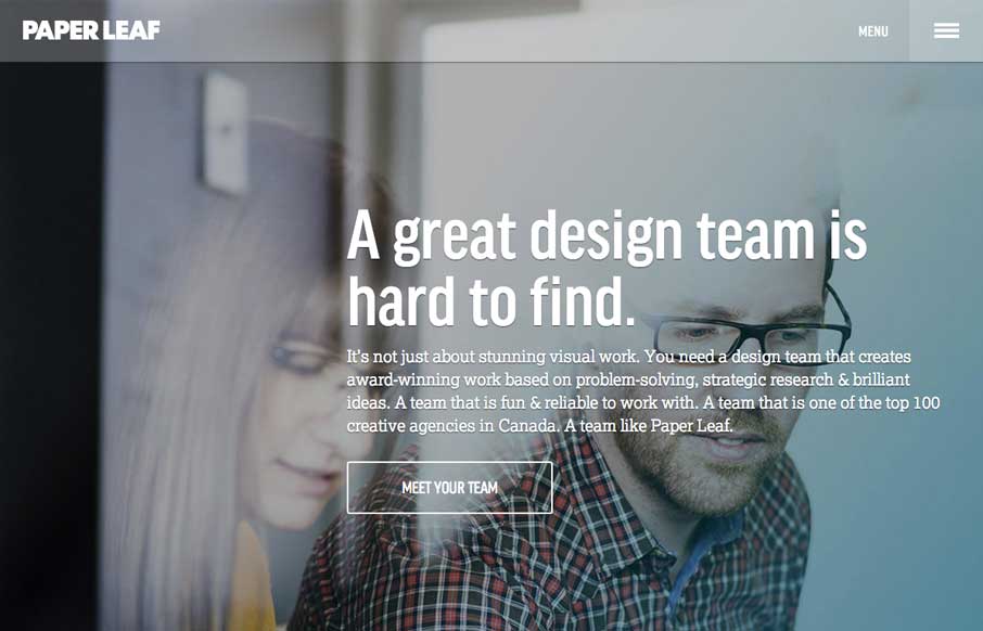
Paper Leaf
Really nice clean design for Paper Leaf. I like the side menu design as well as the overall type treatment - slightly drop outlined or something. Quite nice. Highly detailed, responsive website built on Bootstrap and powered by Wordpress. Key elements: CSS transforms,...
Bacardi Rum
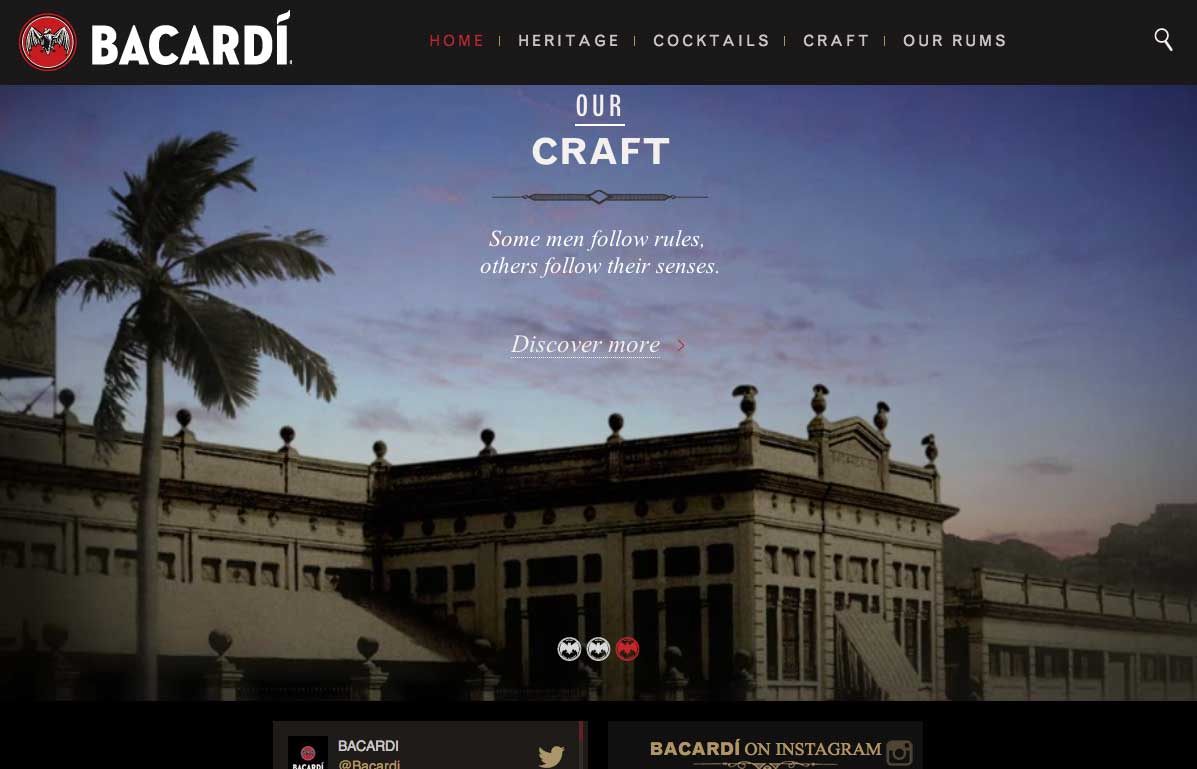
So.. I've been watching and listening to a lot of World Cup Soccer, and Bacardi is a sponsor. I guess advertising works, because after about the seventh time of hearing the ads, I ended up on the site. The opening video background is kind of awesome, especially when...
Vessyl
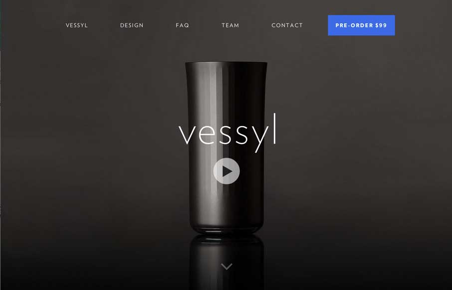
We're kind of fitness and gadget junkies here at UMS. So when the site was submitted, it was cool to imagine what the possibilities were for Vessyl as a device and company. Design-wise, the site itself is slick and sharp, which seems to be very much in-line with the...
CashierLive
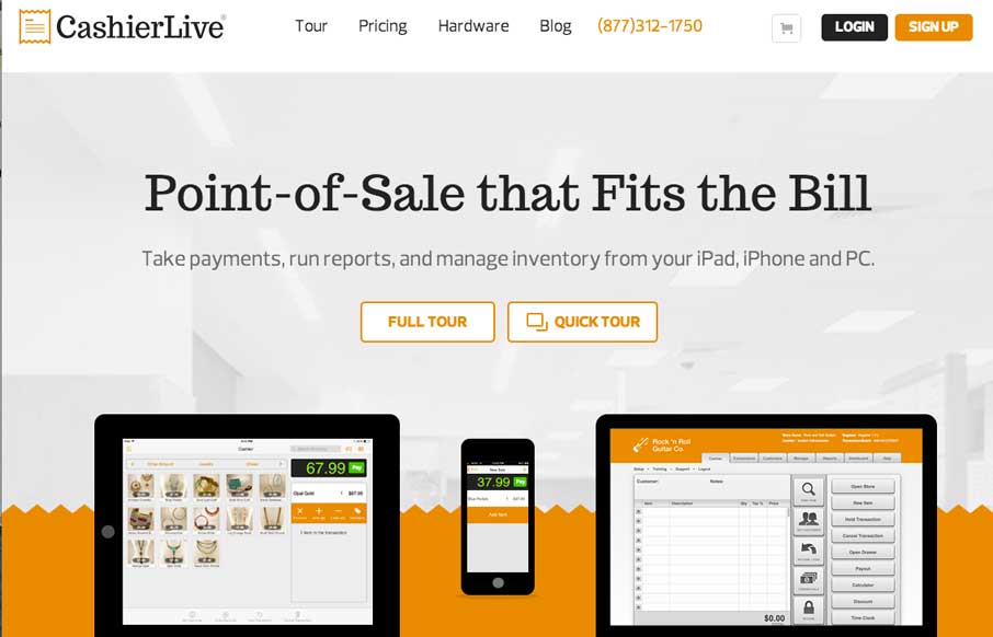
Really nice clean product site. I like the little illustration details scattered down the page. The little grid of posts is nice too. Submitted by: Joe Clay @joeclayallday Role: Designer & Developer
Hypractif
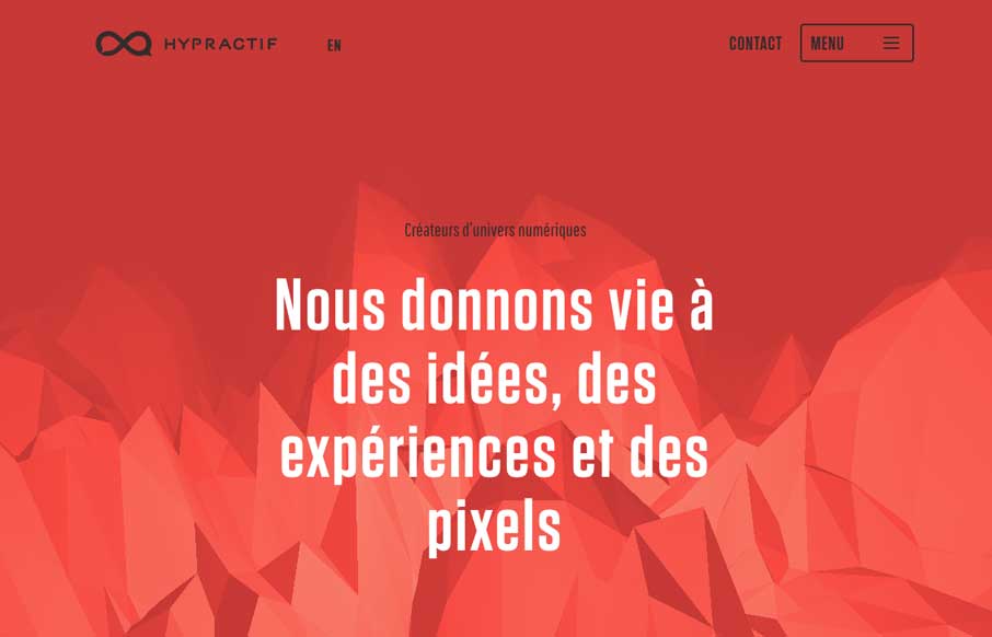
I luuurve the scrolling interaction with the background image on the Hyperactif site. It's pretty badass looking and i'll remember it for a while for sure. Submitted by: L Edouard Reinach @hypractif Role: Designer & Developer This website makes a very interesting...
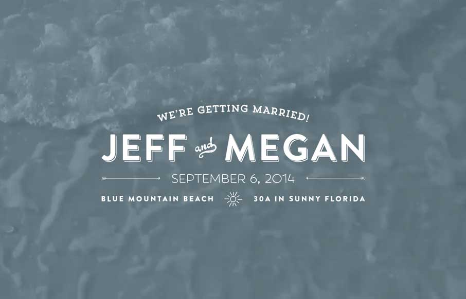
Jeff and Megan
Jeff and Megan are getting married at the Beach. 🙂 It's a wedding site, but it's a nifty one. I like the use of the video and the slow fades between the proposal pictures to sort of be animated(ish). Dig it. Submitted by: Jeff Glenn Role: Designer & Developer
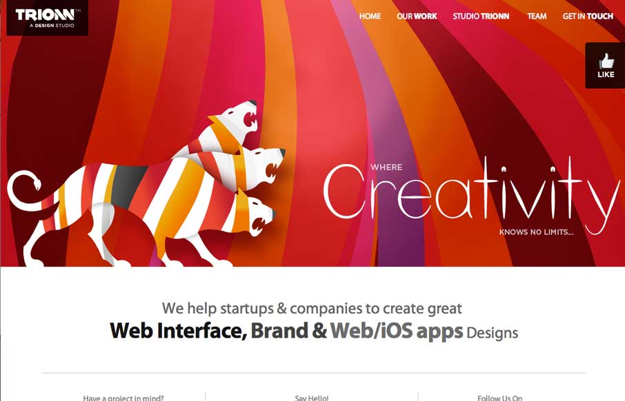
Trionn Design
Some neat graphics here. The three headed lion monster is pretty badass. I like the bold colors, but some of it is over the top. That said however, why not? Submitted by Sunny Rathod @trionn_design
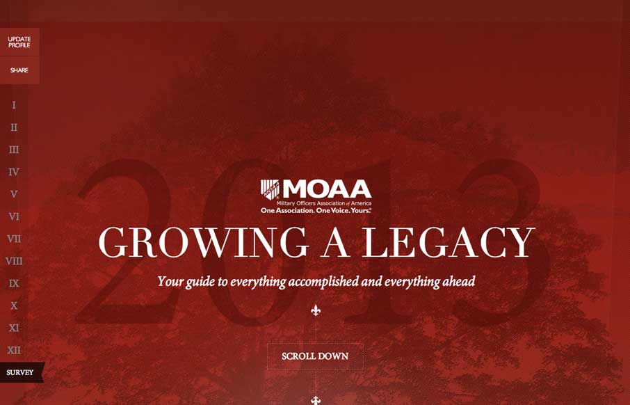
MOAA Annual Letter
Beautifully designed page. I love these type of websites, annual reports or whatever. They are a chance to stretch a website design's limits sometimes. Submitted by LMO Advertising @lmoadv
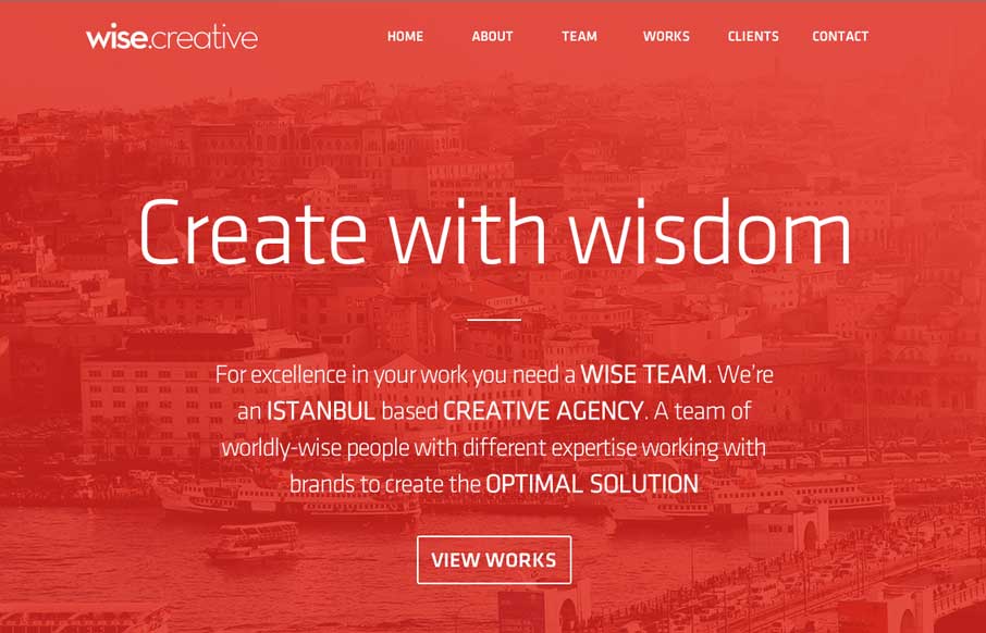
Wise Creative
I always like to see how people handle the fixed nav animation as you scroll design piece. Wise Creative is one of my favs too. I like the overall clean layout of the site as well. Classic color combo red, black and white too.
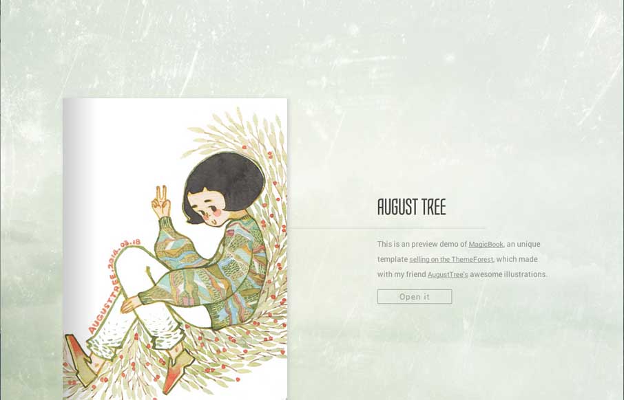
August Tree’s Portfolio
This is a theme you can buy - in fact it's a site that is meant to show off the theme. It's pretty nifty. I've actually had clients in the past ask for this specifically and we've never built one out, too bad this wasn't out then, i'd have just pinched it and made...
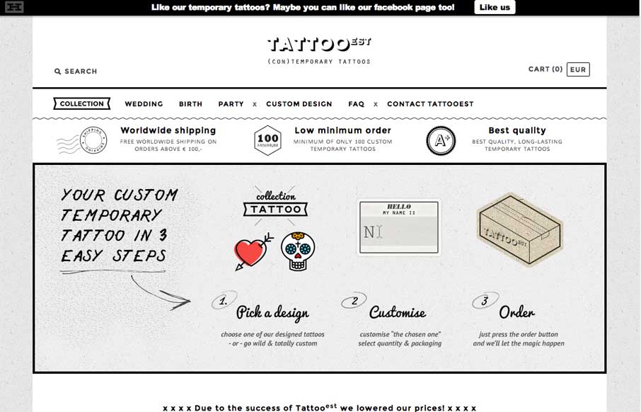
Tatto EST
Nice pure simple black and white site. Clean layout and some nifty illustrations make this site one that I like.

