So two things I really like about P’unk Ave’s website:
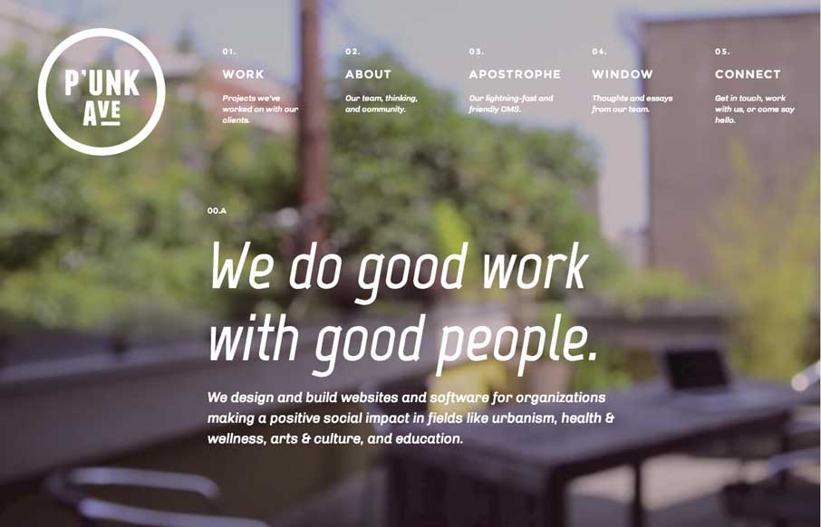
First is the video background. What many sites are doing right now is using the video background to show more about their companies / products – but then you kind of get lost in the video, and forget to read the important words that the copywriter has so eloquently SEO’d for you… P’unk’s idea to mute and blur the video allows you to still have a cool aesthetic, but also get the marketing message they want you to get.
Second – the navigation / menu. I like that they weren’t afraid to do something unconventional. It makes the header larger, but at least I know what I’m clicking on with the descriptions, without having drop-downs to ruin it. Also, as someone who works with information architecture for our clients, it’s kind of cool seeing the 02.A and 02.B actually on the pages (but I’m kind of weird like that).
(And the third thing I like is how they were able to display their double sided logo – that can be used to make coasters and other branded stuff for marketing – and yes, I know I said I liked two things…)


0 Comments