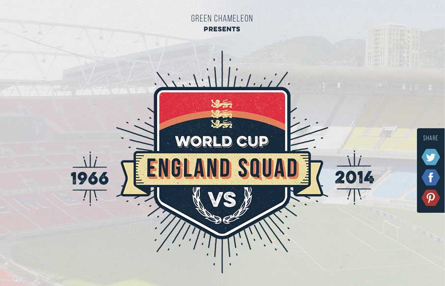
There are infographics – and then there are infographics like this site. It takes a lot of love of country and sport to take the time to build an infographic site devoted to your country’s soccer team competing the FIFA World Cup – and it’s a nicely constructed, clean site… (unfortunately England didn’t have any clean sheets, and are going home early – thus the graphic at the end “They think it’s all over… It’s just the beginning”?)
(Note – I’m writing this post an hour before England’s last game against Costa Rica – so there could be a clean sheet in a couple of hours)
(Note 2 – I’m also writing this two days before the US’s biggest game probably ever in the World Cup, and know how this sport can bring you to the edge of insanity sometimes – so I’m not hating on the England team or England fans – actually, I usually pick England when I’m playing FIFA on PlayStation, as soon as my son picks Brazil… got to have a chance to beat him, right?)
Submitted by: Nathan Riley @craftedbygc
Role: Designer & Developer
Green Chameleon presents a fun animated infographic comparing England’s 1966 World Cup winning team vs this year’s prospective line up.


0 Comments