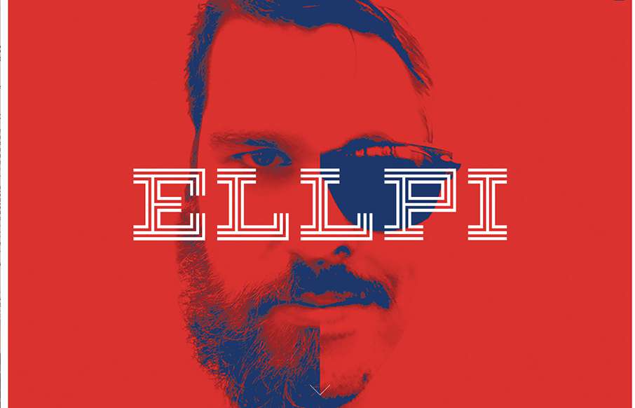
ELLPI

ELLPI

Cool looking red, blue and white agency site out of Montreal from Ellpi. It's very simple and clean, with good white (red) space. I like how the video backgrounds on the site are not featured, they are more like footers on interior pages. From the Designer: ELLPI is a...

Sequoia

Sequoia

Sharp new site from Sequoia Capital out of Menlo Park. Like the intro image that leads down to the cool vertical slideshow, with great suped-up images, and a cool overlay on the left.

SCR fullservice agency

SCR fullservice agency

We usually don't see many dark websites that really "work", but the SCR agency site out of Slovakia makes a good case for it. Unlike other dark sites though, they have good, bold and bright colors to counter-balance everything. Like the collage / block design areas...

Principle

Principle

Good site from Principle out of Atlanta - for their interactive UI tool. The hero video is a great sales tool - and the looped videos are a cool, active way to make sure you understand the app allows animations and interactions. Clean and crisp on all the other parts...

NeueHouse

NeueHouse

I think I've spent about longer looking at this site for NeueHouse then I normally do for reviews. The site is extremely well put together - love the secondary nav at the top and bottom, as well as the movement overall on the site. The work on the NeueJournal part of...

Eye Heart World

Eye Heart World

Great looking site, with really good purpose - Eye Heart World, out of Tampa, Florida, is a non-profit dedicated to stopping human trafficking. Really good work on The Cause page too.

Radar #113 – BDConf DC Edition

Radar #113 – BDConf DC Edition

This week's 113th Radar is a special edition - a preview of BDConf DC that we'll be at October 22-23, 2015: BEN CALLAHAN – Letting Go of Workflow Baggage LEA ALCANTARA – Beyond Static: The New Design System CLARISSA PETERSON – Responsive Color AARON IRIZARRY –...

Joni Korpi

Joni Korpi

I've seen a couple of sites last year that had something similar to what Joni Korpi is doing with his portfolio site, doing zoomable UI for the web. His is pretty smooth. Here's a little bit about his work, the why and how:...

Boldking

Boldking

Love this site from Boldking out of Amsterdam. Great illustrations and animation help tell their story. Also love how the real and non-real elements work together.

Forest Park Map

Forest Park Map

This map from Forest Park in St. Louis, Missouri is an information architect's dream. Using both mobile and desktop, I've been able to get around the 1,371 acre park (virtually) in ways that make regular maps on websites look more than ancient. The navigation is...

Jascha Goltermann

Jascha Goltermann

Looking at Berlin's designer Jascha Goltermann's portfolio site, I'm curious to see where he'll be in 5 years. Reason being, this site has some elements that are totally different from other portfolio sites we see, with out being too out there. Love the "hero" image...

Marie Severac

Marie Severac

This site from Marie Severac, a gastro e-commerce store out of France (not sure if a physical location too), is simple and clean - which is great when you're showcasing things like specialty foods. I think there are a few missing pages, but I like the classic left...

katafarkas

katafarkas

"One of these kids is doing her own thing..." and for Kata Farkas out of New York, that's a good thing. This portfolio site is very experimental, from the side scrolling, to the About page being very "fluid" - even if it's not the typical website experience - isn't...

Samuel Medvedowsky

Samuel Medvedowsky

I really like how designers are putting some time into their portfolios, and especially the case study parts - like how Samuel Medvedowsky's Work Portfolio pages use both full and "fixed" width to tell his stories. More so than that, it's great to get insight into how...

Indicius

Indicius

There are times when we see sites like the Indicius, and I think - way too busy, what's going on... I don't feel like that with this one - especially since there is no other navigation on the site. Really love the movement of the Case Study pages too.

Spark and Craft Studio

Spark and Craft Studio

Cool and tight site from Andre Ventura, aka Spark and Craft Studio out of Georgia. Really like the block design, and the Work detail pages are really crisp - and like how the logo doesn't interfere with the images (like we've seen a lot lately on sticky header type...

gartenrast

gartenrast

Clean, and a lot of gut white space. Love the hamburger / fork-knife-spoon menu - and roosters too.

A-2-O

A-2-O

Pretty unique interaction choices on A-2-). It's different, i'm not sure it doesn't work though. I like how the cursor changes based on moving over a link, I don't like how this is a 100% diversion from what the user has always experienced. Other than this the visuals...

Design Disruptors

Design Disruptors

"Design. Changes. Everything." - Amen. Great website and video work here from InVision, about a topic that's pretty near and dear to our hearts (and probably your's too). It's a promo site for a documentary on how design is disrupting business now more than ever. The...

OnHub

OnHub

We've been having a lot of router issues here lately - this is not a product endorsement, but maybe Google's OnHub is a solution for us? Either way - cool one pager site for the product. I like the intro, how the pre-loader turns into a video that turns into the hero...

Radar #112

Radar #112

In this week's 112th Radar: Design at Facebook Google Is 2 Billion Lines of Code—And It’s All in One Place Design sprints: what are they for? When to Use Bootstrap for Your WordPress Theme (And When Not To) My Top 30 Fonts with the Sexiest Ampersands 15 UX...

yourstru.ly

yourstru.ly

Really great editorial website layout. I love how the text flows between the images and the white space - and really love the rest of the text work on the other pages - it's not totally bound to a grid.

FLA

FLA

Pretty straight forward layout for this Law Firm in Italy. I dig the responsive design decisions made though, go ahead resize it and see what's what.

Studio Veldwerk

Studio Veldwerk

Really simple layout, it's like one project at a time to check out then only 2 other simple nav items. I love this approach. I don't like the bottom "read more" link, I'd like it to be more obvious across all images used for this section. That said, the simplicity...

Mason

Mason

Really cool minimal approach to the interior design studio Mason's website. I dig that you basically only check out some images then there's the hamburger menu, because they take you to some good sample pages of the company's work. Simple flow of info.

The Loppist

The Loppist

The Loppist is a great example of a website with a "mega" drop-down navigation design. I really like this and how it shows more info before you drill down into the site. It'll help that pogo-sticking thing that people get into on a product site.

kikk Festival

kikk Festival

We've created our fair share of event websites here at UMS, and this is one that I instantly fell in love with. I love all the interactions and detail work. It's chock full of fun discoveries as a visitor as I move around the site, play around with it and you'll see...

Young & Norgate

Young & Norgate

I love minimal and clean design. This site pushes it to the limit. It's doing everything right on that side of the house. I do think it falls short a little with the nav items being set in white text, they can get lost based on the background images. However overall...

Form

Form

Beautiful minimal products deserve a website that matches. The Form website doesn't fall short. A simple and elegant grid layout mixed with some simple type and photo direction make for a really great product website.

Spendee

Spendee

Good, clean site from Spendee - a product page for a finance app. Good movement on the on-scroll / scroll-jacking actions - and especially like the hamburger menu that opens up simple horizontal nav on the header - it's actually different than everyone that uses a...