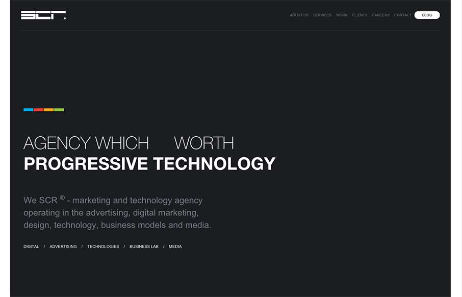
We usually don’t see many dark websites that really “work”, but the SCR agency site out of Slovakia makes a good case for it. Unlike other dark sites though, they have good, bold and bright colors to counter-balance everything. Like the collage / block design areas lower down too (though I’m not sure why the dud has his face wrapped in string… but you know, whatever.) Enjoy!
From the Designer: Full-service marketing and technology solutions.
Submitted by: SCR Team
Role: Designer & Developer
Country: Slovakia


0 Comments