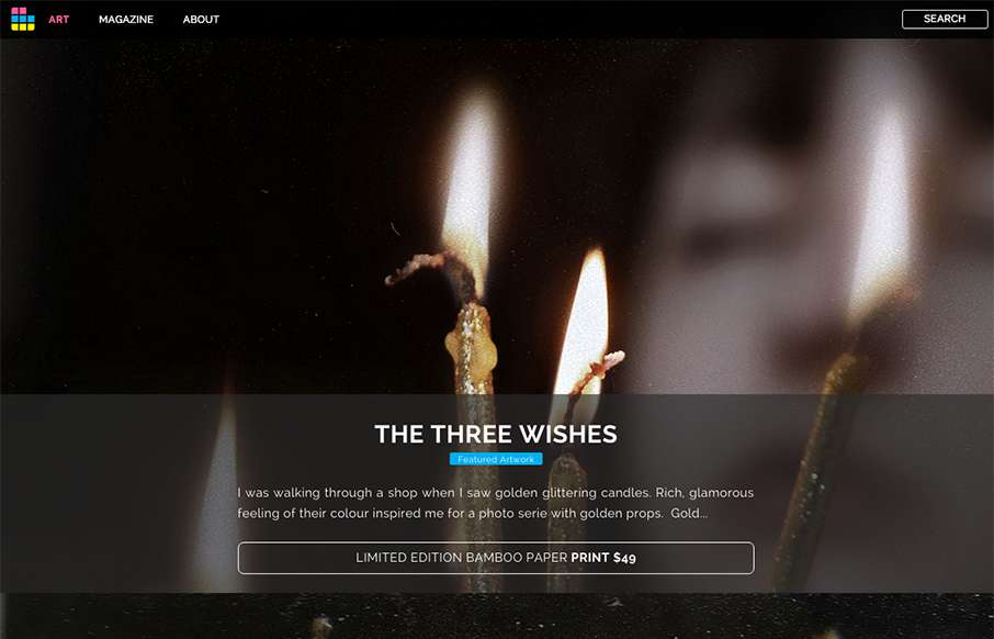
Looks like ArtSocket has changed it up a little since we reviewed them in January. They’ve continued to focus on the Art side, but making the experience a little more immersive with the full-width art scroll on the home page, and more detail on interior pages – new look is great!
From the Designer: This recent redesign features full-screen images, large fonts and more responsive controls and buttons. The whole rig is built using MooTools as a back-end framework and Google Web fonts with PHP as a back-end engine. Everything else is pretty much vanilla.
Content took perhaps the longest time to get right. From long-form articles to immaculate high-res images: everything had to look just right. Navigation and layout design was made with extreme minimalism/non-obstructiveness in mind, which means the stories and the images that went in to the site had to get extra care.
Submitted by: Dmitri Tcherbadji Tcherbadji
Twitter: @artsocket
Role: Designer & Developer
Country: Canada


0 Comments