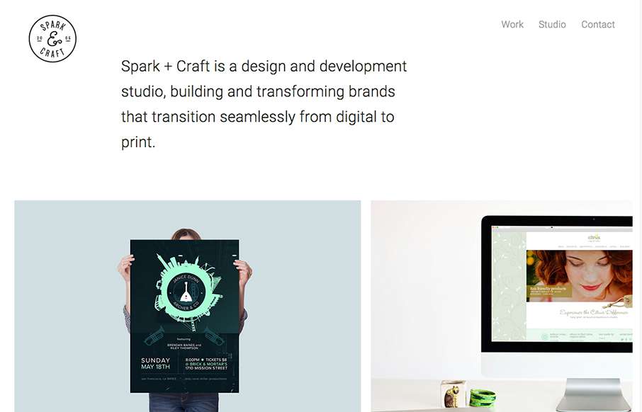
Cool and tight site from Andre Ventura, aka Spark and Craft Studio out of Georgia. Really like the block design, and the Work detail pages are really crisp - and like how the logo doesn't interfere with the images (like we've seen a lot lately on sticky header type...
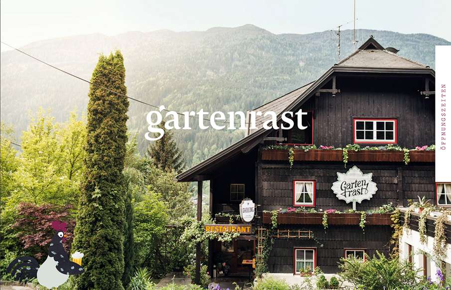
gartenrast
Clean, and a lot of gut white space. Love the hamburger / fork-knife-spoon menu - and roosters too.
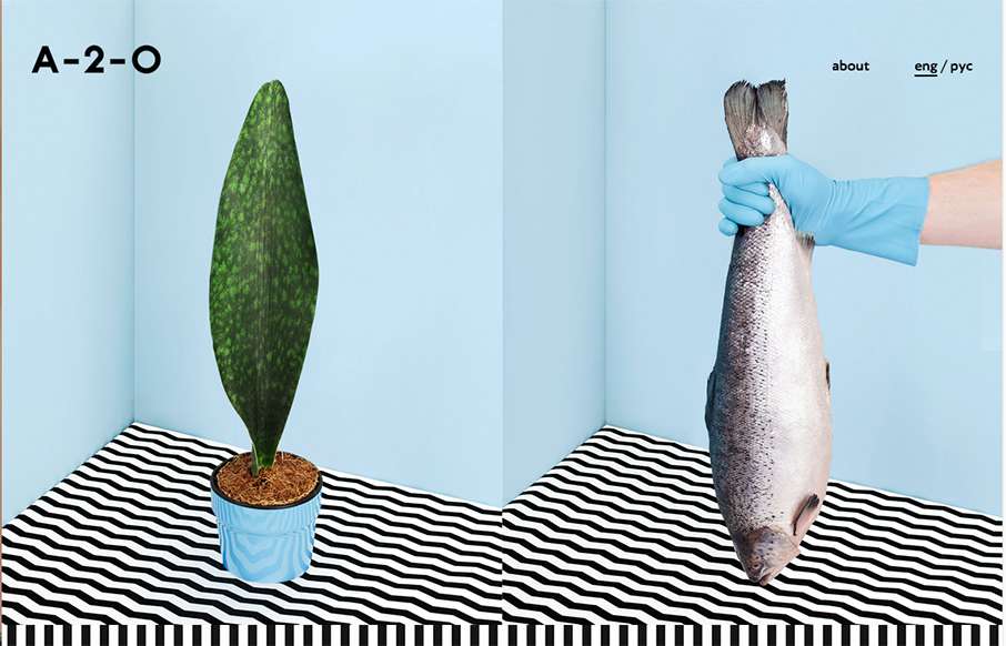
A-2-O
Pretty unique interaction choices on A-2-). It's different, i'm not sure it doesn't work though. I like how the cursor changes based on moving over a link, I don't like how this is a 100% diversion from what the user has always experienced. Other than this the visuals...
Design Disruptors
"Design. Changes. Everything." - Amen. Great website and video work here from InVision, about a topic that's pretty near and dear to our hearts (and probably your's too). It's a promo site for a documentary on how design is disrupting business now more than ever. The...
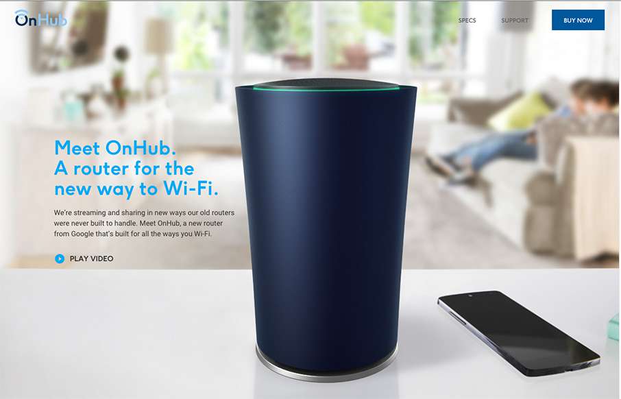
OnHub
We've been having a lot of router issues here lately - this is not a product endorsement, but maybe Google's OnHub is a solution for us? Either way - cool one pager site for the product. I like the intro, how the pre-loader turns into a video that turns into the hero...
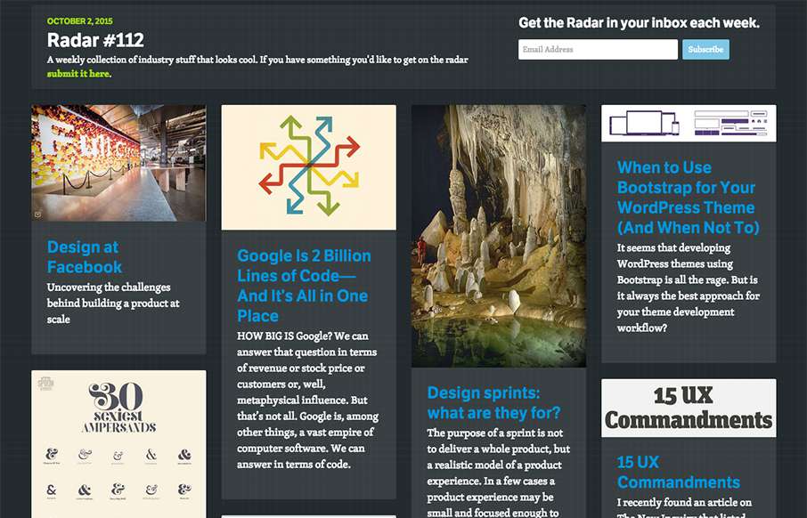
Radar #112
In this week's 112th Radar: Design at Facebook Google Is 2 Billion Lines of Code—And It’s All in One Place Design sprints: what are they for? When to Use Bootstrap for Your WordPress Theme (And When Not To) My Top 30 Fonts with the Sexiest Ampersands 15 UX...
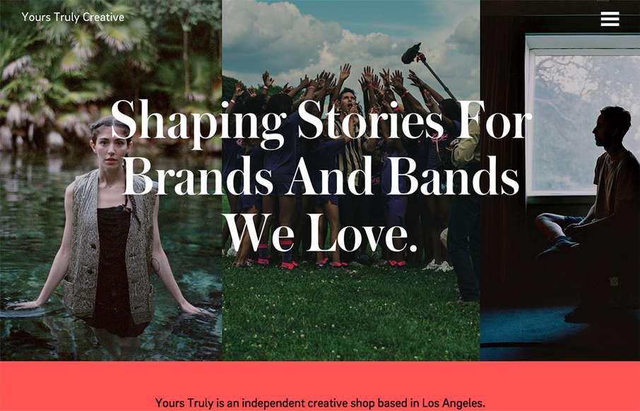
yourstru.ly
Really great editorial website layout. I love how the text flows between the images and the white space - and really love the rest of the text work on the other pages - it's not totally bound to a grid.
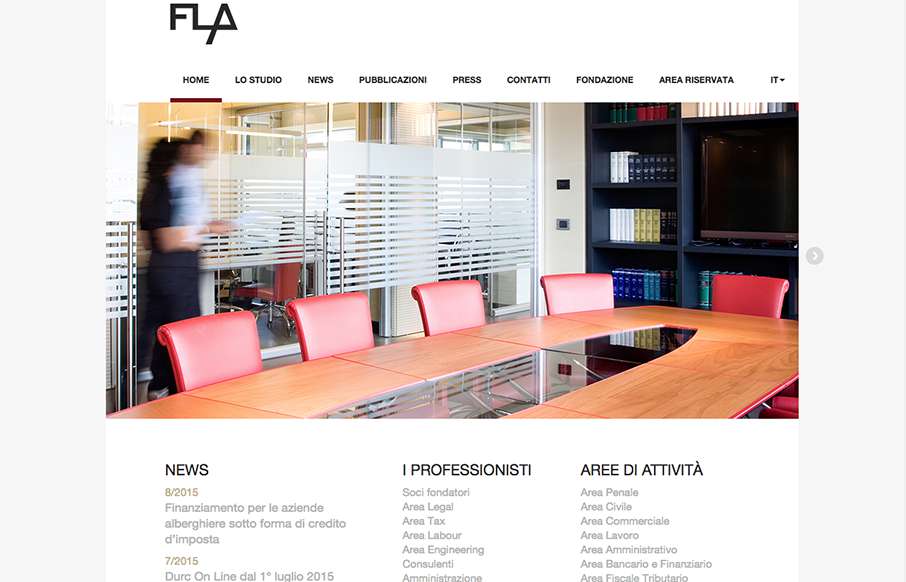
FLA
Pretty straight forward layout for this Law Firm in Italy. I dig the responsive design decisions made though, go ahead resize it and see what's what.
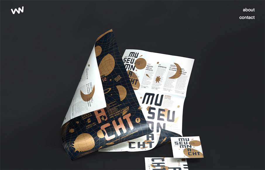
Studio Veldwerk
Really simple layout, it's like one project at a time to check out then only 2 other simple nav items. I love this approach. I don't like the bottom "read more" link, I'd like it to be more obvious across all images used for this section. That said, the simplicity...
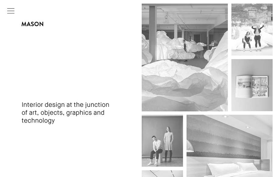
Mason
Really cool minimal approach to the interior design studio Mason's website. I dig that you basically only check out some images then there's the hamburger menu, because they take you to some good sample pages of the company's work. Simple flow of info.
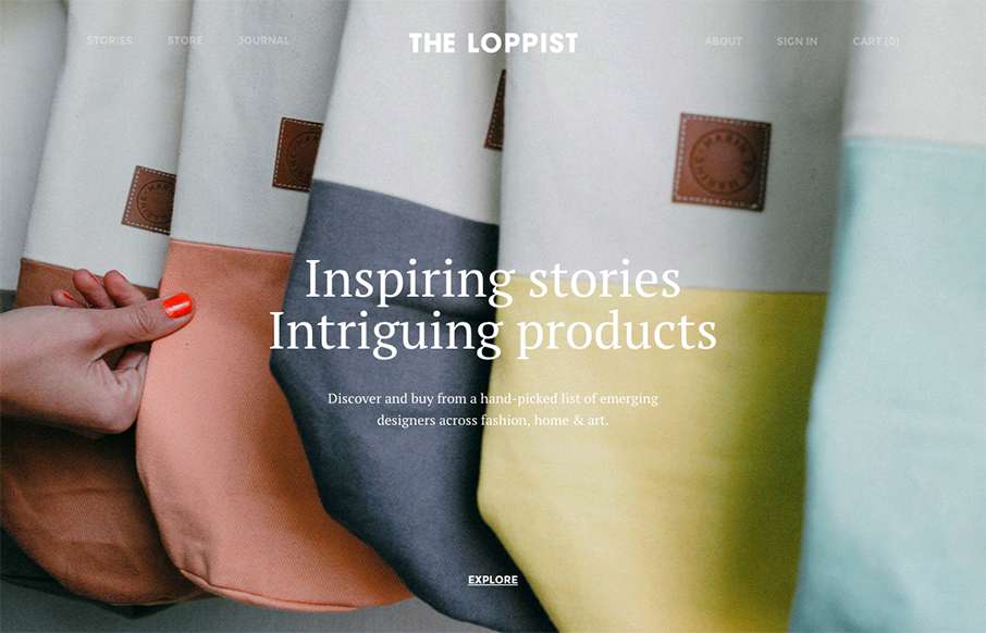
The Loppist
The Loppist is a great example of a website with a "mega" drop-down navigation design. I really like this and how it shows more info before you drill down into the site. It'll help that pogo-sticking thing that people get into on a product site.
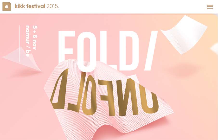
kikk Festival
We've created our fair share of event websites here at UMS, and this is one that I instantly fell in love with. I love all the interactions and detail work. It's chock full of fun discoveries as a visitor as I move around the site, play around with it and you'll see...
Young & Norgate
I love minimal and clean design. This site pushes it to the limit. It's doing everything right on that side of the house. I do think it falls short a little with the nav items being set in white text, they can get lost based on the background images. However overall...
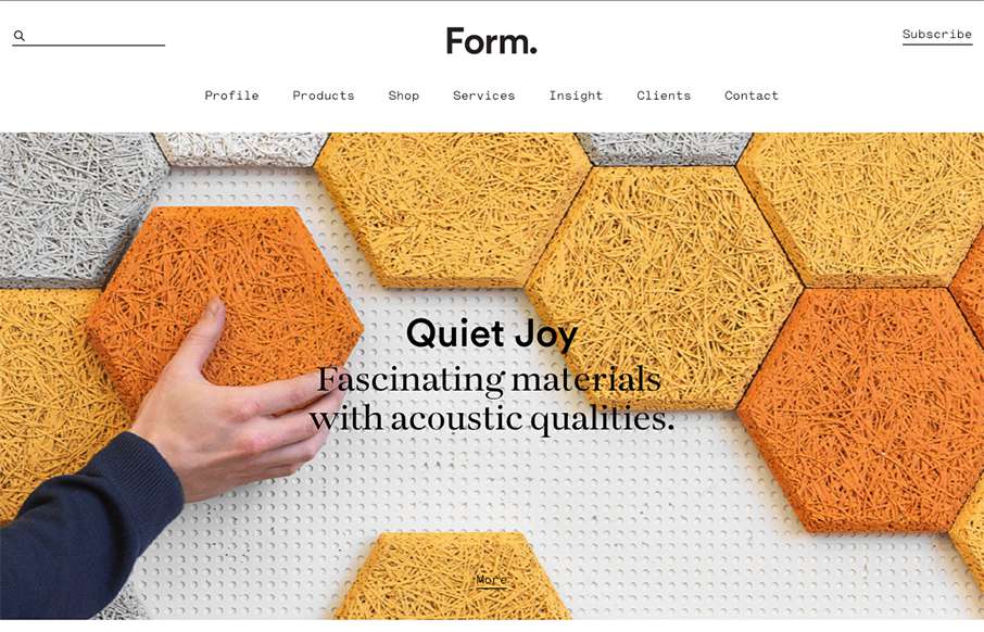
Form
Beautiful minimal products deserve a website that matches. The Form website doesn't fall short. A simple and elegant grid layout mixed with some simple type and photo direction make for a really great product website.
Spendee
Good, clean site from Spendee - a product page for a finance app. Good movement on the on-scroll / scroll-jacking actions - and especially like the hamburger menu that opens up simple horizontal nav on the header - it's actually different than everyone that uses a...
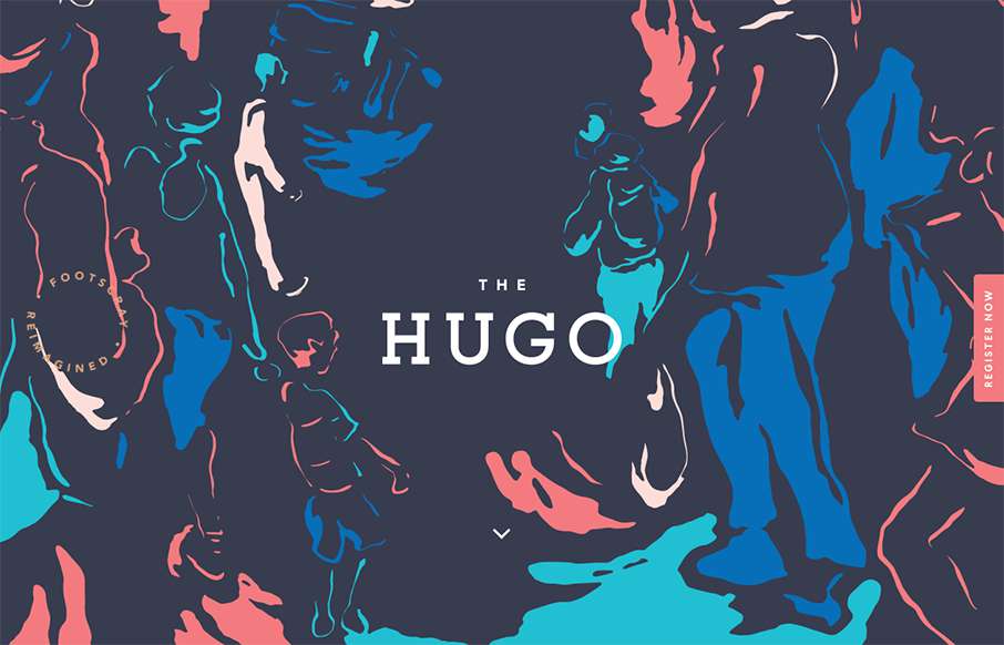
The Hugo
Pretty clever use of the background image. I really like how it's used as the hero area image, then you scroll down and the rest of the site kind of slides up. I like the register button and how it works too. Pretty cool 80's inspired colors too.
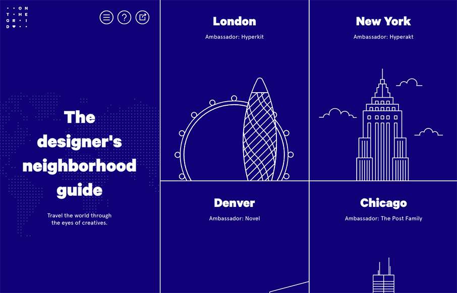
On The Grid
Pretty cool layout. I like the fixed side bar nav and the illustrations that train your eye on each neighborhood section. Which are all designed quite well using a card style design approach. Check out an example of that here.
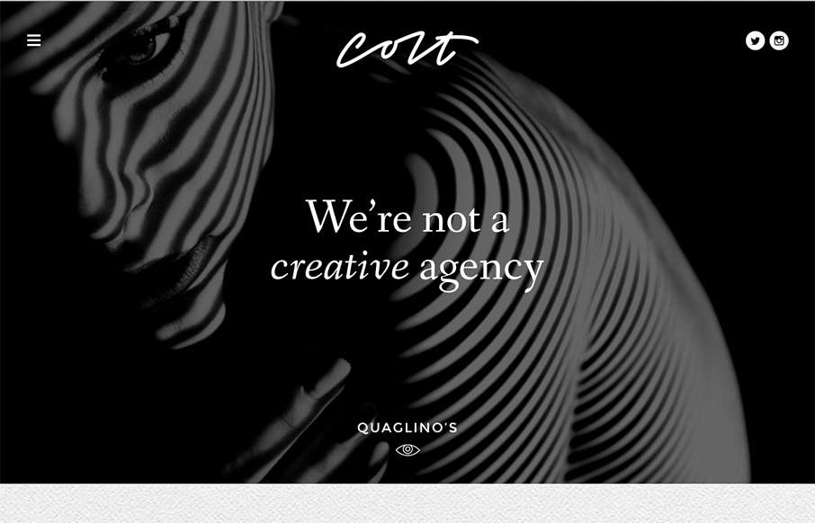
Colt
This site design hits all the "now" standard things design and interaction wise. But sometimes you get it just right, I love the smooth feeling vibe to this site and the imagery is quite nice. The way the case study images load as you scroll for the first time down...
Nineteen Studio
I like the overall vibe of this site design. The black and white setup is nice and gives it a sense of class. The photos are pretty rad too. Smooth experience as well as you make your way down the page(s). Submitted by: Swann Mayor Twitter: @swann_nineteen Role:...
Oxen Made
Cool, image heavy site. I really like the hero image style video and then how the navigation comes up under that as you scroll and then sticks as the header. The remainder of the page is nicely organized and continues with the great imagery. From the Designer: Oxen is...
Rytter & Rytter
Pretty clever single page layout for Rytter & Rytter. I like the way the sections are laid out as you scroll down, the flow feels nice. My favorite section is the pictures of their work, the way they're cataloged and displayed is just clever.
CapRadio Raffle
Nice work with this heavy grid layout, lots of sections of content to get on the page. Sometimes, boy do I know, it's hard to work with all sorts of content that a client might give you and this design just screams this to me. I really like how it's all balanced and...
Think with Google
What a beautiful yet simple layout for Think with Google. I love this, material design in play as well here. Well balanced sections and plenty of space between elements make this easy to scan, read and remember.
Justin Bartlett
Pretty cool, the first site i've seen using the ".guru" domain. Also I like how he asks for your first name before you go deeper into the site, then rolls you right into case studies. Pretty clean and smooth experience overall too. From the Designer: A minimalist...
Atlanta Tech Village
Really nice and clean layout for the Atlanta Tech Village website. I like the way they are showing you people in the space, with photos and video background, etc... the home page keeps you streamlined and puts what people would want to know most up front. This...
Skeleton
Clear layout and hip colors and type make the Skeleton website stand out. I like the focus on the case studies first - after all it's what you want people to check out. I dig that you get a bevy of info after you make your way past those 3 project sections. Also the...
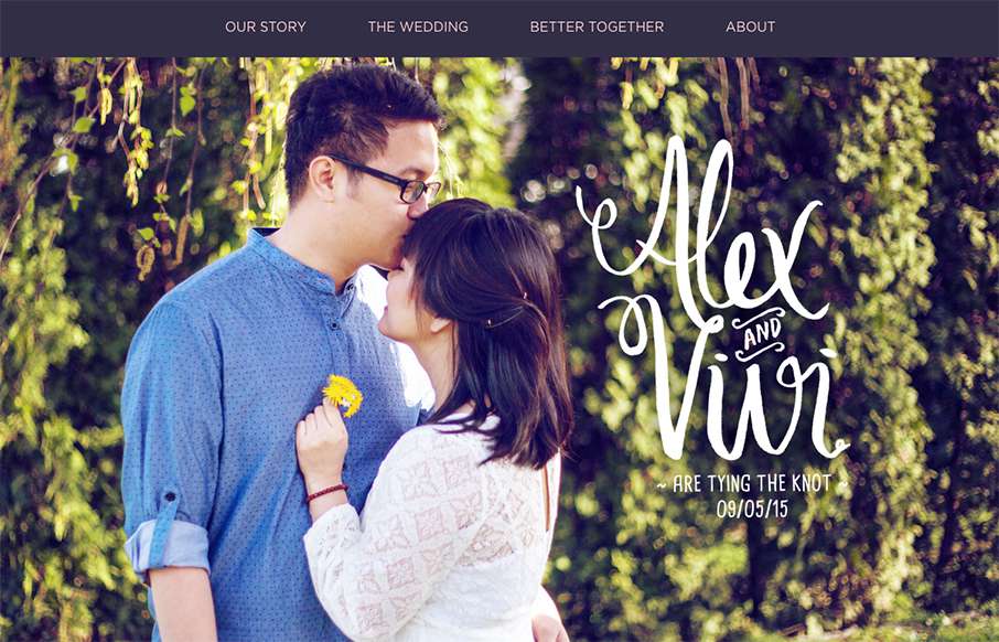
Alex + Vivi Wedding
Nice use of images and supporting graphical elements. The flowers and website element colors match up with the photography really well, that's not easy to get done. I like the way it scrolls rhythm wise as well as slight parallax scroll on the header image/area.
University of Vermont
Great example of a responsive site for a university. Aside from the great responsive work here, I also love the main nav and search area. It's a mega-dropdown style but the entire page sort of slides down. The search box works the same way but it has everything you...
Newsweek
I'm not sure how long this responsive version of Newsweek has been live but I really dig it. I like the balance between screen width targets, they've handled the in between very well too. The large images on the main stories are balanced well over the older stories,...
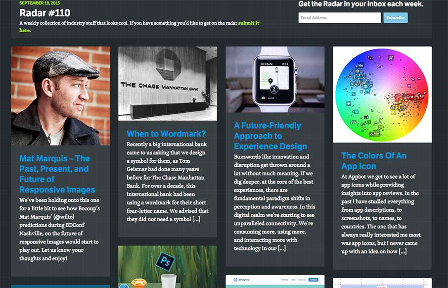
Radar #110
In this week's 110th Radar: Mat Marquis – The Past, Present, and Future of Responsive Images When to Wordmark? A Future-Friendly Approach to Experience Design The Colors Of An App Icon Going Adobe-free Drag and Drop Newsletter Builder using jQuery The future of layout...

