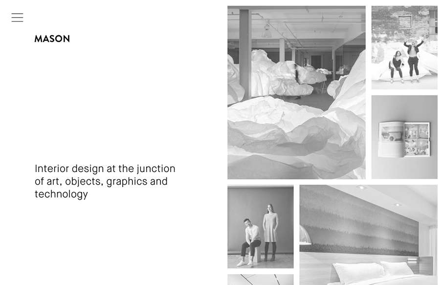
Really cool minimal approach to the interior design studio Mason’s website. I dig that you basically only check out some images then there’s the hamburger menu, because they take you to some good sample pages of the company’s work. Simple flow of info.


The Call to Action, Revisited
The Call to Action hasn’t changed in a decade, but the bar has. A fresh look at prominence, copy, mobile tap targets, and accessibility, with lessons from three major design systems.


0 Comments