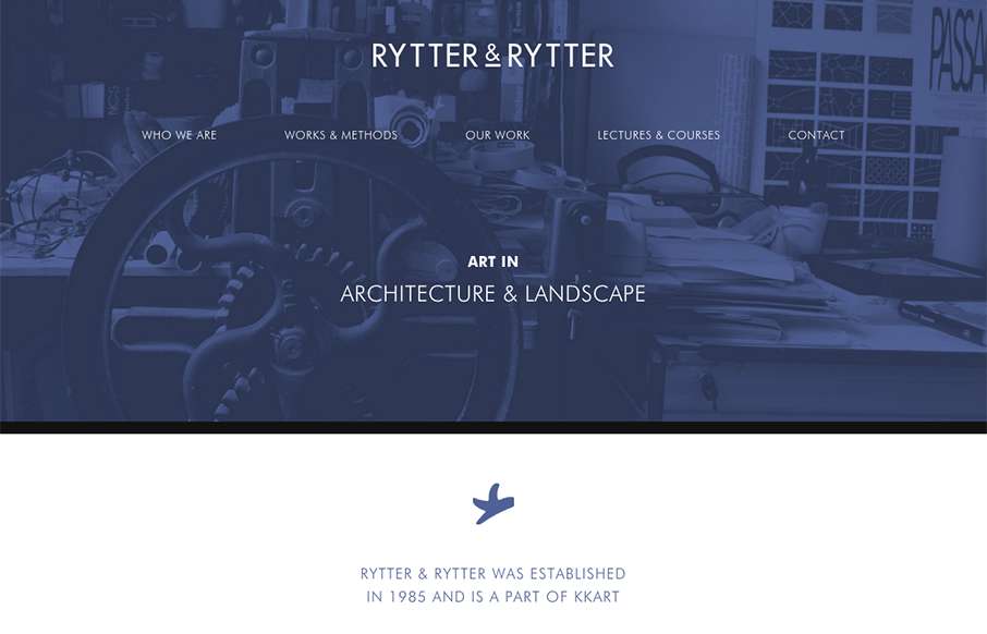
Pretty clever single page layout for Rytter & Rytter. I like the way the sections are laid out as you scroll down, the flow feels nice. My favorite section is the pictures of their work, the way they’re cataloged and displayed is just clever.


The Call to Action, Revisited
The Call to Action hasn’t changed in a decade, but the bar has. A fresh look at prominence, copy, mobile tap targets, and accessibility, with lessons from three major design systems.


0 Comments