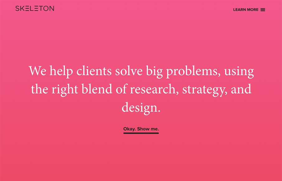
Clear layout and hip colors and type make the Skeleton website stand out. I like the focus on the case studies first – after all it’s what you want people to check out. I dig that you get a bevy of info after you make your way past those 3 project sections. Also the side nav is full of descriptive info for the links and sections.
Glassmorphism: The Transparent Design Trend That Refuses to Fade
Glassmorphism brings transparency, depth, and light back into modern UI. Learn how this “frosted glass” design trend enhances hierarchy, focus, and atmosphere, plus how to implement it in CSS responsibly.


0 Comments