Web Design Inspiration Curated
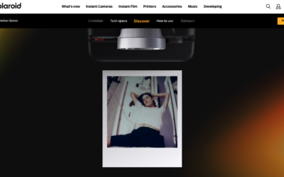
Polaroid i2 Camera
Super slick demo website for the new i2 camera. Solid parallax style triggered animations and super clean and interesting usage of product photography. Not to mention showing off the camera's photo styles as well. Fun!
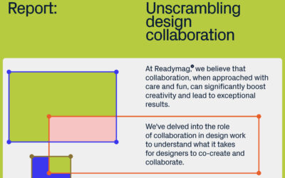
Readymag Report: Unscrambling Design Collaboration
Readymag, the design tool for creating outstanding websites, celebrates its 10th anniversary by launching a report on design collaboration in the form of an interactive digital editorial.
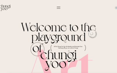
Chung-Yun Yoo
Lots of creative folks, like designers and photographers, really dig HTML5 websites because they let them express themselves in cool ways. Chungi Yoo's portfolio is a neat example. It's not just a plain showcase; it's like a fun playground where you can mess around...
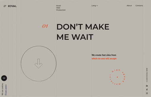
Koval Web
Captivating play between the type layer and background/grid. I like the scroll interactions. Not crazy about taking over my cursor with a circle. Overall solid layout.
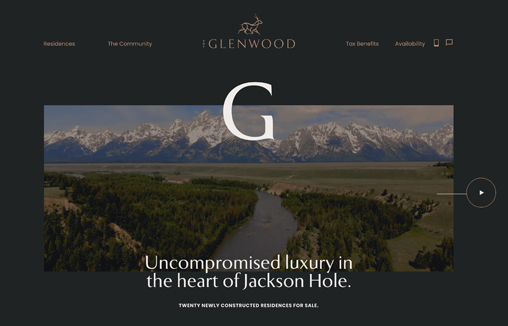
The Glenwood
Branding & Interactive design for The Glenwood, Luxury Real Estate development in the heart of Jackson Hole
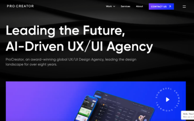
Procreator
Cool background animation. I also dig how the microinteractions work when you mouse over the video area and then the number animations. All in all, this is a compelling visual design that pulls me in.
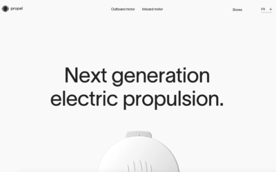
Propel
I LOVE minimal website design. This one really matches the product itself. Clean lines and simply type drive it home to let you just scroll and take in the beauty.
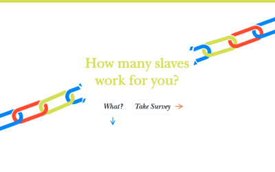
Slavery Footprint
The folks working on Slavery Footprint went with a popular choice for their CSS design: a storytelling approach. They used scroll-activated animations, illustrations, and CSS effects to share a compelling story about slavery. They kept it simple with sliding...
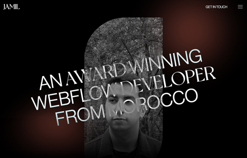
Tarik Jamil
A portfolio site for Tarik Jamil, a Webflow Developer based in Morocco

Sparks
Sparks' design is one that works in an organized and structured way visually but with a bit of fun/flair. Image-based hero section, full-screen slider, gallery, and blog - pretty straightforward stuff. This website is a great inspiration for creating a professional...
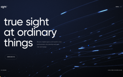
sight
There's a ton going on visually with this website. I'm not wild about the loading image and having to wait and/or click like that, but once you load it up you're given a show. I love the background imagery/animation and how the mouse interacts with it. The...
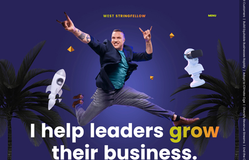
West Stringfellow
Legendary innovator West Stringfellow came to us to design and develop his new website. He wanted a site that reflected his personality fully and delighted his users. Created with Webflow by the team at www.karpi.studio
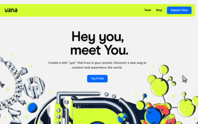
Vana
I really like the visual look of this website. It's got that cool 80's vibe in terms of it's color and type. I'll have to say though, I still don't really know what the product does... the overall approach falls short in quickly selling me on the concept and idea...
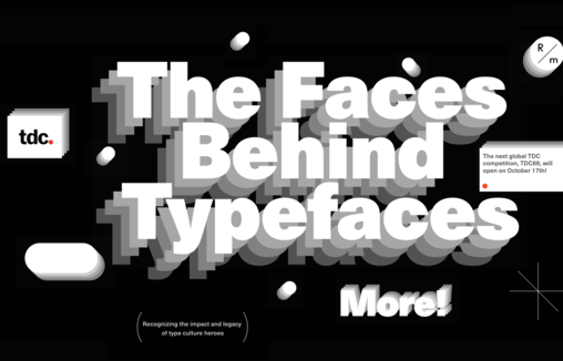
The Faces Behind Typefaces
Readymag, a design tool for creating outstanding websites, in collaboration with Type Directors Club presents “The Faces Behind Typefaces”, a selection of insightful conversations about typographers who have made extraordinary contributions to the creative field –...
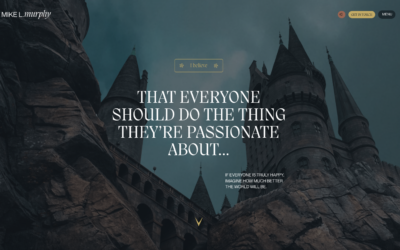
Mike L. Murphy
Immerse yourself in an extraordinary portfolio that exudes the essence of a professional designer aiming for the stars with this ambitious website. Discover a wealth of innovative elements, including partially gamified interactions and native video sections. These...
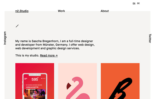
n2.studio
The thing I like most about this design is the way the type is intersected with the background shape behind the main navigation. Outside of that it has a rather retro feel to me. I dig it.
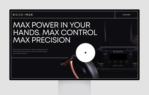
NODOxMAX
The dynamic promo page brings the emotion of the brand forward while emphasizing product benefits.
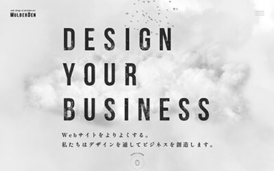
MulberDen
Morphing typography, Cloud parallax, Big cloud background, 3d bird, Morphing hover interaction, Glitch canvas etc.
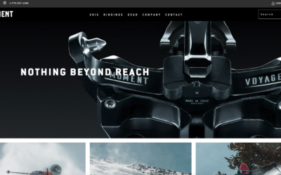
Moment
Moment Skis has a modern feeling/simple design that adds personality to their content and makes their products look appealing. They've used a simple two-column layout but made it interesting with nice colors, great images, and some subtle CSS effects. The result is a...
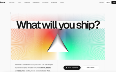
Vercel
I love the simple elements used in this design. Keeps everything clean and straightforward for the user. Some clever grid usage as you scroll down drives home a solid layout. Good stuff here.
EMAIL NEWSLETTER
News & Articles
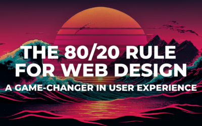
The 80/20 Rule for Web Design: A Game-Changer in User Experience
Unlock the potential of the Pareto Principle in UX design and website development. Focus on the vital 20% to enhance performance, engage users, and gain a competitive edge.
Dark Patterns in Website Design: 5 Practices to Avoid
Discover five dark patterns in website design, from misleading cues to hidden costs, and learn why these unethical tactics harm user trust and brand reputation. Choose ethical design for success.

SQL vs. No-SQL Database: Choosing the Right Database for Your Project
Explore the SQL vs. No-SQL database dilemma in this informative article. Learn the strengths, use cases, and factors to consider, aiding your choice for optimal data management.

HARD WORK. CLEAN FUEL. NO EXCUSES
Use “WARRIOR2023″ for 10% off.