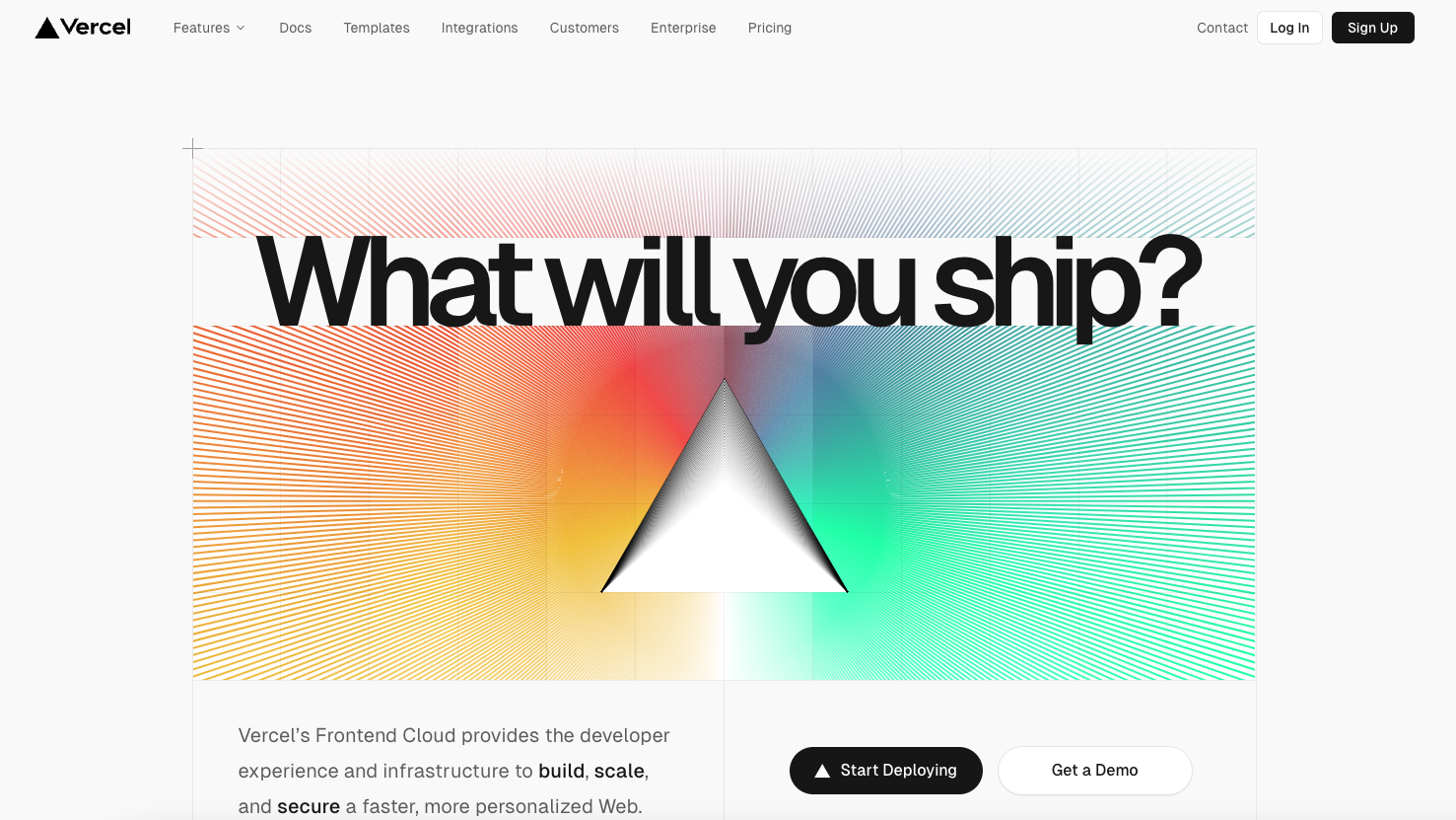
I love the simple elements used in this design. Keeps everything clean and straightforward for the user. Some clever grid usage as you scroll down drives home a solid layout. Good stuff here.
Glassmorphism: The Transparent Design Trend That Refuses to Fade
Glassmorphism brings transparency, depth, and light back into modern UI. Learn how this “frosted glass” design trend enhances hierarchy, focus, and atmosphere, plus how to implement it in CSS responsibly.


0 Comments