
When it comes to User Experience Design it’s crucial to strike a balance between attracting users and maintaining ethical standards. Dark patterns in website design are a contentious subject, as they employ manipulative tactics to influence user behavior. While they may provide short-term gains, their long-term consequences can be detrimental to your brand and reputation. Let’s dig into five dark patterns commonly employed and explain why they should be avoided at all costs.
1. Misleading Visual Cues
The Problem: Misleading visual cues involve using graphics, images, or elements that trick users into taking unintended actions. This can include deceptive arrows, buttons that mimic essential functions, or graphics that lead users away from their intended path.
Why You Should Avoid It: Employing misleading visual cues erodes trust between you and your users. When visitors feel misled, they are less likely to engage with your content, make purchases, or return to your website. Building trust is paramount in the digital landscape, and misleading your audience will only lead to negative consequences.
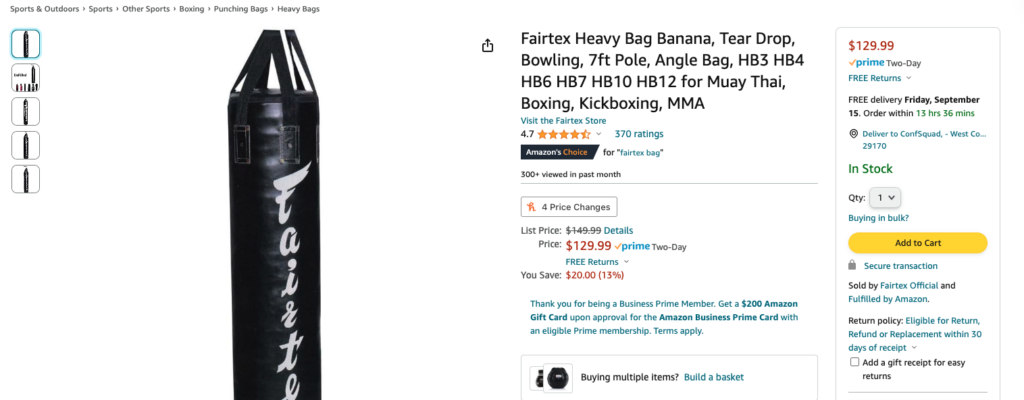
Example: Amazon’s “Add to Cart” Button
Where to Find: When you visit Amazon, you’ll notice that the “Add to Cart” button is prominently displayed and often designed in a way that makes it seem like the only option. This encourages users to add items to their cart without considering other actions like adding to a wishlist or comparing prices.
2. Sneaky Opt-In Strategies
The Problem: Some websites employ tactics like pre-checked checkboxes or hidden opt-in forms to collect user data without their clear consent. Users may unintentionally subscribe to newsletters or provide personal information, often leading to frustration.
Why You Should Avoid It: Respect for user privacy is paramount. Employing sneaky opt-in strategies may result in regulatory issues and damage your brand’s reputation. In an age of increased data privacy awareness, transparency and user consent are crucial for maintaining trust.
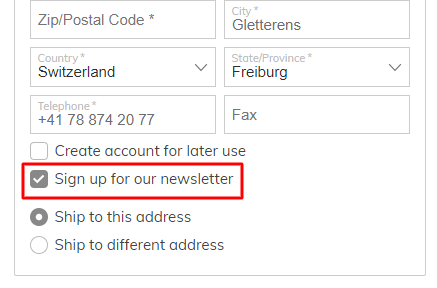
Example: Newsletter Sign-Up Pop-Ups
Where to Find: Many websites use pop-ups that have pre-checked checkboxes for newsletter subscriptions. Users may not notice the checkbox, and by simply closing the pop-up, they inadvertently subscribe to the newsletter. You can find such examples on various e-commerce sites.
3. Forced Continuity
The Problem: Forced continuity involves making it challenging for users to cancel subscriptions or opt-out of services. This unethical practice often results in users being charged without their consent, leading to negative experiences.
Why You Should Avoid It: Forced continuity not only tarnishes your brand’s reputation but can also result in legal consequences. Building customer loyalty should be based on the quality of your products or services, not trickery or deceit.
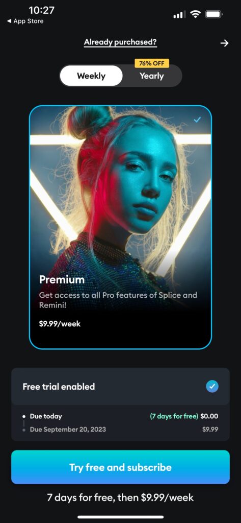
Example: Free Trial Subscriptions
Where to Find: Some websites offer free trials, but when users sign up, they are required to provide their credit card information. After the trial period, users are automatically billed for a full subscription, often without clear cancellation options. This practice is often seen in streaming services.
4. Urgency and Scarcity Tactics
The Problem: Many websites utilize urgency and scarcity tactics to pressure users into making quick decisions. This can include countdown timers, fake low stock notifications, or time-sensitive offers.
Why You Should Avoid It: While these tactics may boost short-term conversions, they often lead to buyer’s remorse and decreased customer satisfaction. Long-term success in the digital landscape relies on building authentic relationships with your audience, not manipulating them into hasty decisions.
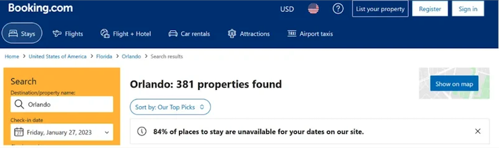
Example: Booking.com’s Countdown Timers
Where to Find: A clever way to make something seem scarce is by using a counter that shows how many places to stay are left on Booking.com. On Booking.com’s website, you can see this counter. It basically counts down to when there won’t be any more places to stay in that area. This makes people feel like they need to act fast. Coming up with creative ways to use countdown timers can tap into how shoppers naturally think.
5. Hidden Costs and Fees
The Problem: Some websites intentionally conceal additional costs and fees until users are deep into the checkout process. This can result in unexpected charges, leading to frustration and abandoned shopping carts.
Why You Should Avoid It: Transparency in pricing is essential for establishing trust with your customers. Hidden costs and fees not only harm your conversion rates but also damage your brand’s credibility. Honesty is key to fostering a positive user experience.
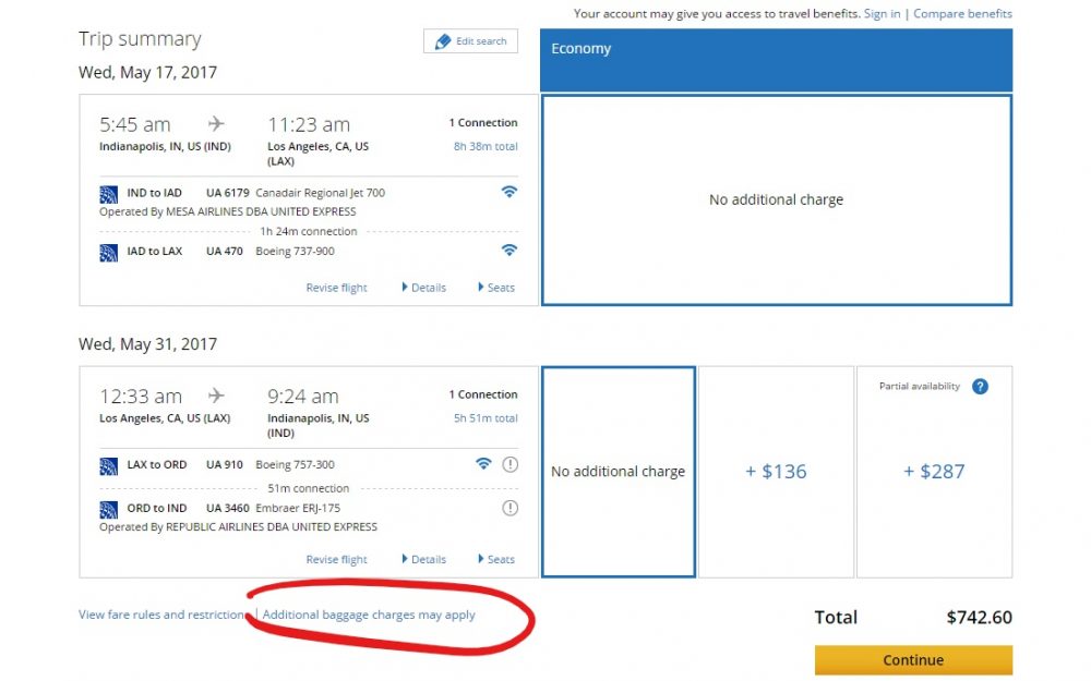
Example: Airlines’ Hidden Baggage Fees
Where to Find: Many airline websites do not clearly display baggage fees during the flight booking process. Users may only discover these fees later in the checkout process. This lack of transparency can lead to unexpected costs for travelers.
But why?
While dark patterns may offer short-term benefits in terms of conversions or user engagement, they come at a significant cost to your brand’s reputation and long-term success. Employing ethical and user-centric design principles should always be the priority. By building trust and providing transparency, you’ll not only outrank your competitors but also create a sustainable and reputable online presence.


0 Comments