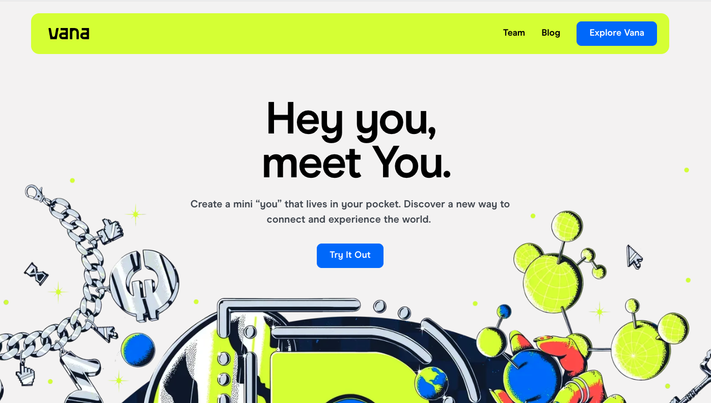
I really like the visual look of this website. It’s got that cool 80’s vibe in terms of it’s color and type. I’ll have to say though, I still don’t really know what the product does… the overall approach falls short in quickly selling me on the concept and idea behind the product. Something to learn from here, you can look very sexy but still fall short of your mission.
Glassmorphism: The Transparent Design Trend That Refuses to Fade
Glassmorphism brings transparency, depth, and light back into modern UI. Learn how this “frosted glass” design trend enhances hierarchy, focus, and atmosphere, plus how to implement it in CSS responsibly.


0 Comments