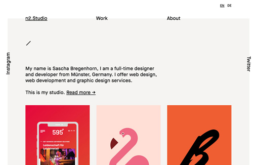
The thing I like most about this design is the way the type is intersected with the background shape behind the main navigation. Outside of that it has a rather retro feel to me. I dig it.
Glassmorphism: The Transparent Design Trend That Refuses to Fade
Glassmorphism brings transparency, depth, and light back into modern UI. Learn how this “frosted glass” design trend enhances hierarchy, focus, and atmosphere, plus how to implement it in CSS responsibly.


0 Comments