We are looking for editors. If you think reviewing websites would be fun, or even writing blog posts, please drop us a email and say hello! 🙂
Web Design Inspiration Curated
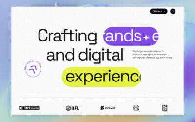
Alien Design Agency
An award-winning digital design agency focused on building brands and experiences for startups and enterprises.
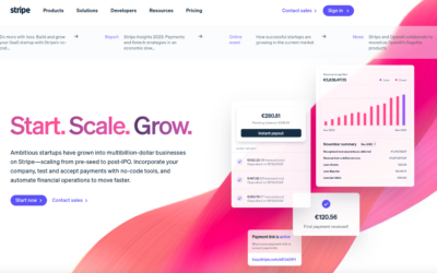
Stripe Startups
Holy cow what a super detailed design for Stripe Startups. Now this isn't the most trendy, over the top, designer portfolio style design but if you are a UX professional you'll just love to pick this one apart. Dig into it with the video below:...
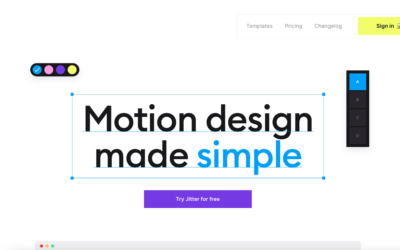
Jitter
Very cool interactions. Well, it kinda has to have it, yeah? Lolz. Seriously though this is a fun one to scroll down the page on. Check it out.
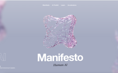
Fantasy AI
The Fantasy website(s) have always been pretty rad. Even back in the Flash days - they've continued this sort of approach here. I'm not normally a fan of the scroll (down) but get horizontal movement thing, but it somehow feels natural here. As always their visuals...
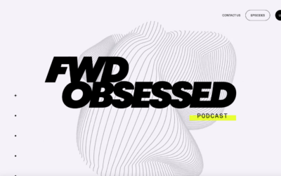
Forward Obsessed
I like the stark black and white approach to the design on this podcast website. The scrolling display of sections is pretty trendy and this example works really well. I dig the background/hero animation as well.
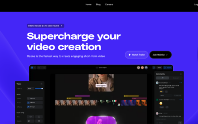
Ozone
Super cool interactions and scrolling sections. I dig this as a 'coming soon' website too, it's engaging. Something that we often forget to deliver for people who visit our websites. https://youtu.be/ZOyLqxpI9yY
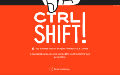
CTRL SHIFT Podcast
Really fun scroll interaction on this website. It's super simple and likely that people never really listen to the show on the actual website, but man is it memorable when you go there.
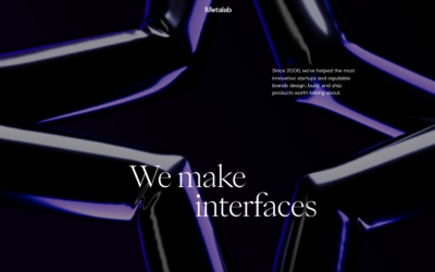
Metalab
I've long been a fan of Metalab's work. Their own website is no exception. Solid interaction and visual design make it pretty memorable, at least for me.
The Leap
I dig the soft/thin lines and screen captures. This app website has a look & feel that's unique but understated. Love it.
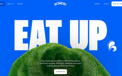
Bowery
Very nice layout with some very solid detail interaction work. I love the nav and how it minimizes as you scroll but let's you play between scroll and back-to-top. The section in the middle that locks the page but slides up the detail screens is also very well done.
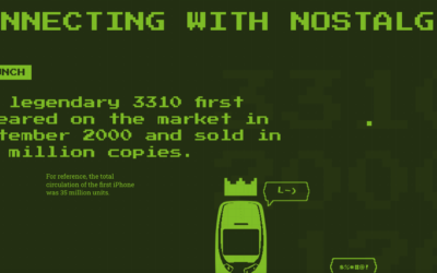
Nokia 3310
The legendary 3310 first appeared on the market in September 2000 and sold in 126 million copies. This website is a testament to that indestructible piece of history. 🙂 Also, this website is quite fun.
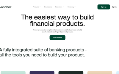
Anchor
Very cool animation and scrolling triggered animations. It's one of the first i've seen that make sense to the page's concept. Making it tie together with the copy is smart and makes me smile. https://youtu.be/6dmvdnlIZ6s
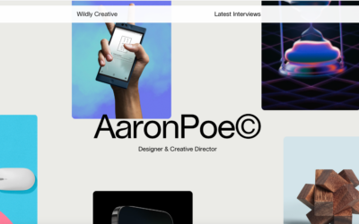
Aaron Poe & Co.
Clean 'bento' looking layout. Nice subtle scroll animations and the large images of the work let you see some good detail.
Klarna
Large and loud photography to tell the story of what it is that Klarna does. Good timing on the scroll animation sections and solid typography on top of all of it. Good stuff.
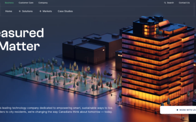
Wyse Meter
Super rich graphical design. Sharp photos and timing on the scrolling. I like it most at the point where it goes from the kinda "hero" section to the more content centric portions on the page. Solid work.
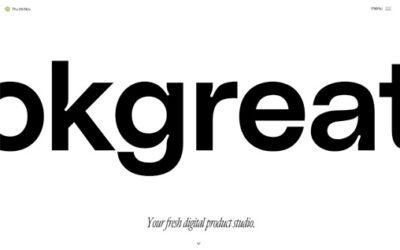
Okgreat
A nice mix between creativity and a clean interface with some funky fonts and sweet animations.
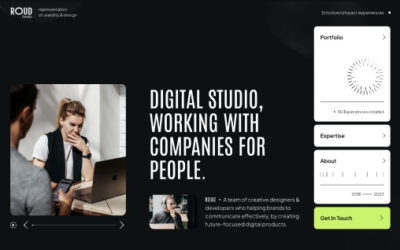
Roud Studio
Roud Studio’s creative website ingeniously displays usability in a unique and distraction-free way. With a focus on simplicity, it invites users to explore seamlessly, highlighting our innovative features without unnecessary clutter. Welcome to an online space where creativity meets functionality with a touch of unexpected delight.
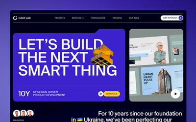
Halo Lab
Halo Lab’s product-oriented website features a folder-based style, offering intuitive navigation with a streamlined, organized interface reminiscent of a well-curated portfolio.
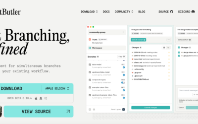
GitButler
Very strong design for GitBuilder, I love the detail work put into the interactions and such. Very clean layout and just fun. https://youtu.be/-fJsKwL0jwE
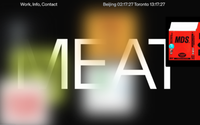
Meat
Brutalist style design? I kind of like it, the mouse-overs on the hero section are a mystery to me though. Overall I dig the layout and design. Fun stuff.
EMAIL NEWSLETTER
News & Articles

Looking Fast: The Art of Website Speed Perception
In the web world, technical speed and user perception matter. By improving design for a faster appearance, you boost conversions and stand out online. Speed isn’t just loading time; it’s perception.

Designing for Errors: Creating User-Friendly Contingency Plans
Contingency Design hinges on empathy, understanding user frustration, and transforming errors into positive impressions. By embracing these principles, you enhance user experiences, retain customers, and boost revenue in the competitive digital landscap

Fixed Navigation: Enhancing User Experience and Aesthetic Appeal
Explore the advantages and considerations of fixed navigation design in web development. Enhance user experience and aesthetics while ensuring it serves a purpose in your design.

HARD WORK. CLEAN FUEL. NO EXCUSES
Use “WARRIOR2023″ for 10% off.