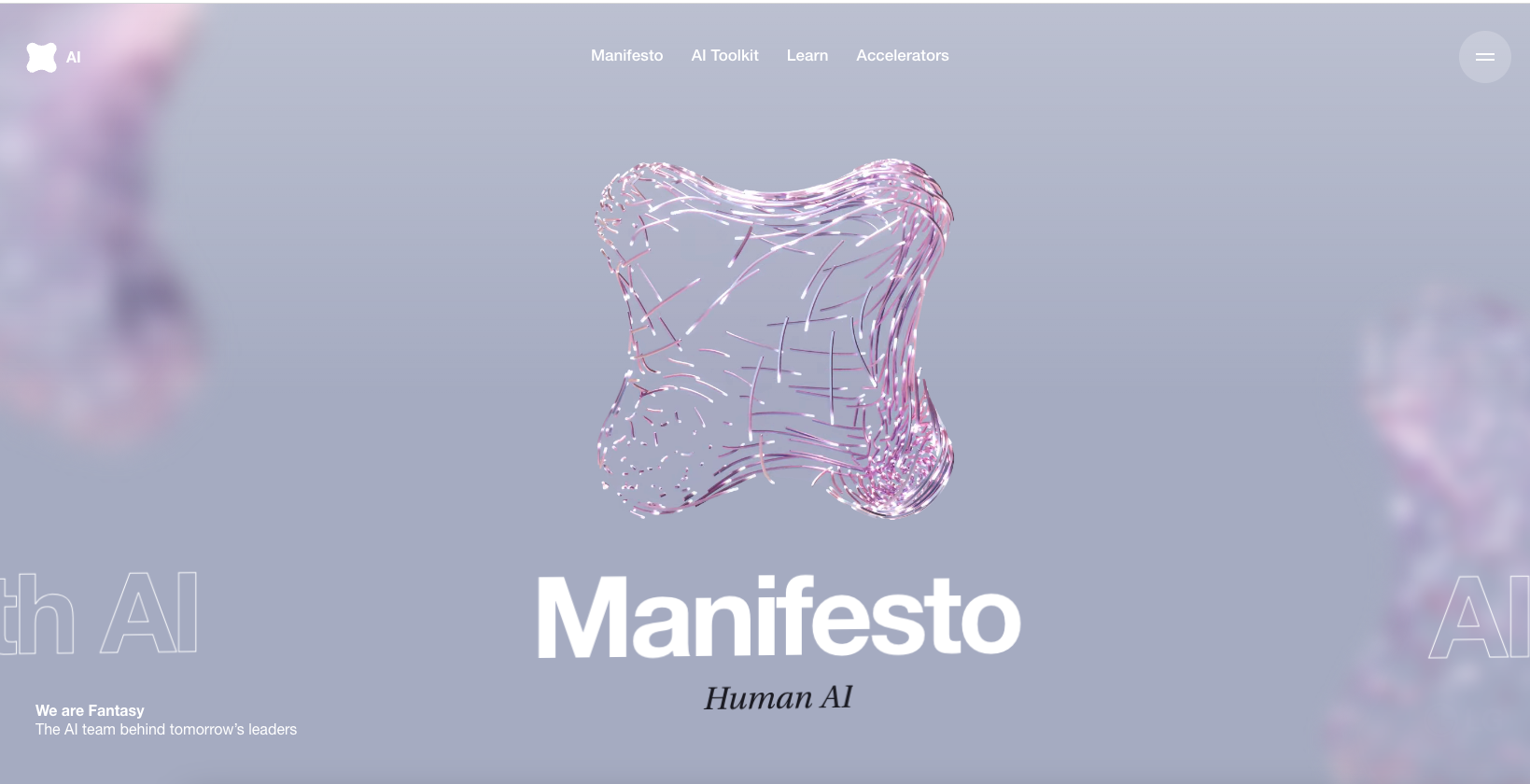
The Fantasy website(s) have always been pretty rad. Even back in the Flash days – they’ve continued this sort of approach here. I’m not normally a fan of the scroll (down) but get horizontal movement thing, but it somehow feels natural here. As always their visuals are out of this world. Solid stuff.
Glassmorphism: The Transparent Design Trend That Refuses to Fade
Glassmorphism brings transparency, depth, and light back into modern UI. Learn how this “frosted glass” design trend enhances hierarchy, focus, and atmosphere, plus how to implement it in CSS responsibly.


0 Comments