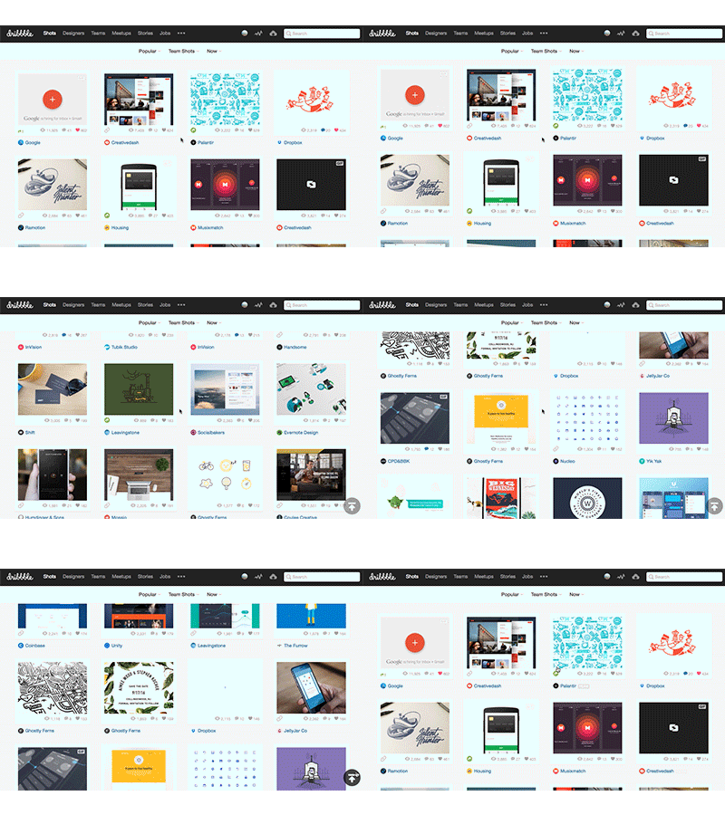
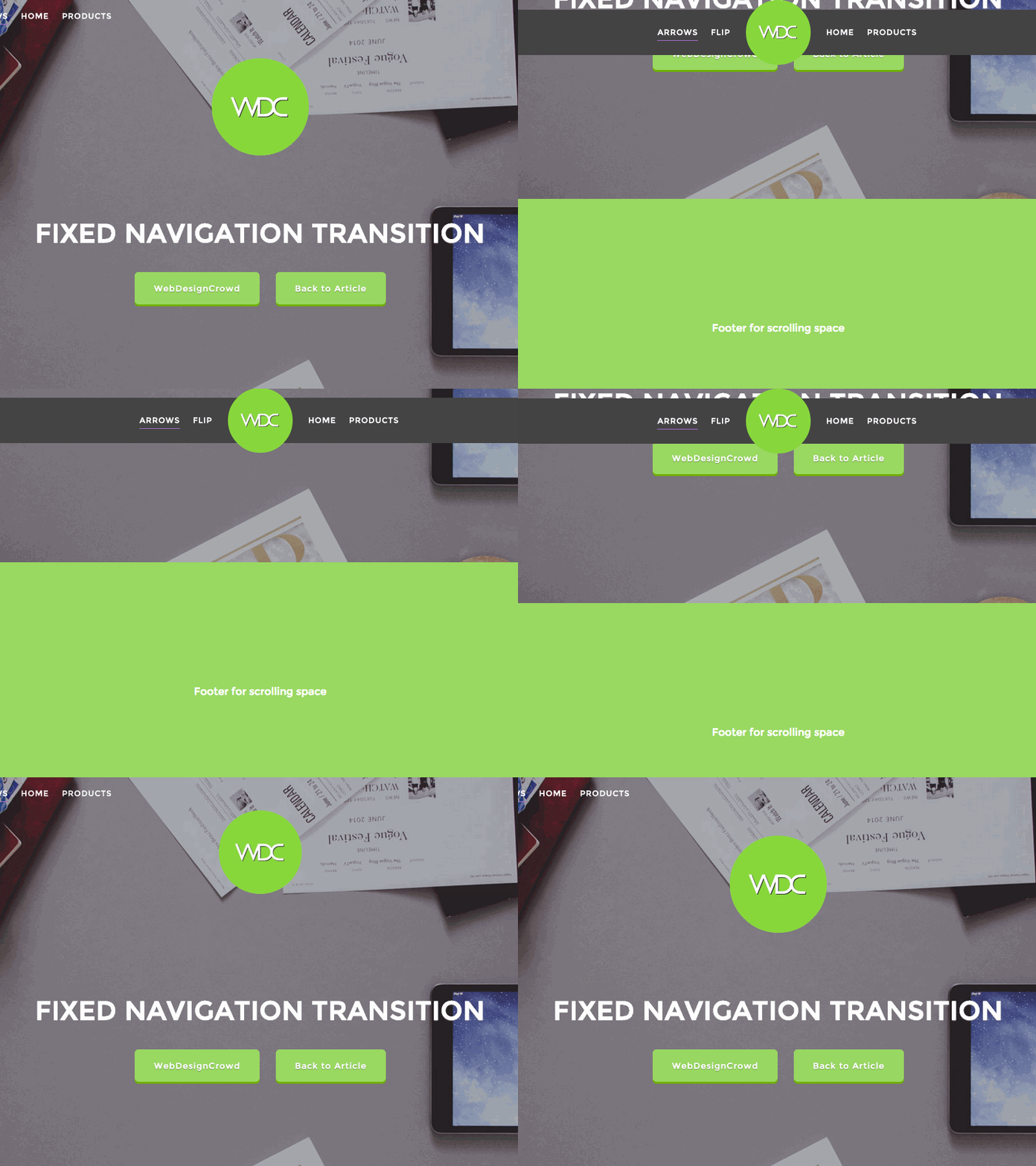
A trend that has becoming sort of ubiquitous in recent years is the “fixed navigation” design element. This design element involves keeping the main navigation elements of a website stationary, whether in the header or on one of the sides of the layout. Fixed navigation has become particularly popular for single-page websites. In this article, we delve into the intricacies of fixed navigation design, exploring its advantages, considerations, and its potential to enhance both user experience and aesthetic appeal.

The Significance of Fixed Navigation Design
Fixed navigation, when executed thoughtfully, can offer several benefits to website visitors. It serves as a powerful tool for guiding users through the content, making it easier for them to explore the site and access different sections. Moreover, it provides a visual anchor that remains constant as users scroll, thereby enhancing the overall user experience. To harness the full potential of fixed navigation, it’s crucial to ensure that it serves a purpose and is seamlessly integrated into the website’s design.
**Simply making the navigation sticky for the sake of following a trend is ill-advised; there must be a legitimate reason to adopt this design approach.
On the Nielsen Norman Group’s post discussing Persistent Headers they summarize it as follows:
Sticky headers can be a positive addition to a site, but only if they truly serve a purpose for your users. If a sticky header does provide value to users, then ensure that it is as small as reasonably possible, it has high contrast against the background, does not use gratuitous animation, does not obscure content, and does not distract your users.
– NNG
Further they advise the following rules for approach it within your design(s):
- Maximize the Content-to-Chrome Ratio by Keeping It Small
- Contrast with Content Is Important
- Keep Motion Minimal, Natural, and Responsive
- Consider Partially Persistent Headers
- Consider Whether a Sticky Header Is Needed at All
Considerations for Implementing Fixed Navigation Design
Screen Size Matters
The effectiveness of fixed navigation varies with screen size. What works perfectly on a desktop or laptop monitor might not translate as well to a smaller screen, such as an iPhone. It’s essential to consider the user’s experience on various devices and optimize the fixed navigation accordingly. Responsive design is key here – ensuring that the navigation adapts seamlessly to different screen sizes.
Length of the Page
The length of the page plays a critical role in determining whether fixed navigation is a viable choice. For lengthy, single-page websites, fixed navigation can be highly beneficial, as it simplifies navigation and ensures users can effortlessly jump between sections. However, on shorter pages, implementing fixed navigation may seem unnecessary and potentially disruptive. The decision to use fixed navigation should align with the content and structure of your website.
Visual Integration
An essential aspect of successful fixed navigation design is its ability to visually integrate with the overall layout. The most effective fixed navigation implementations seamlessly blend with other design elements, disappearing or interacting in a captivating manner as users scroll. This not only enhances aesthetics but also contributes to a more engaging user experience. The fixed navigation should go beyond being a mere block of color with links; it should be an integral part of the site’s visual narrative.
Section Identification
For single-page designs, fixed navigation can serve as an aid in informing visitors about their current location within the page. It emulates the experience of navigating to a new page, with the fixed navigation highlighting the active section. This not only improves user orientation but also provides a sense of progress as visitors explore your content.

Wrap Up
Fixed navigation, when applied thoughtfully, greatly benefits users by providing a consistent point of reference as they scroll through your content. The key to its success lies in its purpose and seamless integration into your website’s layout. As you incorporate fixed navigation, ensure every element serves a justified role, regardless of its size, and blends harmoniously. Fixed (or Persistent) navigation stands as a timeless, enduring element that enhances aesthetics and user experience when implemented thoughtfully.


0 Comments