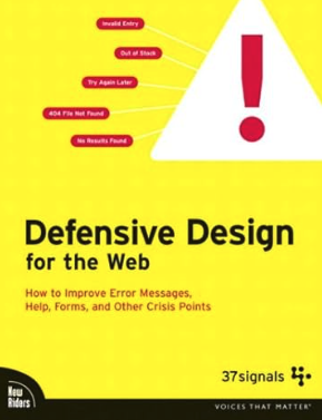
A great User experience is at the core of any successful website or web app, and one aspect that often gets overlooked is Contingency Design. This concept introduced by 37signals back in 2002 (that they called Defensive Design,) remains as relevant today as it was then. Contingency Design acknowledges the inevitability of failures and emphasizes the need to handle them gracefully. It doesn’t matter whether the fault lies with the user, the system, or even cosmic anomalies like solar flares; what’s crucial is how you respond to these failures.
Why Contingency Design Matters
Imagine a scenario: a user attempts to use your website or application, and something goes wrong. It might be a typo in their search query, a misinterpretation of a form field, or a completely random system glitch. Regardless of the cause, the user ends up frustrated, and you risk losing a potential customer and revenue. This is precisely where Contingency Design comes into play. It’s about creating an environment where errors are not just tolerated but addressed in a way that retains the user’s interest and trust.
Practical Applications of Contingency Design
1. The 404 Page
A basic but essential element of Contingency Design is the 404 error page. Every website should have one, but not all 404 pages are created equal. A well-designed 404 page doesn’t just inform the user that they’ve encountered an error; it guides them on how to proceed. This could include offering a search form, suggesting alternate links, or even humorously acknowledging the mistake to lighten the mood.

2. Clear Error Messages
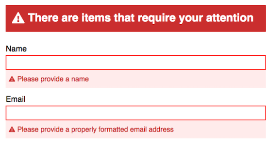
In any form on your website or application, clear and specific error messages are crucial. Instead of vague alerts like “Invalid input,” provide context-relevant feedback. For example, if a user forgets to include a required field in a form, the error message should precisely point out the omission and suggest how to rectify it.

3. Explaining Limitations
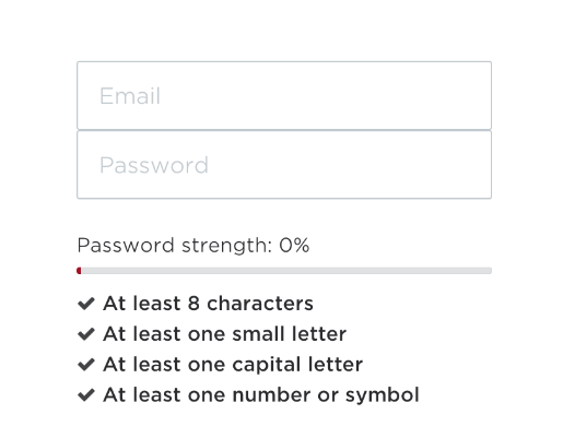
If your platform has specific input requirements, such as passwords needing a combination of numbers, letters, and even a backward ‘J,’ it’s best to communicate these constraints upfront. Provide users with a concise explanation of what’s expected before they start filling out a form. This helps prevent errors and fosters a more seamless user experience.

4. Enhanced Search Functionality
If your website incorporates a search feature, it’s not sufficient to display a bland “No Results Found” message. Instead, go the extra mile by offering alternatives. If the user misspelled their search query, present a list of similar results to guide them in the right direction. This not only helps users find what they’re looking for but also demonstrates your commitment to their satisfaction.

Empathizing with Users
Contingency Design hinges on empathy, understanding user frustration, and transforming errors into positive impressions. By embracing these principles, you enhance user experiences, retain customers, and boost revenue in the competitive digital landscape.
Further reading/research:
Defensive Design for the Web: How to Improve Error Messages, Help, Forms, and Other Crisis Points


0 Comments