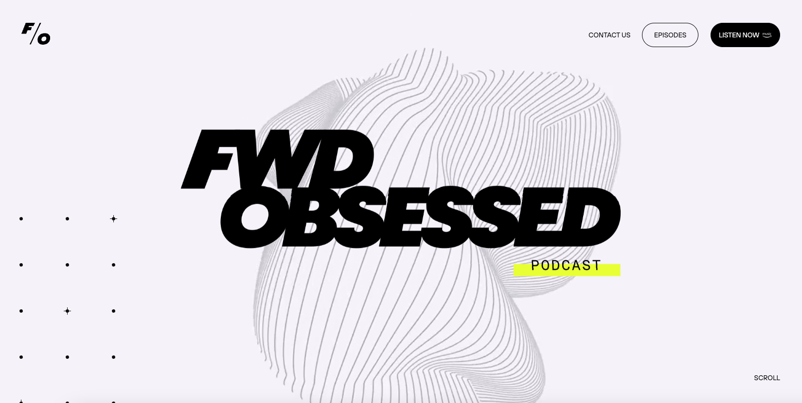
I like the stark black and white approach to the design on this podcast website. The scrolling display of sections is pretty trendy and this example works really well. I dig the background/hero animation as well.
Glassmorphism: The Transparent Design Trend That Refuses to Fade
Glassmorphism brings transparency, depth, and light back into modern UI. Learn how this “frosted glass” design trend enhances hierarchy, focus, and atmosphere, plus how to implement it in CSS responsibly.


0 Comments