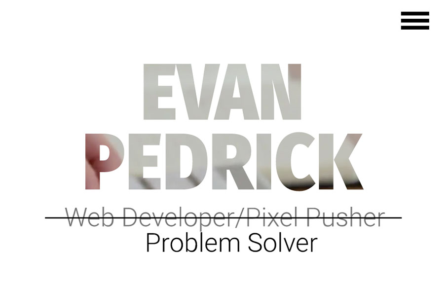
Man I dig this layout. It feels very original and open, the graphics are relatively neat too, especially the main blueprint background imagery. From the Designer: This is my personal portfolio website. It has been designed and built by hand from the ground up. The CSS...
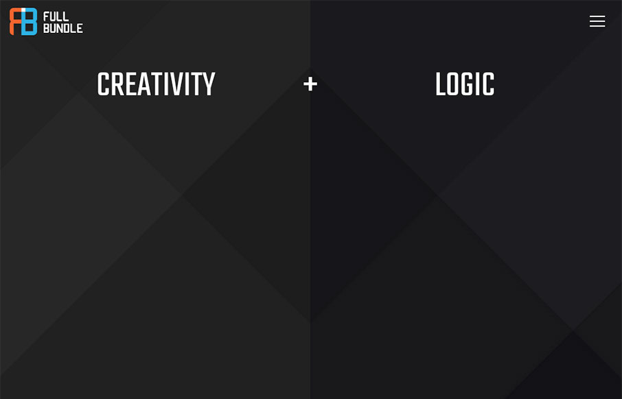
Full Bundle
Really fun website with a fairly minimal base. I love the way the bits of design float up or away from your mouse when you interact with the website/screen. The content sections are solid examples of design too. Great visual work here. From the Designer: Full Bundle...
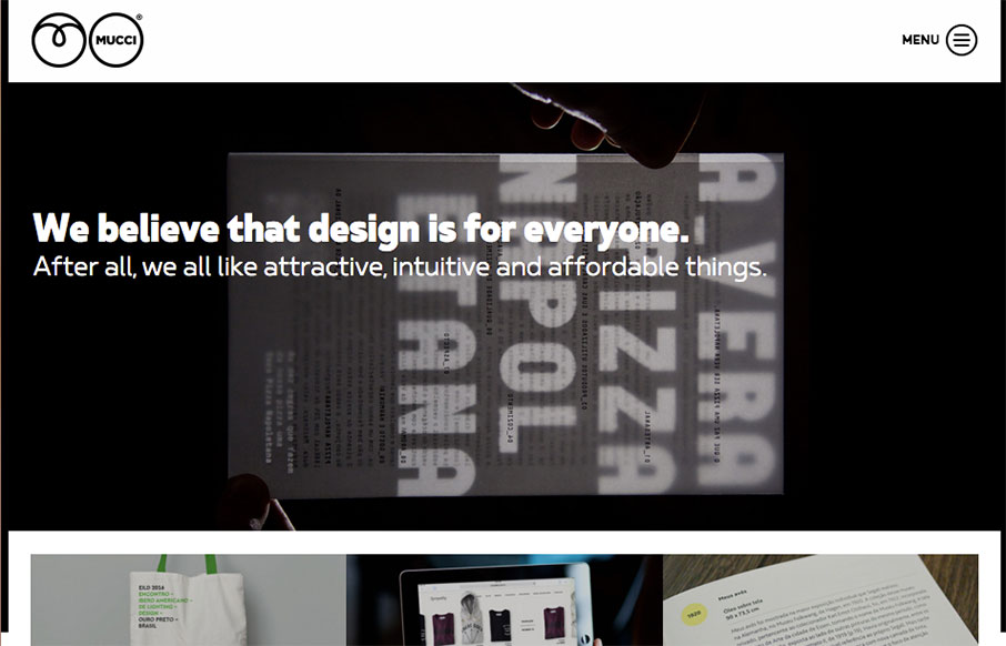
Mucci Estúdio
Clever layout for Mucci Estúdio. I dig the main nav interaction and how the hero image get's folded up under it when you scroll. From the Designer: Mucci Estúdio is a graphic and web design studio based in São Paulo, Brazil. Submitted by: André Giacomucci...
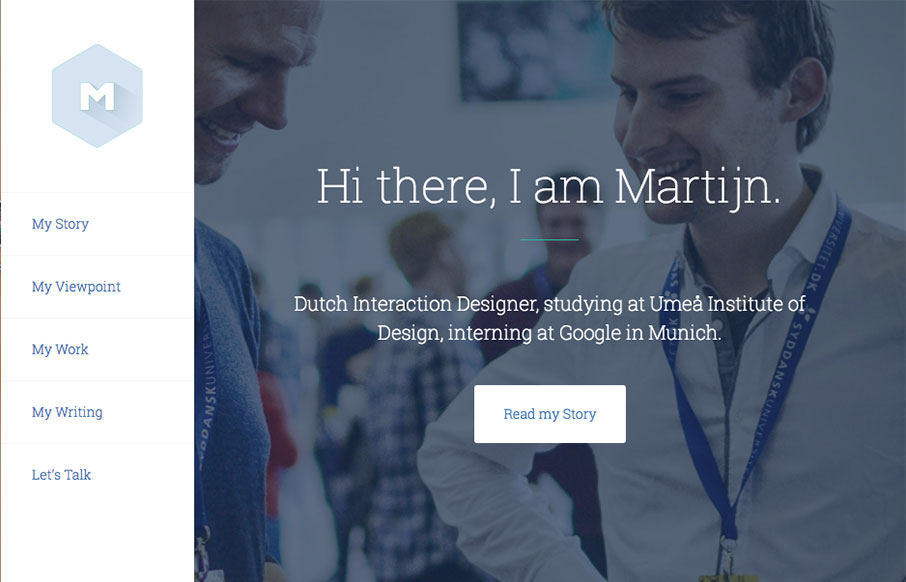
Martijn
UX Design intern at Google. Pretty solid work here. I love the overall simple and clean approach, but I love the little interaction when you scale the window down the most. Clever and nice touch for sure. Hire this dude!
Sugar Vision
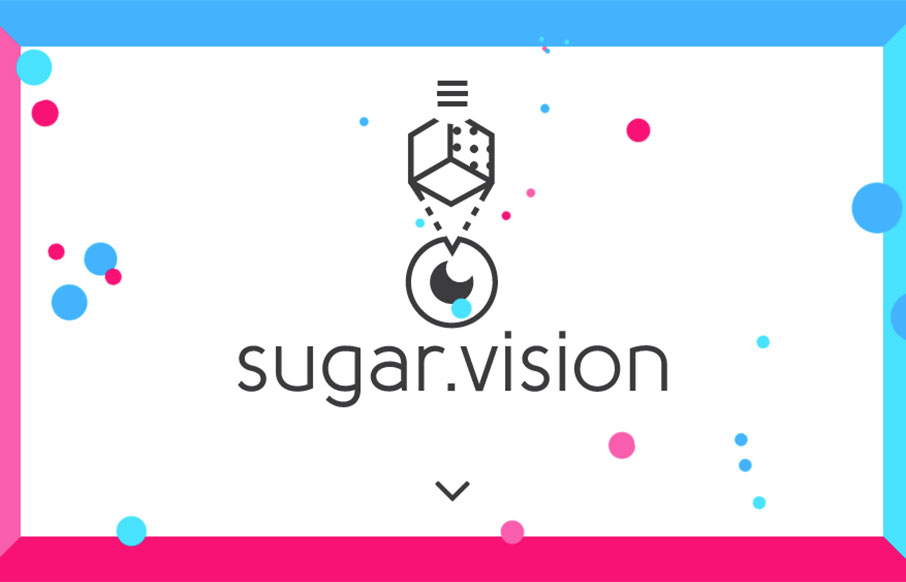
Badass looking design for Sugar Vision. I love all the things! It has solid design and layout and execution and also heart. I love the vibe and design approach, so much cool. From the Designer: Sugar Vision is a dedicated team of experienced creatives working on...
DigitalBLB
Pretty solid design work here. I really dig the way the logo slides over the word mark as you scroll down. The remainder of the home page layout is well done, with the different sections giving it a good rhythm and corporate vibe. From the Designer: As a digital...
Confederation Studio
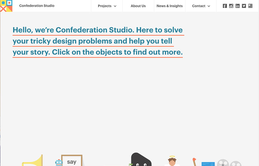
Luuurrrvvvee the simple layout approach to Confederation Studio, the thing that lands it in the cool zone is the illustration work. Really, they're great. I love how it goes from a big hero image area to colorful blocky sections. The rhythm is strong and the...
Julie Poignot
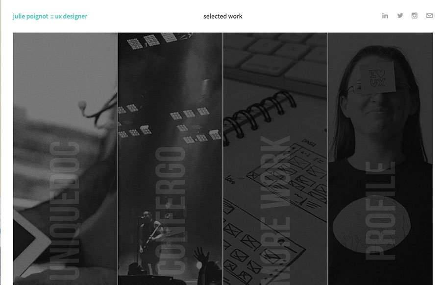
Pretty unique layout and design for Julie Poignot's site. I love this thing. It's intriguing at first glance as well as deeply enriched by animation and content. The case studies for example are amazing rich and well done. Check this site out when you get a chance....
CHARIJ
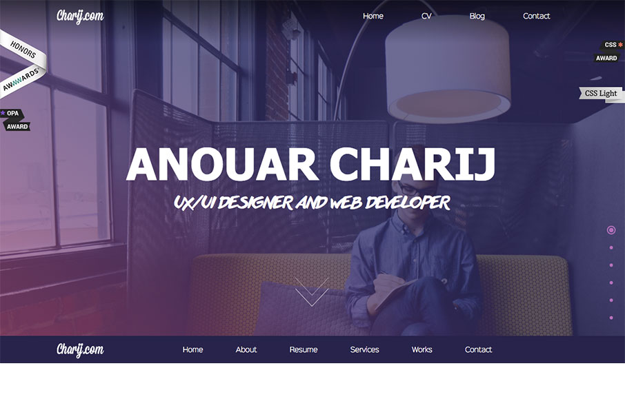
Pretty standard fare from a layout perspective but what i'd like to point out is the animation load for the timeline. That's pretty rad, I think it kind of makes the site for me. Good stuff.
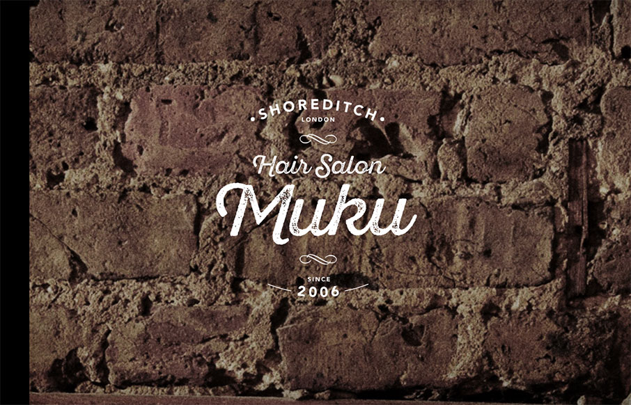
Hair Salon Muku
Love the graphic design, the logo and imagery. Really nice look and feel. Then the approach to the layout is solid as well, the nav isn't really necessary and that's smart from a user and mobile perspective. Then when you get to the hamburger there some good stuff...
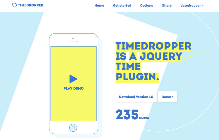
timedropper
Pretty rad looking plug in, but an equally rad looking web design to share. I dig the coloring, reminds me of blueprints and planning docs. Solid approach. From the Designer: timedropper is a jQuery UI timepicker. Manage time input fields in a standard form. Focus on...
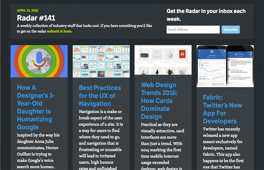
Radar #141
Each week, we do a round up of curated "stuff from the interwebs" that we call Radar. In this week's 141st Radar: How A Designer’s 3-Year-Old Daughter Is Humanizing Google Inspired by the way his daughter Anna Julia communicates, Hector Ouilhet is trying to make...
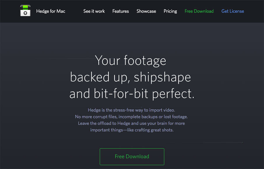
Hedge for Mac
Pretty nifty app/product website. I dig the animated piece that explains what the app does and how it works. Also nifty that it's largely a dark background site. Wanting to showcase Hedge's main features we chose to feature an animation combined with a a long form...
Jonathan Edmund-Jones
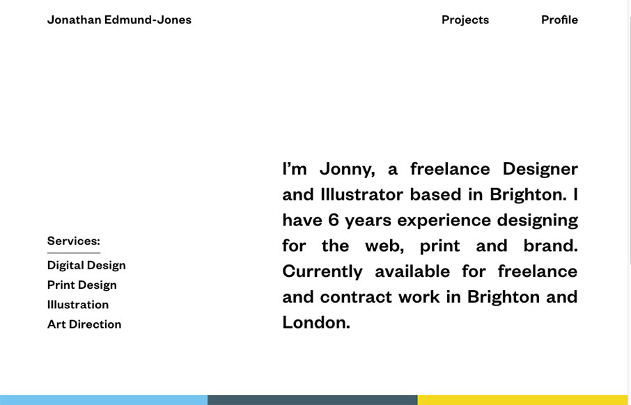
Pretty nifty and very different looking/feeling site design for Jonathan Edmund-Jones. I like the way the top half is black and white and all text with the second half mostly color and work samples. It's a nice reveal as you scroll down, creating a pretty nifty...
Heirlūm Design Co
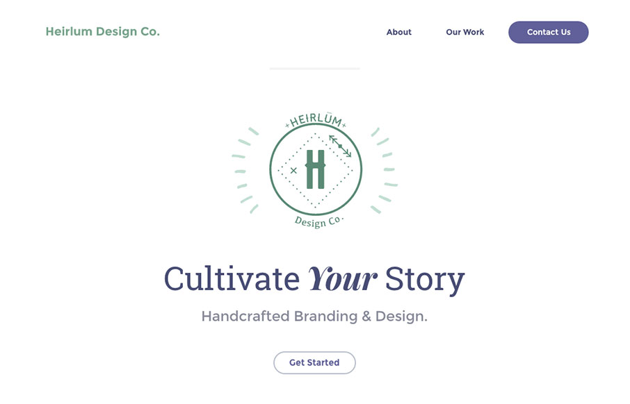
I really dig the look and feel of this website layout. It has just the right amount of detail work and minimal approach to make me take a closer look. The off kilter layout is very original feeling too. Great work. From the Designer: We wanted this website to be super...
SistaGirl
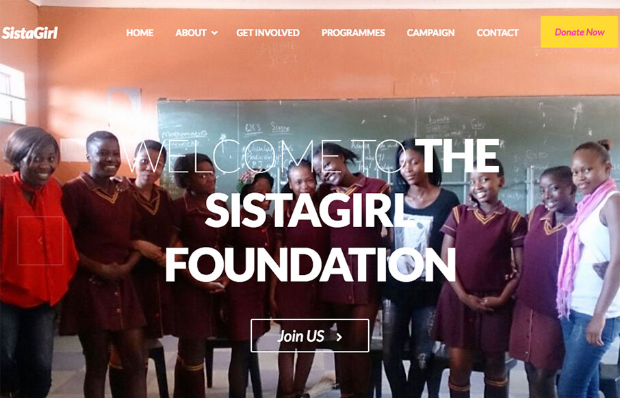
First thing I notice are the bold colors. I really like that, it's refreshing. I also like the discreet content block sections of this site, like the "how can I help" section under the hero image area and then the double blocks of stuff under that. The vibe is nice...
Game and Fish Facts
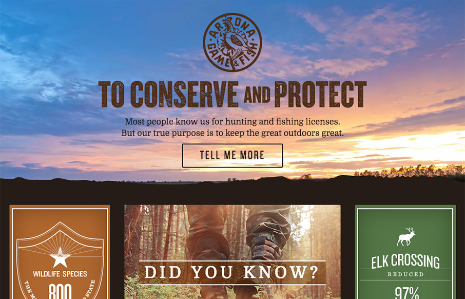
Super rad layout on the home page. I dig the block/grid approach here and the small interactions built into it are superb. The graphic application of the imagery and the video background in the hero area echo very well to the rest of the site design.
Made By Few ’16
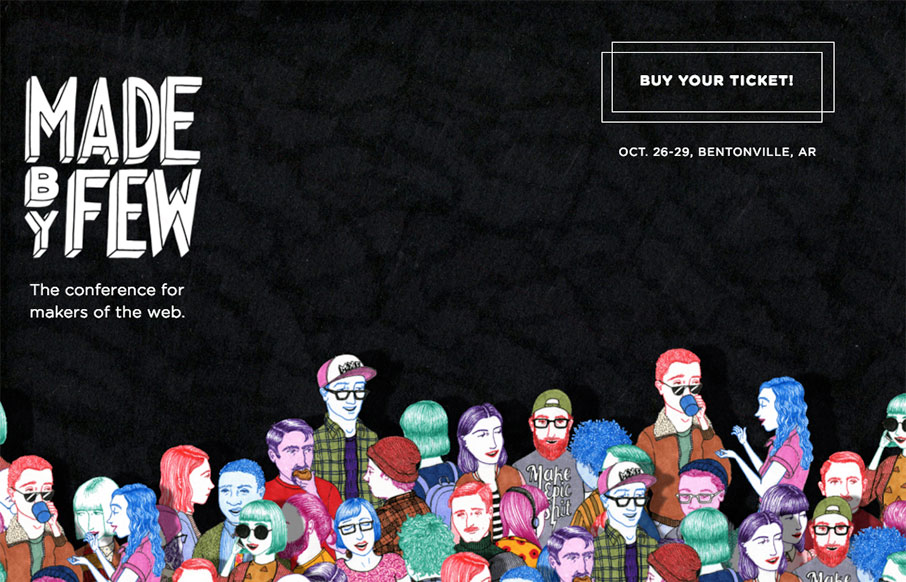
Just LUUURRRVVE the new Made By Few 2016 website. That little parallax effect is badass and the illustrations blow me away. Here at UMS we totally understand what a pile of work getting a website this cool is... Great job all around ya'll. This year's website design...
Elevated Interest
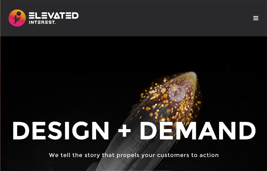
Love the use of the astronaut on the Elevated Interest site, out of San Diego. (NASA images are royalty-free folks - send your self to the moon and beyond!) And in a marketing-UX sense - I really like the red banner at the bottom of each page - CTA to Contact Us all...
Simon Foster Design
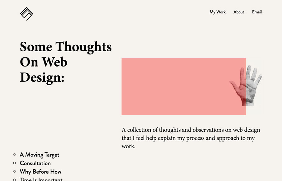
Simon Foster, who from his Twitter profile seems to live at "Your Mum's house" in the UK, has a cool, minimal portfolio site. Love the simple home page - and really like his side projects - especially the Take My Texture (sent it to my design team a few minutes ago -...
Agendrix
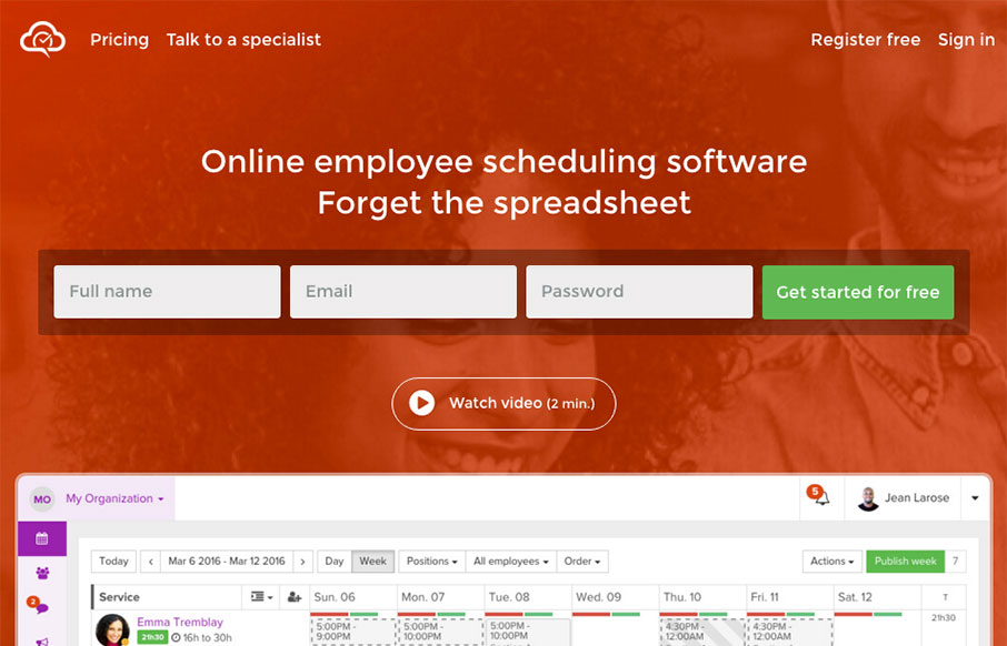
Well done product website for Agendrix. I dig the way the signup form has been designed the most about this site. The fields are lined up horizontally, giving it a sense of ease or speed to start the signup process. It also has the label "Get started for free" for the...
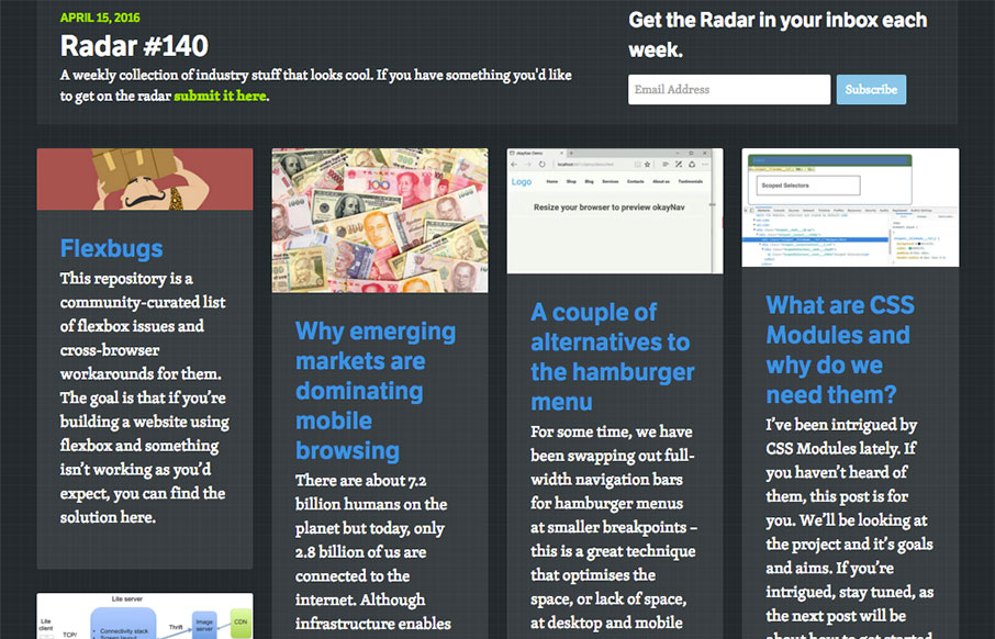
Radar #140
Each week, we do a round up of curated "stuff from the interwebs" that we call Radar. In this week's 140th Radar: Flexbugs This repository is a community-curated list of flexbox issues and cross-browser workarounds for them. The goal is that if you’re building a...
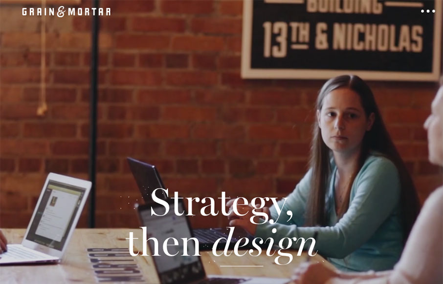
Grain & Mortar
Beautiful work. I love the feeling of richness this website exudes. From the photography to perfectly selected typefaces to match it's solid from top to bottom. I especially like the rhythm of the page, going from larger hero sections to smaller more open blocks of...
Emotit For President
Real real solid product website here. I dig the overall concept of the way the app is presented. Also the detail work of the slight parallax in the bigger hero views really makes the site sing. The app itself looks beautiful and so the website pulling in some of that...
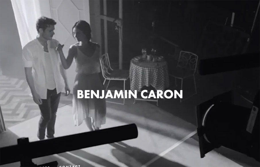
Ben Caron
Pretty strong layout to go around putting a pretty hefty amount of copy on the page as well as lots of elements and even video. Simple and straight-forward enough to make it all work seamlessly well together.
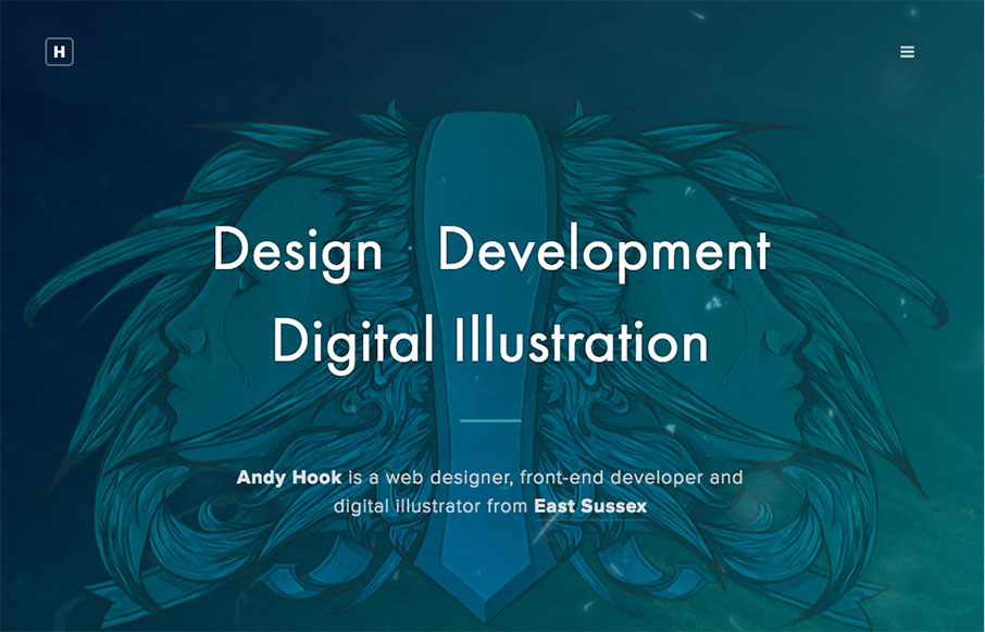
Andy Hook
Man - another great portfolio site from the UK for Andy Hook. Cool illustrations and great tone to the site. Nice. Submitted by: Andy Hook Twitter: @andy_hook Role: Designer & Developer Country: England
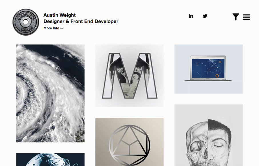
Austin Weight
I kind of love this portfolio site from Austin Weight out of London. Scroll over the work samples on the Home page - very cool effect that we haven't really seen much of yet. Also really like the work he did on "The Connection - Scales of Reality". And yes - the...
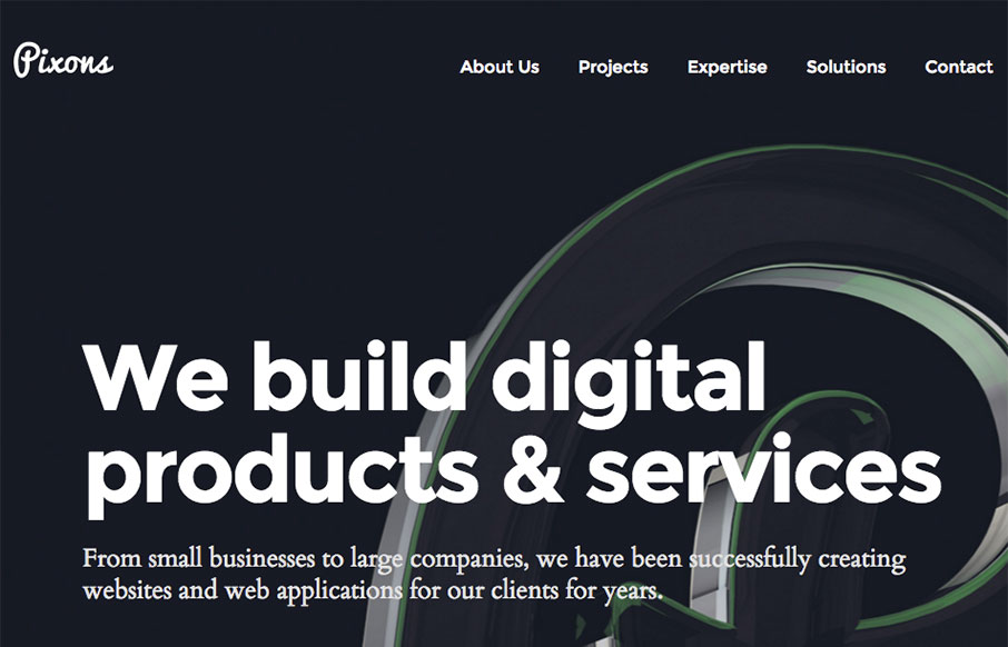
Pixons – Digital Agency
Good, clean site out of the Ukraine for Pixons. I like the block design and work on the Projects page especially - good balance with imagery and descriptive text. From the Designer: This is our company brand new website. We build digital products & services. From...
Evan Kosowski
Solid, simple 3 column based layout. Dark background is good as well. What I love most and what IMHO really sets this website off into orbit is the navigation design/interaction. I freaking LUUURRRVE this thing! A personal portfolio design is never an easy task. 5...
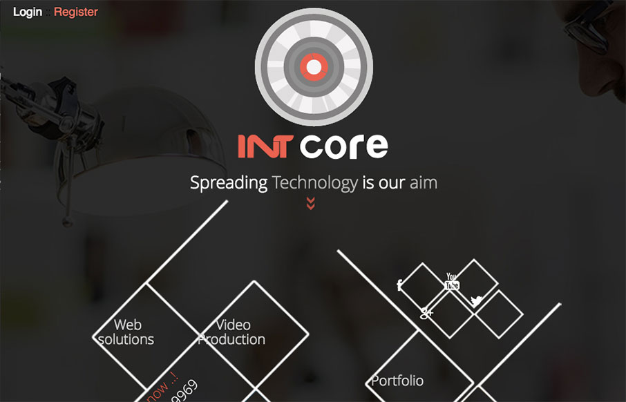
INTcore
Pretty straightforward design. It isn't perfect but it does have several cool details that are worth reviewing. From the Designer: Intcore is one of the Egyptian leading companies in software development and media production that working hard to meet all technology...

