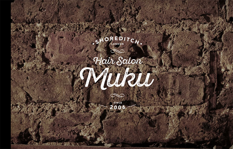
Love the graphic design, the logo and imagery. Really nice look and feel. Then the approach to the layout is solid as well, the nav isn’t really necessary and that’s smart from a user and mobile perspective. Then when you get to the hamburger there some good stuff there for use too.
From the Designer:
This is a responsive design with a theme of vintage & classic style.
Tried to let the website’s usability and brand image.
CSS animation is also good such as menu button or mail button.
Submitted by: Yut Nakamura
Twitter: @yuto3
Role: Designer
Country: Japan


0 Comments