Jonathan Edmund-Jones

https://www.jonnyej.co.uk/

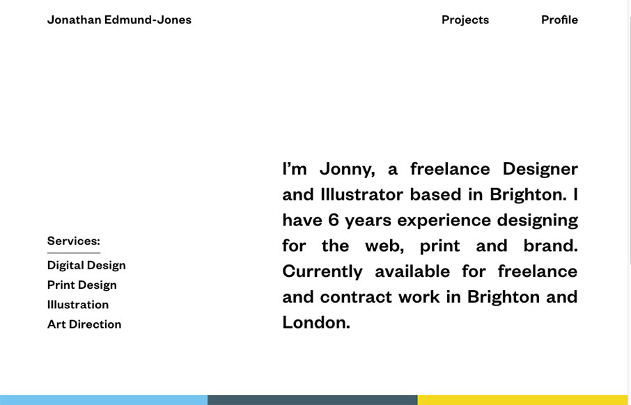
Pretty nifty and very different looking/feeling site design for Jonathan Edmund-Jones. I like the way the top half is black and white and all text with the second half mostly color and work samples. It’s a nice reveal as you scroll down, creating a pretty nifty “moment” in the website.

From the Designer:

Online portfolio of Brighton based Designer, Jonathan Edmund-Jones.

Submitted by: Jonathan Edmund-Jones
Twitter: @jonnyej
Role: Designer
Country: United Kingdom

0 Comments

Submit a Comment

Your email address will not be published. Required fields are marked *

News & Articles

Sign-Up: Enhancing Conversions through good UX

Sign-Up: Enhancing Conversions through good UX

Optimize your website’s sign-up process by focusing on clarity, ease, and user mindset. Clearly explain the purpose, benefits, and steps, and use social proof to build trust and drive conversions.

The Essential Guide to Getting Started on Freelance Writing

The Essential Guide to Getting Started on Freelance Writing

Explore the lucrative and fulfilling world of freelance writing with our essential guide. Learn about specialties like blogging, social media, article, and technical writing. Build a portfolio, find work, set up your business, and discover the potential earnings. Embrace the freedom of working from home and follow tips for success in your dream career.