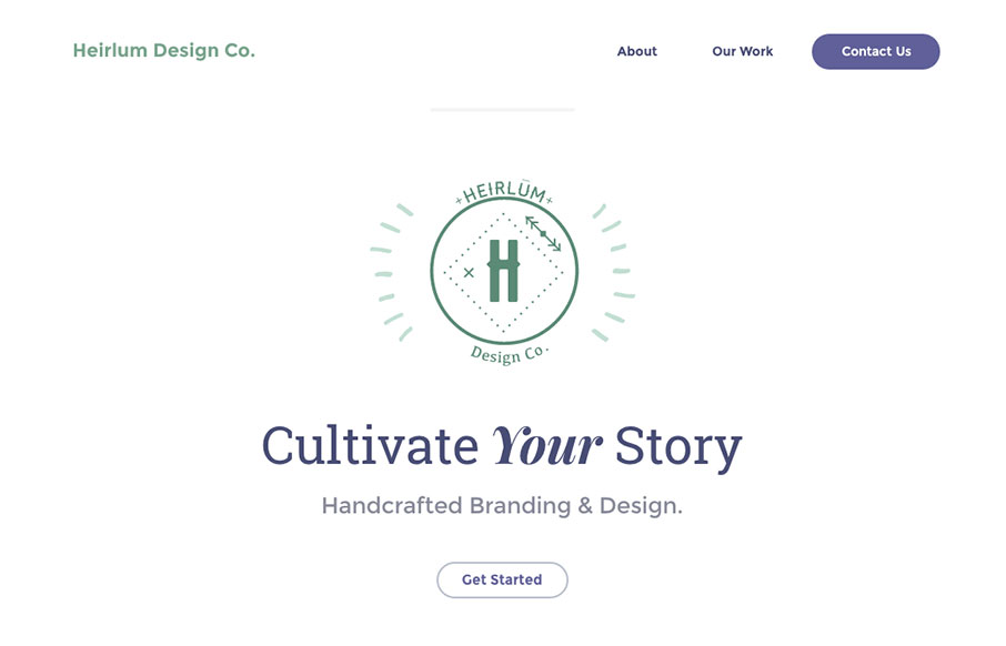
I really dig the look and feel of this website layout. It has just the right amount of detail work and minimal approach to make me take a closer look. The off kilter layout is very original feeling too. Great work.
From the Designer:
We wanted this website to be super clean, while also inviting. The color scheme is not oft used, as it’s usually considered difficult to design using mossy green and a deep plum color. That’s what I really enjoyed about this project. It’s always fun to create functional designs with unexpected elements.
Submitted by: Karmon French
Twitter: @heirlumco
Role: Designer
Country: United States


0 Comments