I'm digging the Charlie Rose website. There is a lot of pretty solid UX to study here. From the grid layout and display of episodes to the search form. Tip top design here.
An Interesting Day
Pretty crazy illustrations are the core of this website's awesomeness. Now, normally, we wouldn't post a splash or coming soon page but this one is just so weird and exciting looking. Lurve this kind of thing.
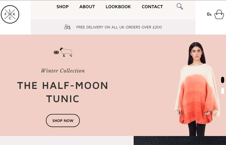
Flock Knitwear
Really cool grid work here. I love the blocky line based layout a lot on this site for Flock Knitwear. The colors some of the subtle off-set-ness. Beautifully done.
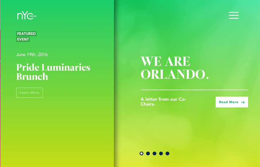
NYC Pride
Really unique website experience here for the NYC Pride site. I really really love how it's a wholly different experience for desktop vs. mobile. Literally different styles of interaction. I dig the monochromatic color palette a great deal too. The overlay nav design...
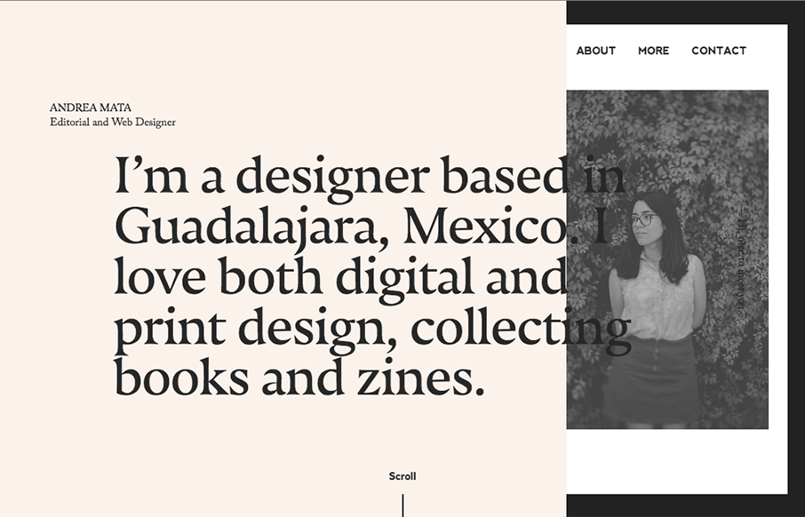
Andrea Mata
Very cool asymetrical layout for Andrea's portfolio site. I love the limited color palette and the off kilter typography. Not a huge fan of the mobile size/design, but overall love the look and feel.
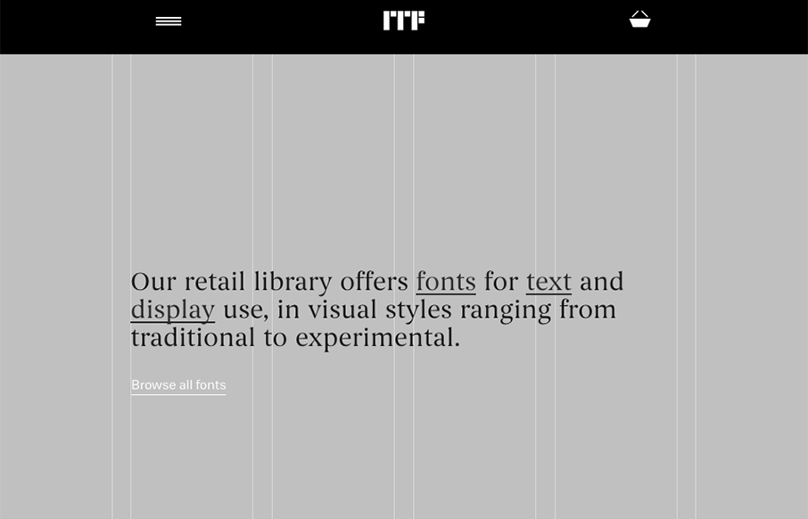
Indian Type Foundry
Super cool, at first glance, standard looking website design. As you scroll around and start checking things out, you get hit with some pretty cool little interactions. Like the mouse overs and then those fly-out nav items on the cart and login. Super cool way to...
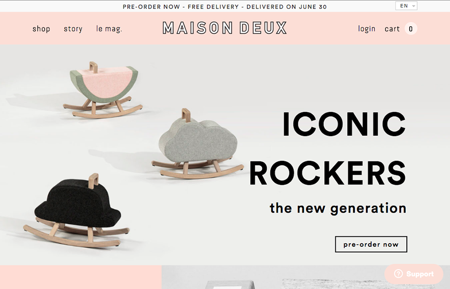
Maison Deux
I like the grid-ness of this layout. That, paired with the simple thick line details around the logo and then elsewhere to help pull it all together visually. It's subtle but works really well and obviously. Good work.
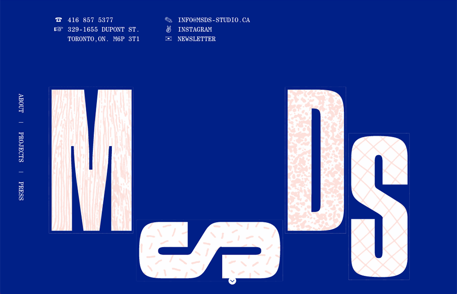
MSDS Studio
Pretty cool, non-standard typography here. Mix that in with that neat thing they're doing on the site, where when you scroll down and back up it changes the site considerably. Pretty cool and unique work.
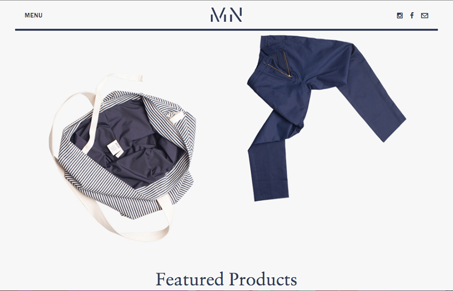
MN Uniform
Pretty cool angle on some now-standard design patterns. I love how the header has that line and everything perfectly scroll-folds up into it. Then the menu is cool, all the lines and blockiness of it make it feel really fresh to me.
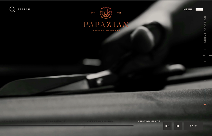
Papazian
Beautifully done website. I love the subtle and fragile looking lines and the way the photography supports it. The News & Updates section of the layout on the home page is wonderful as you get down to it. Really nice website here.
Jolien Roos
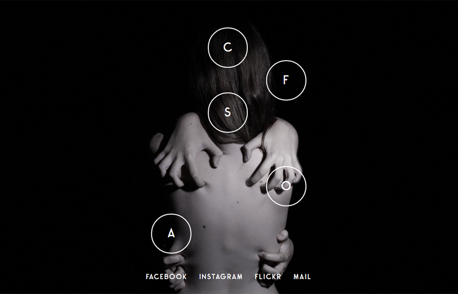
Love this photo portfolio site for Jolien Roos out of Belgium - looks to by @studiosiebe. Very unique intro/navigation, five circles that turn into your "hamburger" as you move through the site. For photography sites - the images sell it - and the full width / full...
Ugmonk
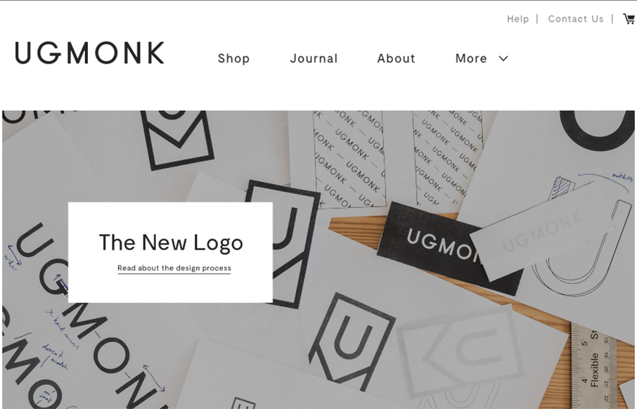
So our friend Jeff Sheldon at Ugmonk has a new site and logo. (Jeff spoke a ConvergeSE a couple of years ago) Very cool to read where the changes in business and design come from as your company grows, and grows up. Great article here from Jeff about all of it. Here's...
ARA Modular Phone
This website has a nice clean layout that displays its product quite well while replicating the design of the phone into the layout of the site.
Colm McCarthy
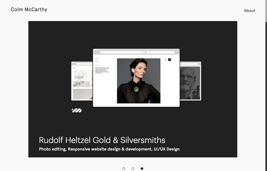
Nice, minimal portfolio site from Colm McCarthy out of Ireland. Like the use of the text over the main image on the work detail pages - interesting to see how it lands on different viewports.
Graphic Design Festival
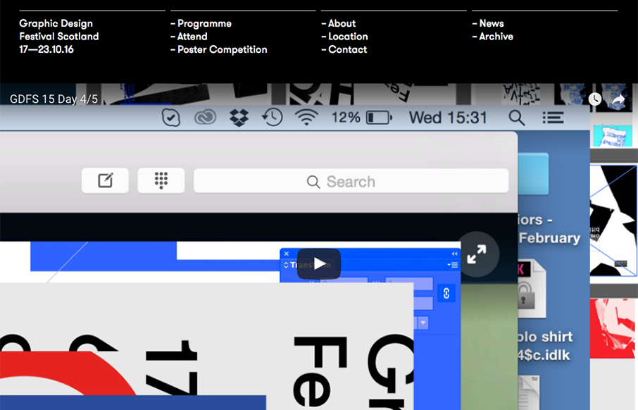
Love the smart use of the gridlines for the Graphic Design Festival in Glasgow, Scotland. Simple and clean - good stuff. From the Designer: Graphic Design Festival Scotland is an international organisation promoting creativity, innovation, collaboration and...
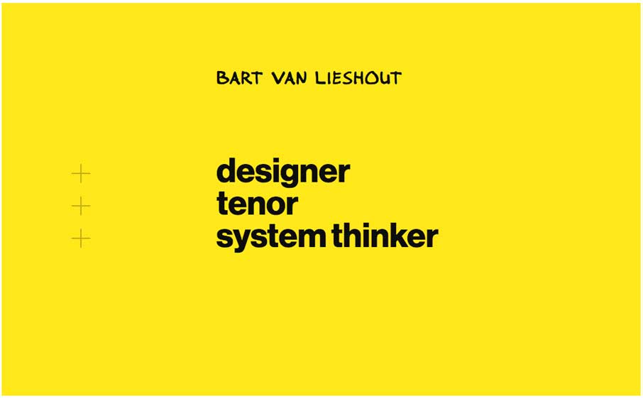
Bart van Lieshout
Bart van Lieshout is a designer and singer. And he occasionally writes blog post on design and futuristic topics. His personal website has a clean information architecture and simple interactions. It was designed to offer a pleasant reading experience on all platforms...
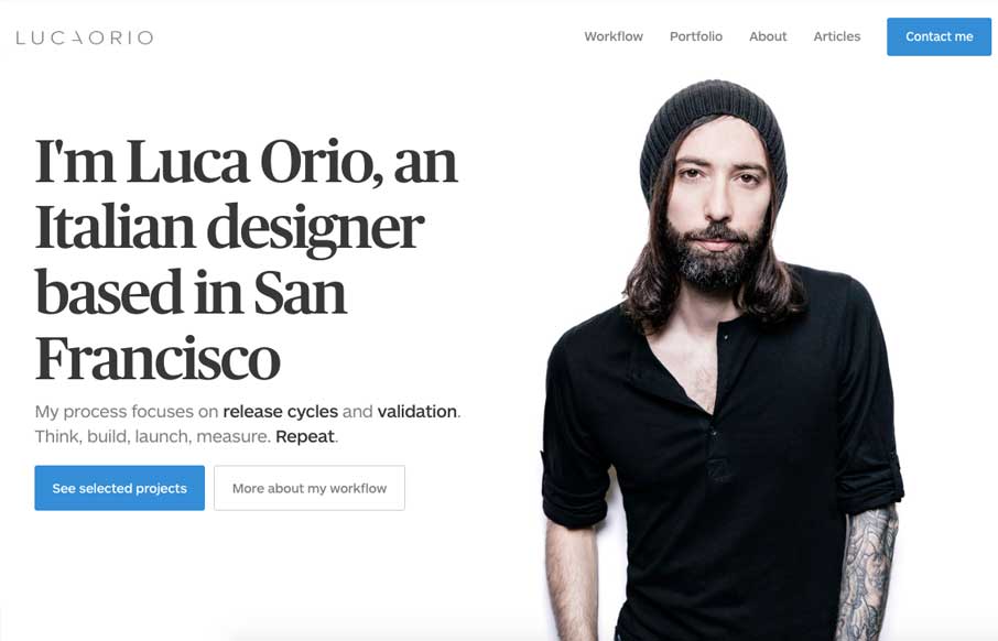
Luca Orio
Pretty slick and straight forward portfolio site for Luca Orio. Style and class go a long way and this designer has those in large amounts. I love this site. From the Designer: Luca Orio is an Italian designer based in San Francisco. His process focuses on release...
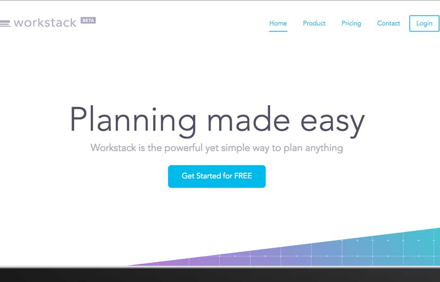
Workstack
Lots of standard layout stuff for this web app product, but it's just. I don't know, nicer. I love the oversized image for the view of the product and the overall vibe is just nice. Clean simple design that focuses on showcasing the product by avoiding any unnecessary...
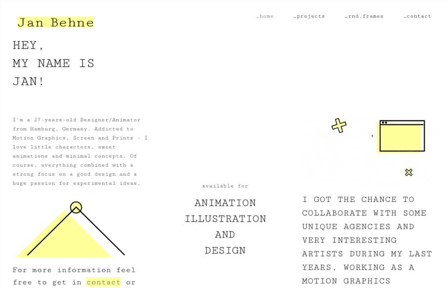
Jan Behne
Pretty nifty change of direction for the Jan Behne portfolio site. I dig it, I love the way the three columns are used. Very print design like but totally digital in it's content and deliver. Smart work. Hey, I'm a Graphic Designer and Animator from Hamburg, Germany....
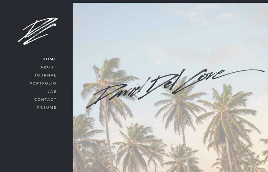
Daniel Del Core
Really simple website design, we've seen stuff like this before, but I just dig this one. I love the 80's inspired script for the logo and the overall simplicity that the work is presented.
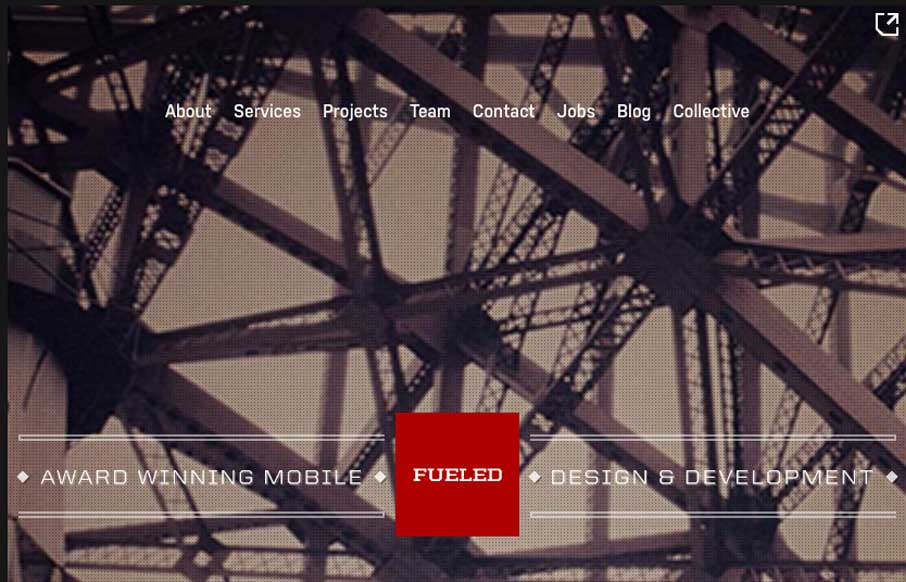
Fueled
Pretty cool looking website for Fueled. I dig the background image and vibe it gives off. I really dig the way they show their work on the home page when you scroll, with the fixed position iPhone outline. The page transitions and sub pages are superb as well. Lots of...
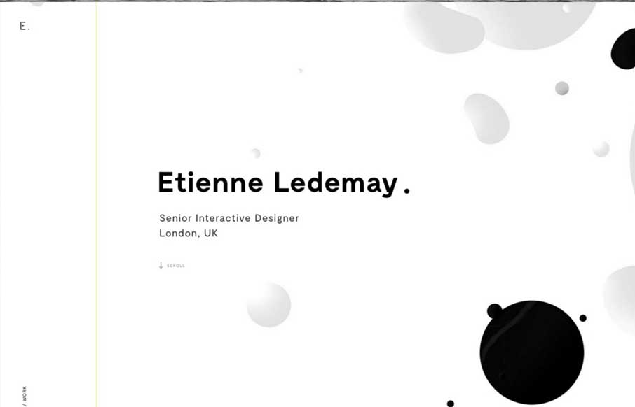
Etienne Ledemay
Gotta love great graphic design when you see it. Etienne Ledemay delivers. I love the simplicity that overlays the complexity of the typography and scrolling interactions here. That line also delivers you straight to the bottom of the site. Well done!
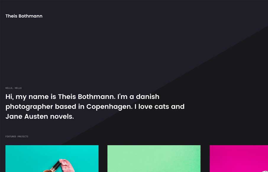
Theis Bothmann
Simple portfolio site for Copenhagen-based photographer Theis Bothmann. Subtle parallax effects and smooth page transitions. Submitted by: Frederik Christensen Twitter: @frede Role: Designer Country: Denmark
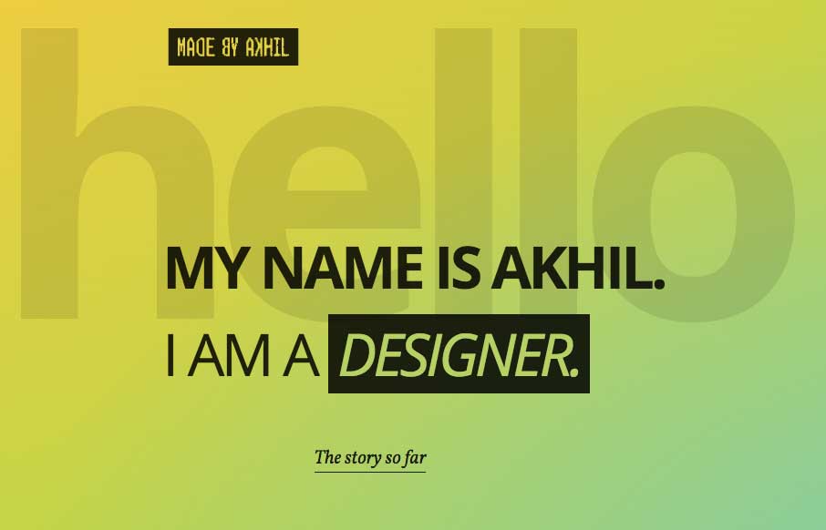
Made by Akhil
Pretty cool starting section that leads to a more standard feeling layout. I dig this, this transition and the sub-sections too. They're very intuitive with the arrows and work smooth as you scroll. The footer section is also solid information design wise too. The...
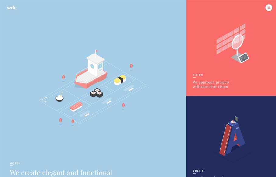
Waaark
Holy moly, the Waaark site is brilliantly designed, visually. I love all the transitions and detail work with the illustrations. It's very very unique and you get the vibe of a high end solutions firm here. That said, the transitions in some ways leave me feeling like...
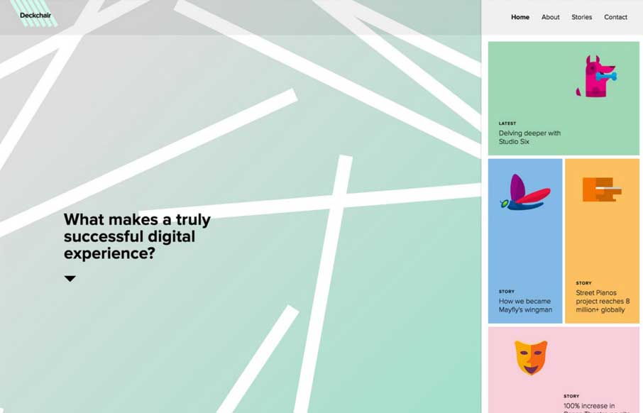
Deckchair
Oh my god. I love the Deckchair site so much. The stuff on the right hand side, the fixed nature of that plus the animated background really make me want to dig into how this thing was put together. The Material Design influence here is obvious too. Love. It. So. Much.
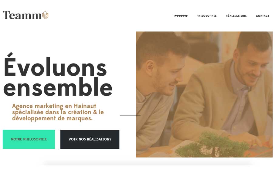
Teamm
Pretty cool, clean and clearly designed website for Teamm. I like the staright forward-ness of the site design but then some neat typography mixed in for good measure. Simple usually wins, this site is no exception.
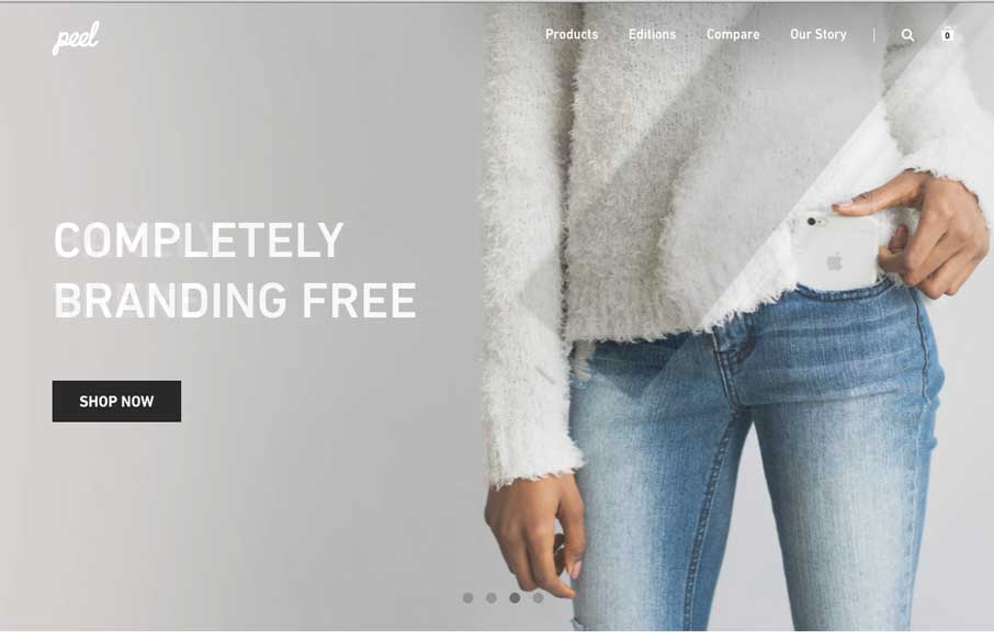
Peel
Pretty sleek and elegant looking e-commerce site for Peel cases here. I dig the oversized images and grid layout. Solid stuff. Submitted by: @digit Twitter: @digit Role: Designer Country: USA
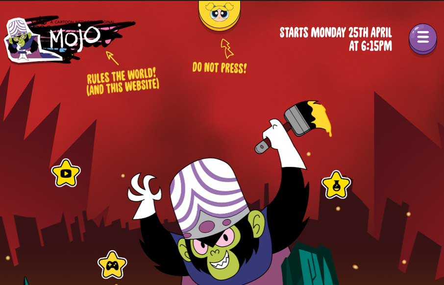
The Powerpuff Girls
The new Powerpuff Girls website, running alongside the global TV series launch, starts with your average day in the City of Townsville and ends with the girls battling their horrible, mean archenemy Mojo Jojo as he tries desperately to take over the site! Submitted...
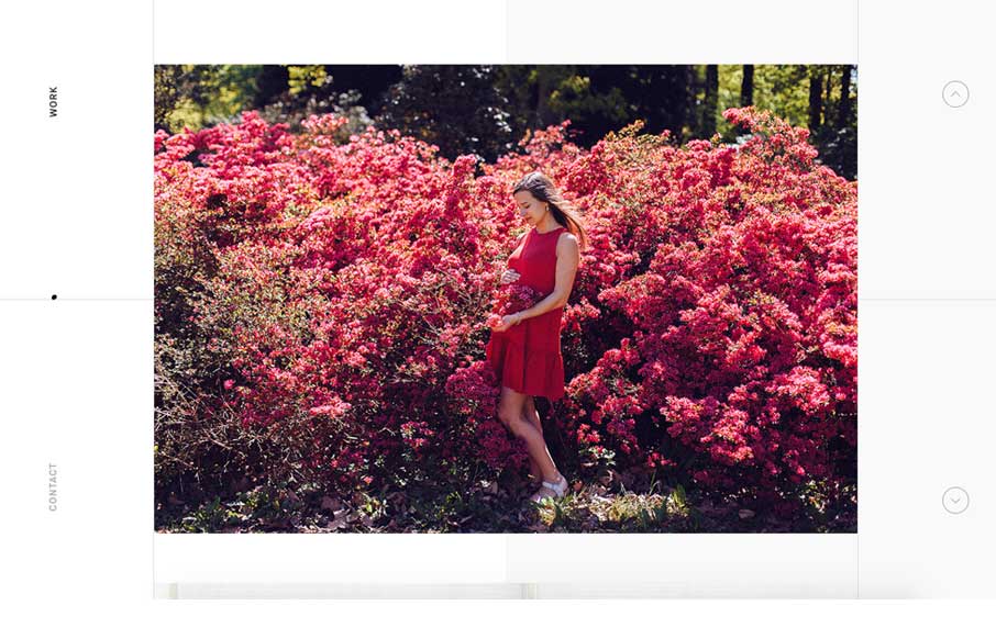
I AM LIZ
Pretty rad looking portfolio site. It's simple, just show the work. This site does that well. It's also unique feeling which is something you'd also look for in a portfolio. Cool. I also really love the small-screen width or "responsive" version of this site too....


