Web Design Inspiration Curated
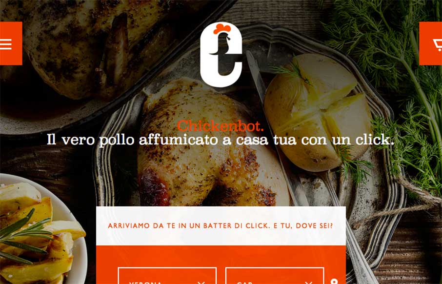
Chickenbot
Note to self - don't do website reviews on food sites three hours before lunch - especially when it looks as appealing as the Chickenbot website out of Italy... yes, Chickenbot. Great, savory images and pretty decent ordering functionality for delivery... they just...
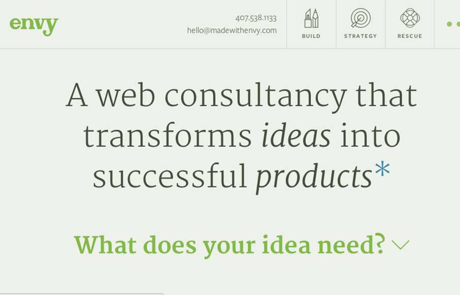
Envy Labs
The new Envy Labs site is really good stuff. There's a good balance of content and clean tidy layout. I love the little interactions that are built into the design like the "what does your idea need?" piece and the way the navigation has multiple states because you...
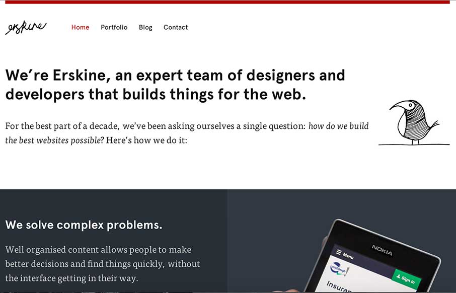
Erskine Design
Sometimes you just need a design that simply states who you are, and is devoid of bells and whistles that may complicate your message. Erskine Design out of Dallas, TX, has done that - clear layout, decent font combinations (serif, sans, and script) - a little...
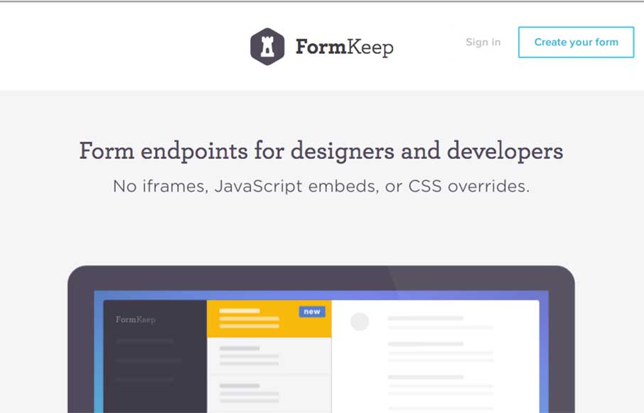
Form Keep
I would like to hear from the designers to be sure, but it looks like they may have used SVG and CSS animation in tandem? Either way, the good flat animation gives you a sense of Form Keep's usefulness - like the no iframe idea too.
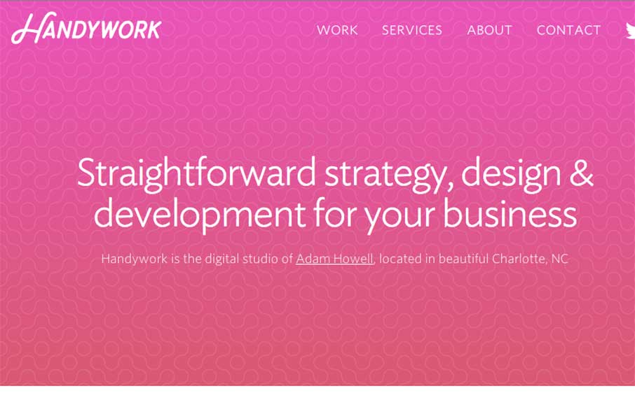
Handywork
Nice SVG animations and flat illustrations that become the focal points of a very clean site. Each page in this portfolio site from Adam Howell our of Charlotte, NC, has some different functionality, still keeping within the same theme, showing off some good work.
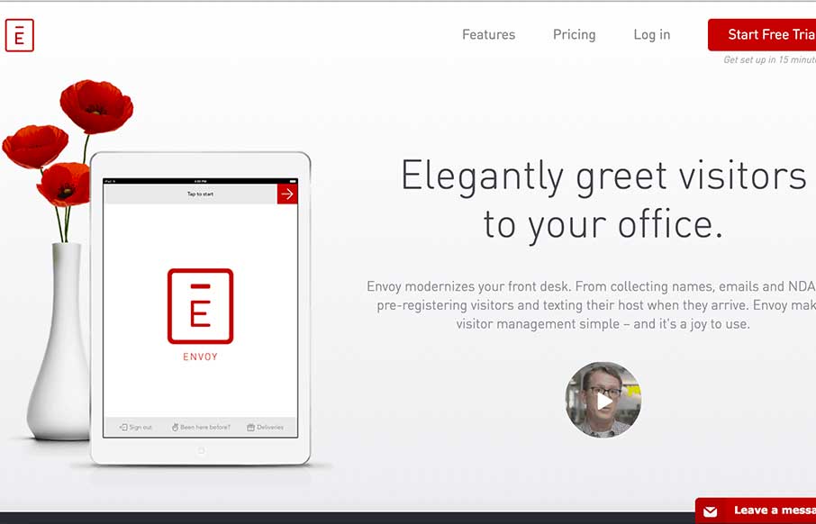
Envoy
Really enjoyed the video explaining Envoy - seems like a good, versatile app / system for checking in visitors to your company. The site itself has good on-scrolling animations that give you a good sense of how the actual app performs, while also describing the...
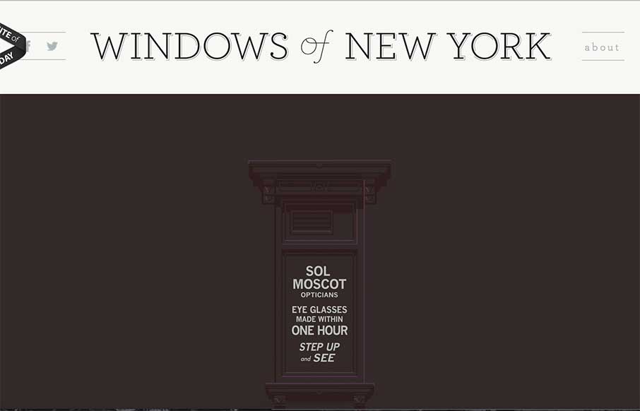
Windows of New York
Interesting way to start your week - this site is an outlet of an obsession for Jose Guizar out of New York. Windows of New York is a cool project, clean site, and just a little fun to start the day.
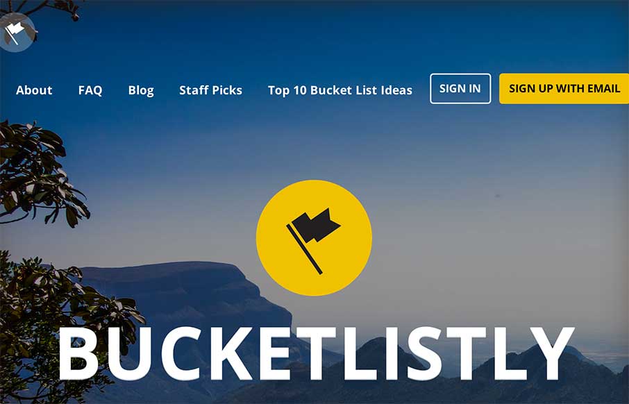
Bucketlistly
Dude... where was this site when my wife and I were living and traveling in Australia, South East Asia, and Europe - sans kids? This is awesome visual representation of peoples "bucket lists" - from skydiving to climbing Mount Kinabalu in Malaysia. Great sweeping...
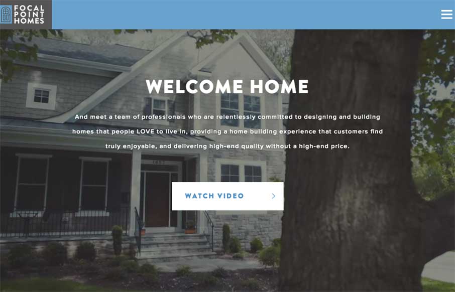
Focal Point Homes
Who knew that you can make a real estate website that looks good and is functional (most of the builders and agents in our area have the worst websites ever... really.. we just bought a new home a few months ago, so I've seen them all) Focal Point Homes out of McLean,...
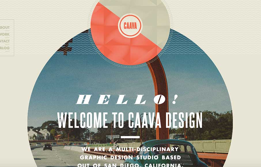
Caava Design
Great single page agency site from Caava Design out of San Diego, California. While I wish it were responsive, I love the layout and coloring - an neat trick with the arrow coming down on scroll to highlight the Featured Work area.
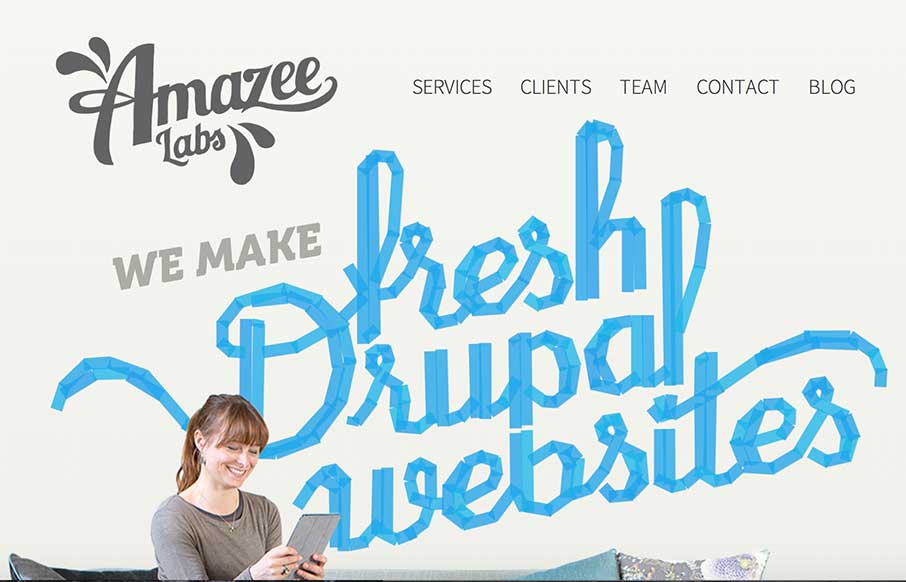
Amazee Labs
Great looking site from Amazee Labs out of Switzerland. Like how they carried the tape pieces theme through out the site - all the way to making new social media icons in the same theme (from their team detail pages). Plus - I accidentally found their 404 page -...
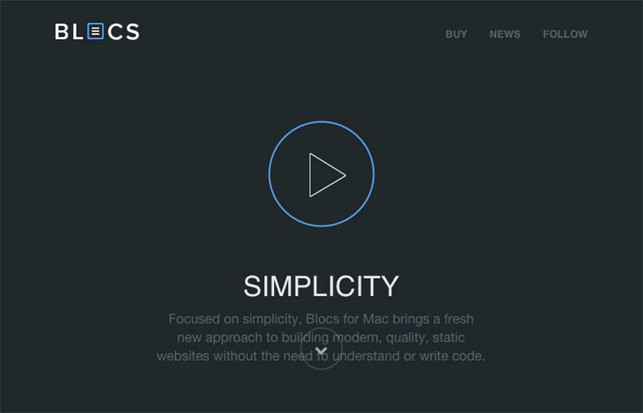
Blocs
If you've read any of my reviews - then you'll probably notice that the word "simple" comes up about every other review. Simple is a term of endearment in my world, because for me, it means cutting to the core / heart / bones - and getting the the job done. So when...
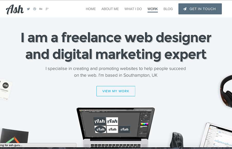
Ash Stallard-Phillips
Solid looking portfolio site from Ash Stallard-Phillips out of Southampton, UK. Has cool flat illustrations and fly-ins that give the light site some depth... (yeah, I just said the flat illustrations give depth...)
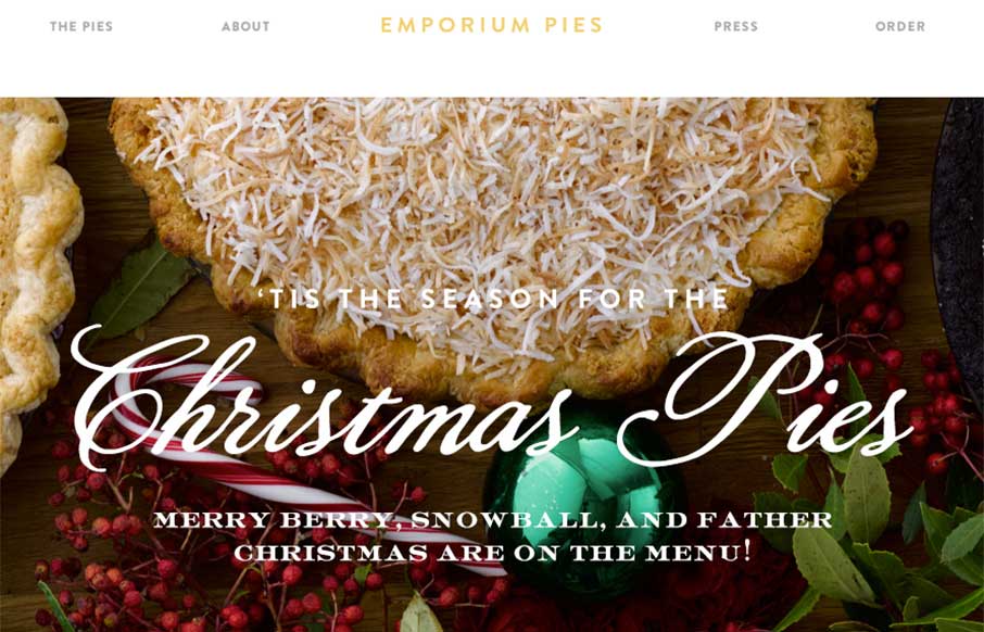
Emporium Pies
My co-worker and I have been staring at this site for a few minutes going "mmmmm.... pie" as if we were two Slingblades sitting in a hipster office staring at pies... I know - sad visual... but the Emporium Pies site is a very good visual. "What do you do? - we make 7...
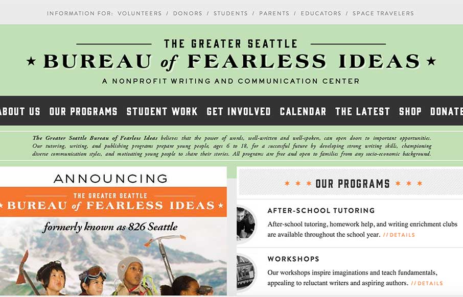
Bureau of Fearless Ideas
I'm sure every generation says this about the ones coming behind them - but kids today don't seem to have the communication and writing skills of their future predecessors (see what I did there?). I'm saying this as a father of three children from the ages of 4-9. So...
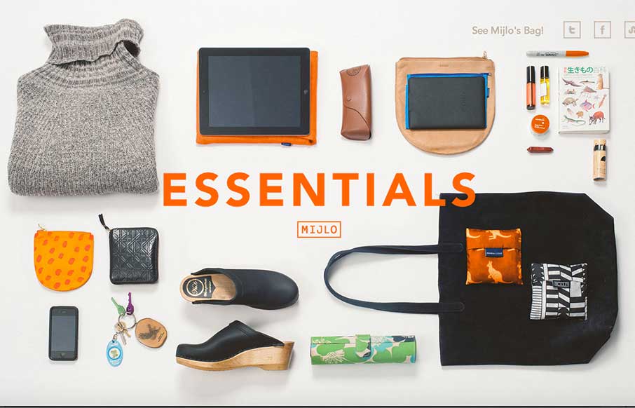
MIJLO
Something a little different - this is a splash site from Mijlo.com, based on their Kickstarter campaign for a sustainable backpack. MIJLO reached out to a select group of global creatives to curate a collection of essential items - with one caveat - their style had...
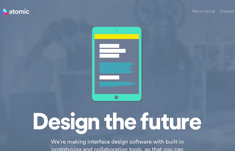
Atomic.io
Over the years, we've used what seems to be all manner of tools to collaborate between designers, developers, and the pesky client. Atomic.io (from the video) looks to have some firm solutions, and some features that you just go - yep, need em - didn't know I needed...
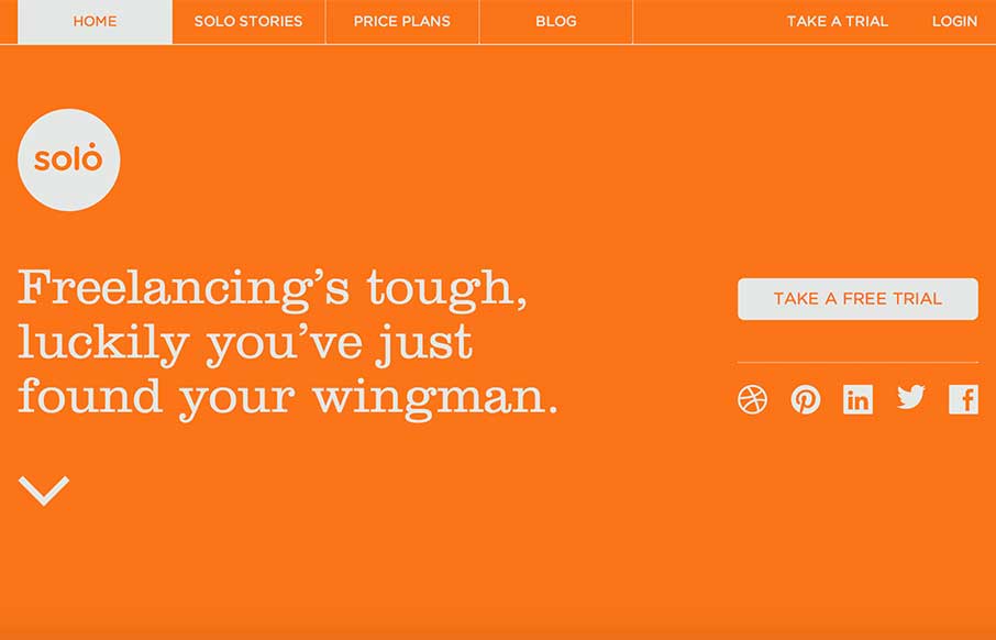
Solo
Great flat site with really great illustrations through out. Make sure you also check out their blog: blog.thrivesolo.com - the artwork alone is worth it.
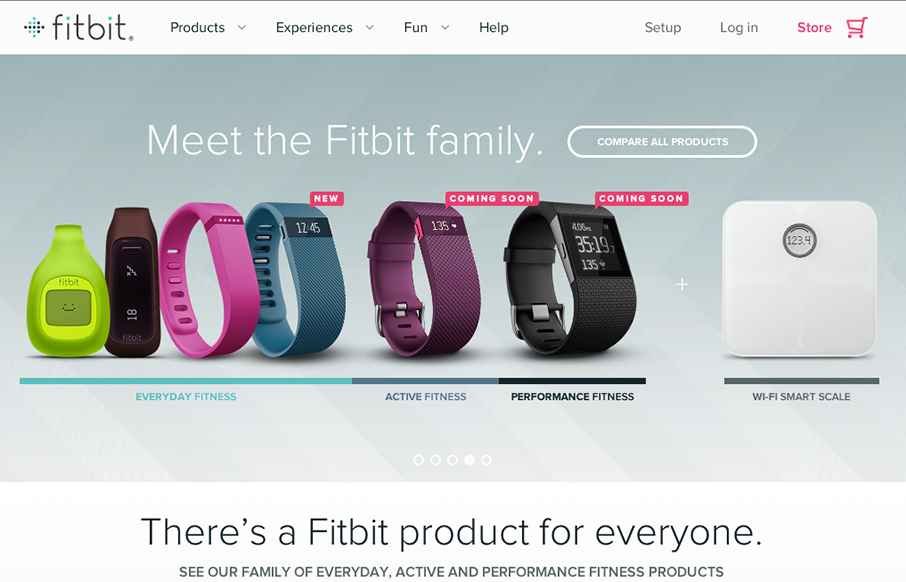
fitbit
So... the home page for fitbit really doesn't do the rest of the site justice. I actually held off on this review because of my first glance at the home page. Head to the big drop-down menu, or click on these links: www.fitbit.com/surge, www.fitbit.com/flex,...
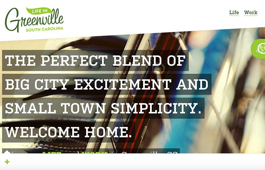
Life in Greenville SC
Super nice site design for "Life in Greenville SC". I believe this is a community driven/created website which is awesome. So much detailed design work here in this site, just go spend some time with it and I think you'll agree.
EMAIL NEWSLETTER
News & Articles
BizCraft Episode 6 – All about pricing
 Episode 6 of the BizCraft podcast with Carl Smith and Gene Crawford. Recorded live on August 24th. This episode is all about pricing your services.
Draft Episode 03: Art Direction
 Draft is a podcast about the craft of designing for the web, in this episode we discuss the role of the Art Director. Featuring Giovanni DiFeterici and Gene Crawford.
Pushing the Creative Boundaries with Canvas
 Ian James Cox recently redesigned his website and did some interesting things with Canvas, in this article he explains his approach and how he successfully worked it into his plans.

HARD WORK. CLEAN FUEL. NO EXCUSES
Use “WARRIOR2023″ for 10% off.