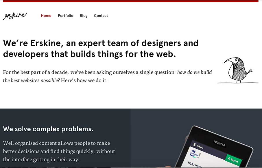
Sometimes you just need a design that simply states who you are, and is devoid of bells and whistles that may complicate your message. Erskine Design out of Dallas, TX, has done that – clear layout, decent font combinations (serif, sans, and script) – a little illustration – a little portfolio – and voila – good website. I also like how they address accessibility (see footer) – which probably leads to the design decisions above.
Glassmorphism: The Transparent Design Trend That Refuses to Fade
Glassmorphism brings transparency, depth, and light back into modern UI. Learn how this “frosted glass” design trend enhances hierarchy, focus, and atmosphere, plus how to implement it in CSS responsibly.


0 Comments