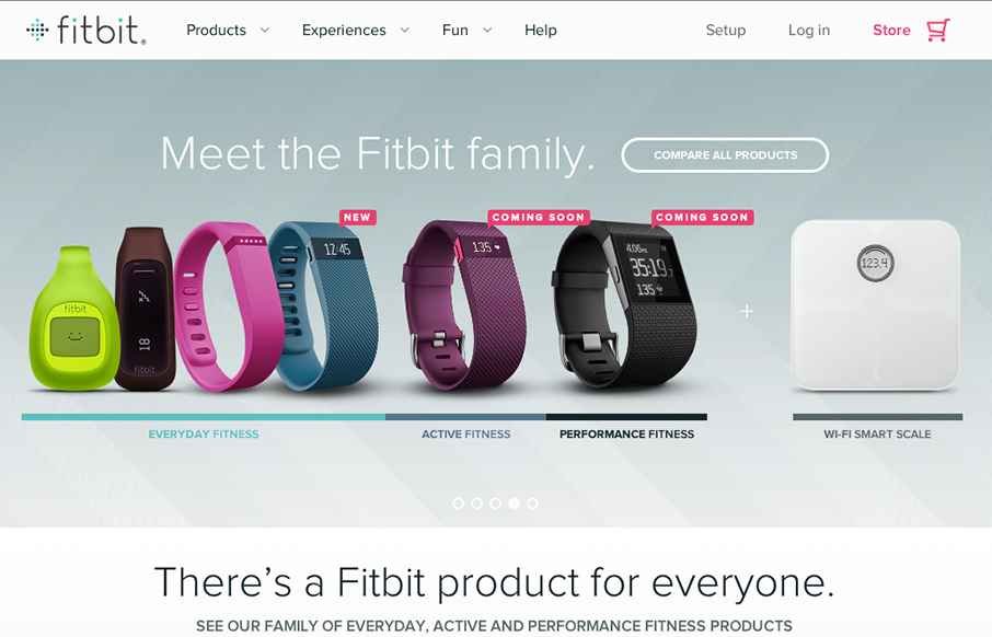
So… the home page for fitbit really doesn’t do the rest of the site justice. I actually held off on this review because of my first glance at the home page. Head to the big drop-down menu, or click on these links: www.fitbit.com/surge, www.fitbit.com/flex, www.fitbit.com/whyfitbit to see why I really like this site.
Glassmorphism: The Transparent Design Trend That Refuses to Fade
Glassmorphism brings transparency, depth, and light back into modern UI. Learn how this “frosted glass” design trend enhances hierarchy, focus, and atmosphere, plus how to implement it in CSS responsibly.


0 Comments