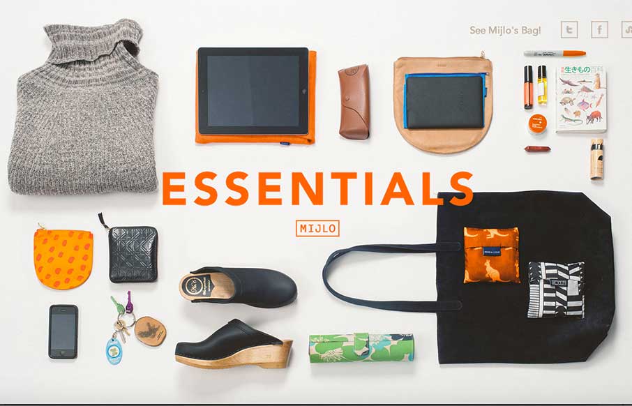
Something a little different – this is a splash site from Mijlo.com, based on their Kickstarter campaign for a sustainable backpack. MIJLO reached out to a select group of global creatives to curate a collection of essential items – with one caveat – their style had to be as timeless as the bag they packed it in. This one page site is the culmination of that. Not usually a fan of infinite scroll or modals – but they work and make sense for this site because of the type of content (along with the cool transitions for each designer pack).
Glassmorphism: The Transparent Design Trend That Refuses to Fade
Glassmorphism brings transparency, depth, and light back into modern UI. Learn how this “frosted glass” design trend enhances hierarchy, focus, and atmosphere, plus how to implement it in CSS responsibly.


Nice branded portfolio in the site cool !