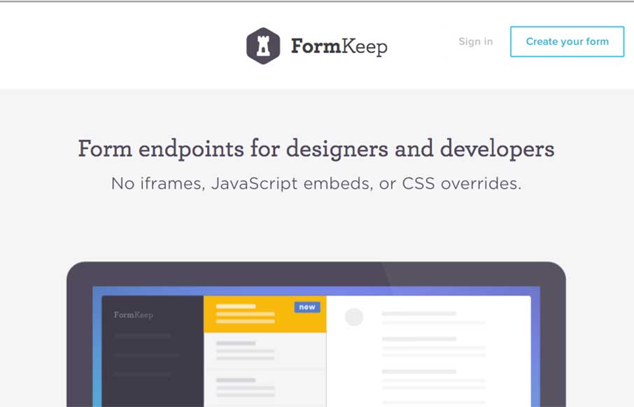
I would like to hear from the designers to be sure, but it looks like they may have used SVG and CSS animation in tandem? Either way, the good flat animation gives you a sense of Form Keep’s usefulness – like the no iframe idea too.
Glassmorphism: The Transparent Design Trend That Refuses to Fade
Glassmorphism brings transparency, depth, and light back into modern UI. Learn how this “frosted glass” design trend enhances hierarchy, focus, and atmosphere, plus how to implement it in CSS responsibly.


0 Comments