Blocs

http://www.blocsapp.com/

If you’ve read any of my reviews – then you’ll probably notice that the word “simple” comes up about every other review. Simple is a term of endearment in my world, because for me, it means cutting to the core / heart / bones – and getting the the job done.

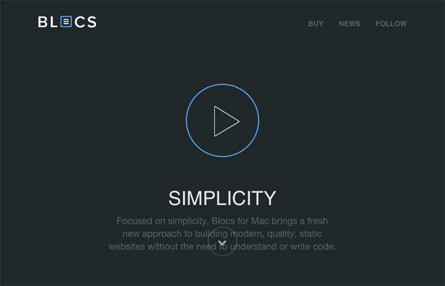
So when the Blocs App site starts with the word “Simplicity” – I’m already a fan.

The concept of building simple, clean websites without code, and it’s implications on our industry is another post altogether (which I wrote already, and then remembered this is a gallery review).

Basically – I like this site. The design itself is consistent with the software’s philosophy of “simple”. Good icons, quick descriptions, good spacing and layout – they all sell the app well. The video is put together well also.

1 Comment

  1. Patricia Johnson

    love to see logo & logical short presentation middle in the site.

    Reply

Submit a Comment

Your email address will not be published. Required fields are marked *

News & Articles

Sign-Up: Enhancing Conversions through good UX

Sign-Up: Enhancing Conversions through good UX

Optimize your website’s sign-up process by focusing on clarity, ease, and user mindset. Clearly explain the purpose, benefits, and steps, and use social proof to build trust and drive conversions.

The Essential Guide to Getting Started on Freelance Writing

The Essential Guide to Getting Started on Freelance Writing

Explore the lucrative and fulfilling world of freelance writing with our essential guide. Learn about specialties like blogging, social media, article, and technical writing. Build a portfolio, find work, set up your business, and discover the potential earnings. Embrace the freedom of working from home and follow tips for success in your dream career.