Web Design Inspiration Curated
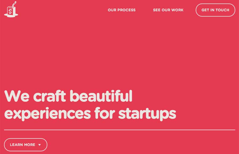
Simple As Milk
You know I like simple websites - Simple as Milk, an agency out of Eastbourne, UK keeps to their name - which is always good! I want to say they have made some slight changes since I first looked at their site - changing up the home page coloring and some messaging...
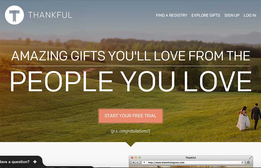
Thankful Registry
Good way to end the week. Since you may be in "giving" mode right now, Thankful Registry - a gift registry site that doesn't feel clunky, and makes the experience for the gift giver a little easier. Nice large images on the home page and the registries - good...
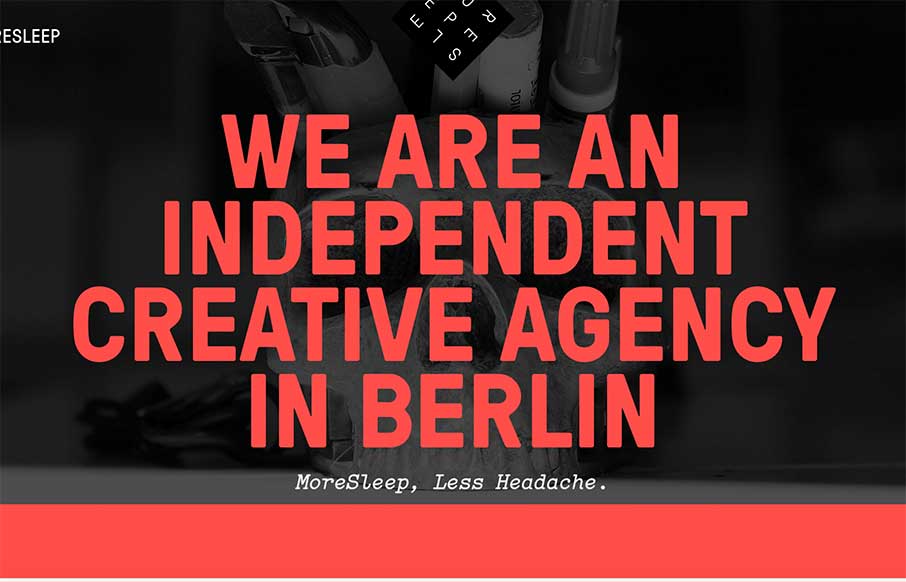
MoreSleep
"More Sleep, Less Headache" - we should all be so lucky! The MoreSleep web design agency out of Berlin, Germany is promising that. Based on their website and portfolio of work, I would have to say "das ist richtig". Like the off screen menu actually produces a...
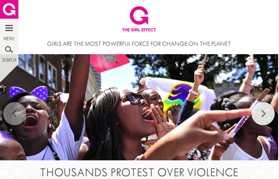
The Girl Effect
I was saving this review for today. I'm glad I did - looks like The Girl Effect website changed over last night (at least I think it did) - and is stunning. I really dig the off-screen navigation on the left, that really allows space to get their stories front and...
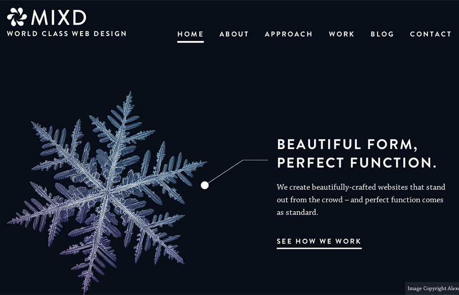
Mixd
This is from the Mixd design house out of North Yorkshire, UK. I like how each page has it's own initial background color, while still keeping the same aesthetic throughout the site. Also like that they must maintain the site and switch out the home page, that is a...
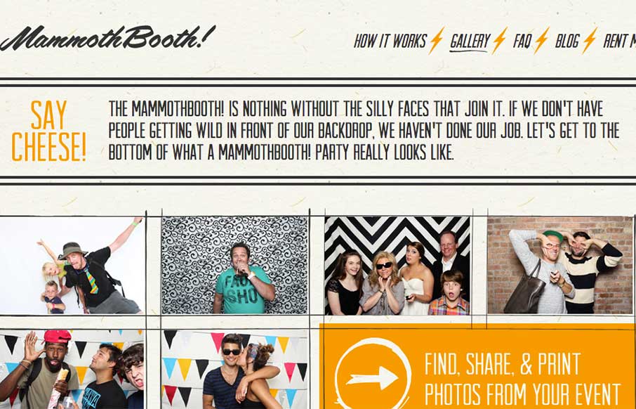
Mammoth Booth
Listen... good marketing is this: Do Not Press Button. What's the first thing you want to do? This is how the Mammoth Booth site starts out - good irreverence coupled with some nifty illustration and CSS animation, and then the pay-off: an explosion of cool photos...
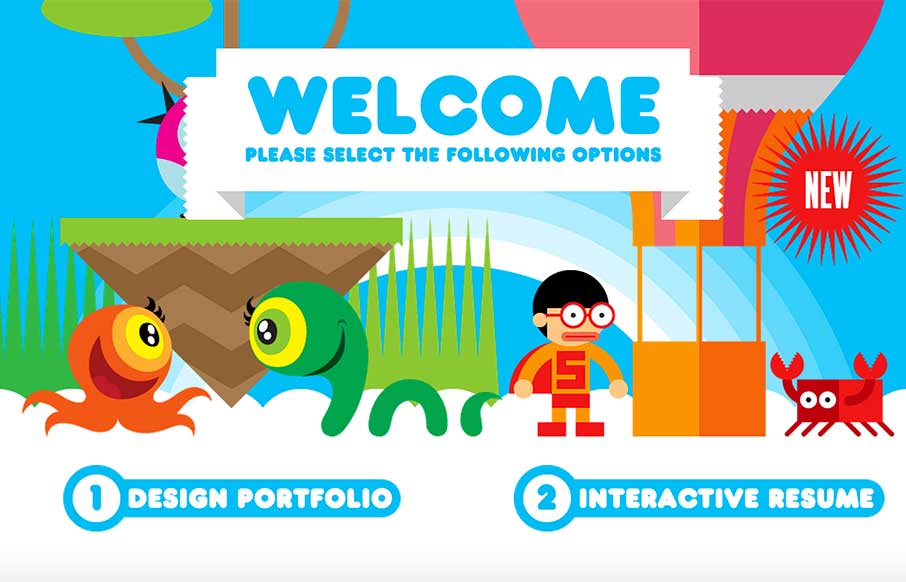
Robby Leonardi
Yeeeeeaaaaaaaaah! If you don't click on the "Interactive Resume" and go into a Nintendo glazed over comatose, eating Doritos, drinking Jolt Cola, wondering why your thumb joints ache and you have thumb calluses... then you're probably under the age of 35. Doesn't...
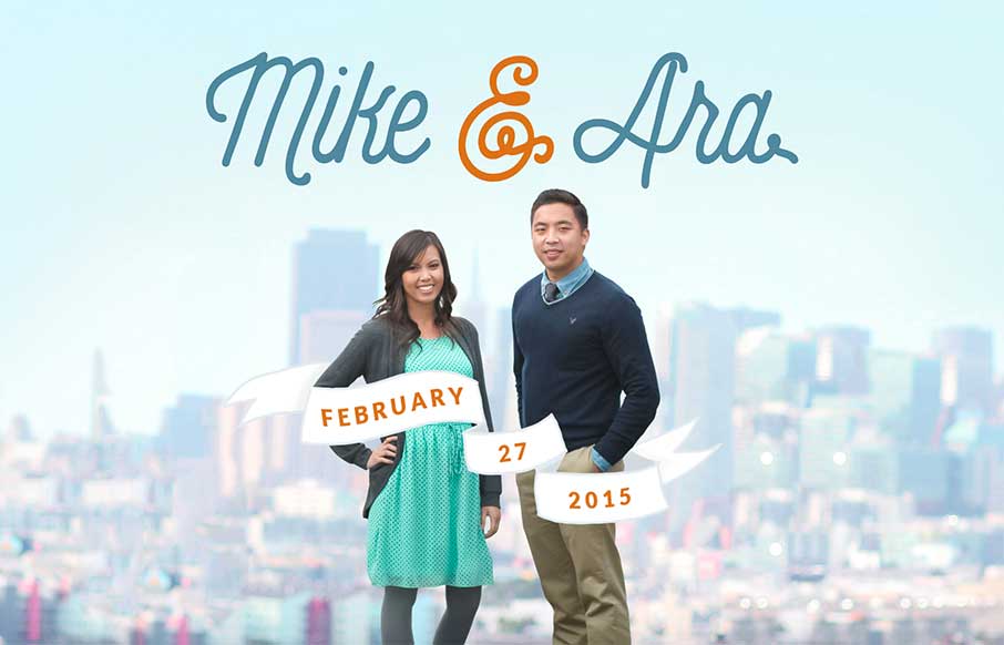
mikeandara.com
Listen - we don't normally do wedding / proposal sites - but this one from Mike Pechardo out of the San Francisco area is really well done. Looks like he spent a lot of time to make everything come together seamlessly on the web side - hope that continues for him and...
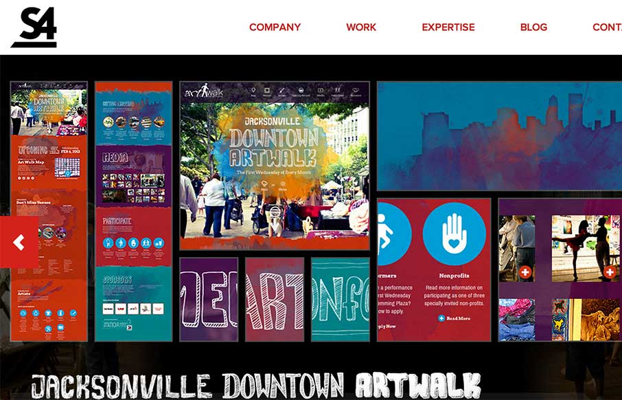
Station Four
Good design company site from Station Four out of Jacksonville. These folks have come and hung out with us at ConvergeFL - good people. They work on a bunch of different platforms, and their work and their site looks clean, has cool icons / infographics to tell their...
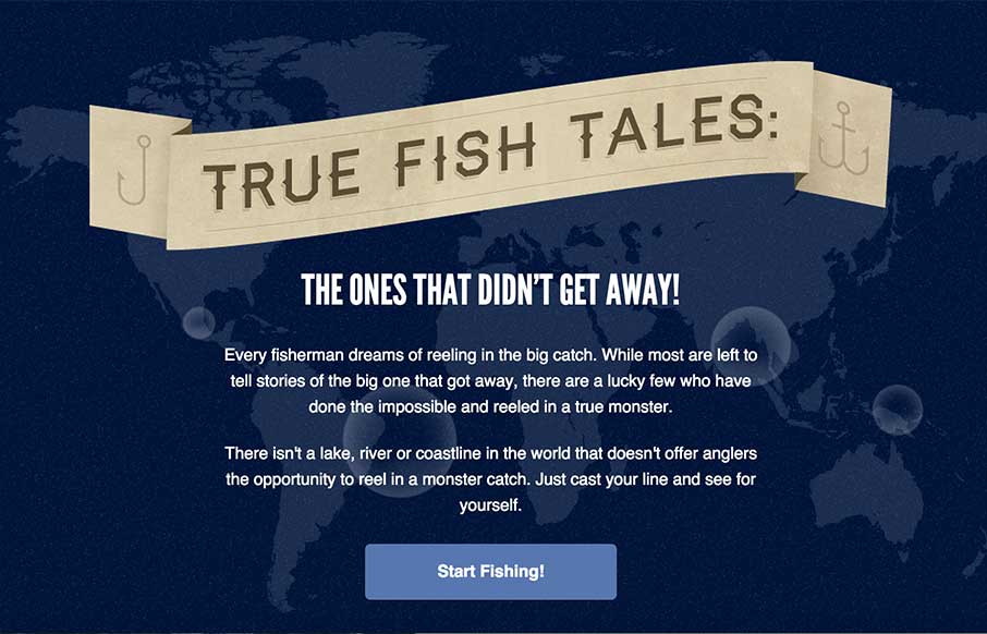
True Fish Tales
So.. here's the story... this site is all about true whopper fish tales... "the lucky few who have done the impossible and reeled in a true monster." Yeah sure, great on the CSS animation, map and interesting way they present the stories so you see the magnitude of...
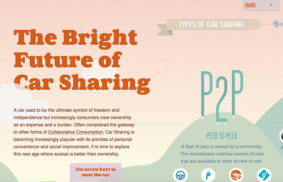
The Bright Future of Car Sharing
Ok - awesome fonts, flat images, and animation in an interactive full web page infographic. It took me a minute to navigate what to do with my car (hint: use the scroll bar at the bottom or use your left and right keys), but once I got going, I think it's excellent...
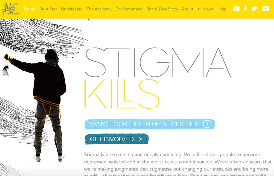
Life In My Shoes
I like the contrast of using stark white space and texture in the background and around important shapes/spaces on the page itself. Contrast can go really far as a design tool.
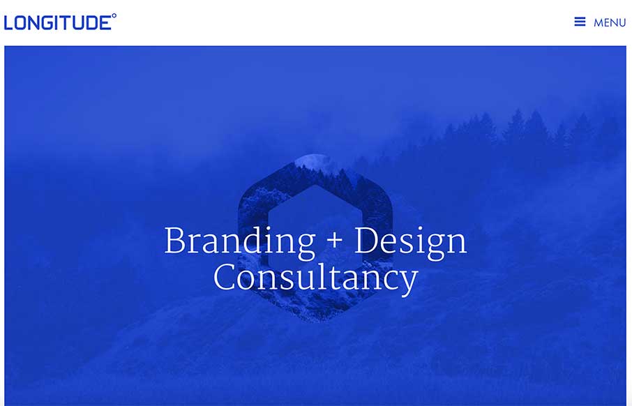
Longitude
Pretty straight forward layout, but fitted with some nice tight detail work. I really dig the subtle impression you gain by viewing this site. Submitted by: Dustin Myers @dmyers09 Role: Designer
kylereadsays.com
Very nice project/website to showcase the skills. I love stuff like this and this site for Kyle Read is one nifty example of how to do it. Love this site by @kyleread: http://t.co/DM0IobW5GI /via @timbrown — Elliot Jay Stocks (@elliotjaystocks) November 18,...
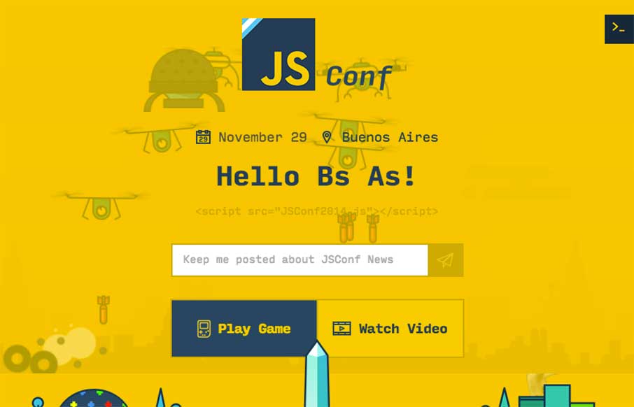
JSConf BA
Pretty dang awesome! I know you can do a lot now with Javascript - so the .jsConf out of Buenos Aires did it all. Their conference just ended on November 29th, but I'm glad they left the site up so that I can destroy the alien bad guys.... Just check out my...
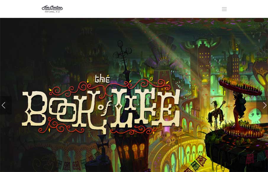
Jon Contino
Make sure you check out the detail pages for Jon Contino's (out of New York) portfolio - really sweet designs. I like the "Work" page too - faceted search so you get the idea of Jon's strengths - and a hint of parallax (kind of like the icons on your iPhone home page...
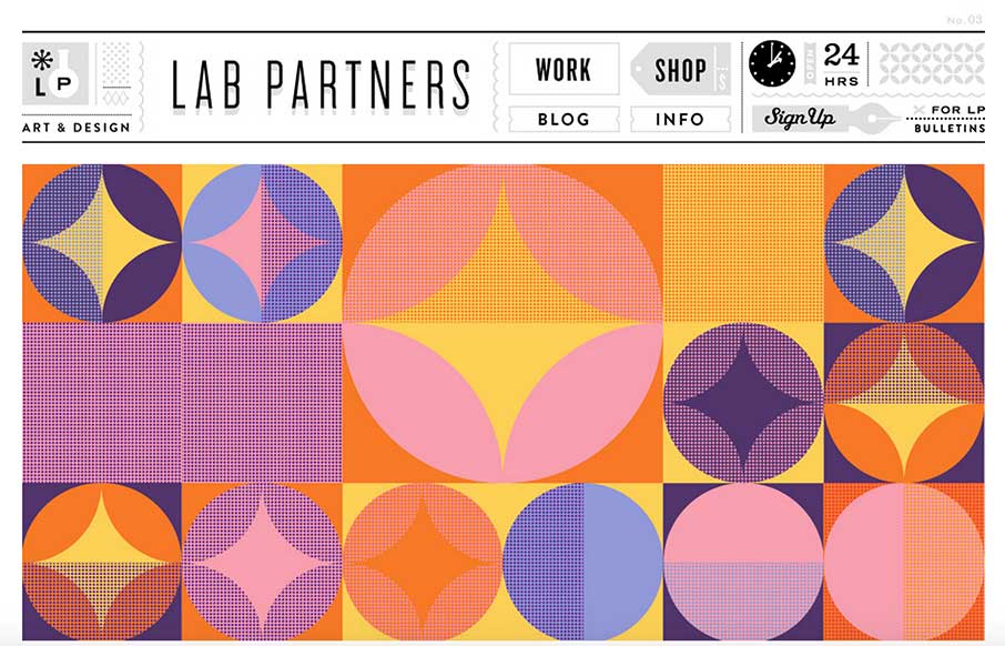
Lab Partners
I love non-standard stuff, like with Lab Partners. For instance the clock in the upper right, works! I'm sure there's a way to make this design responsive, but it's still pretty sweet looking to me.
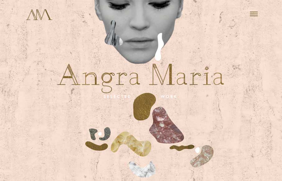
Angra Maria
I like quirky design and I extra like it when it's working hand in hand with solid tried and true design techniques. Just like with Angra Maria's portfolio site, beautiful work.
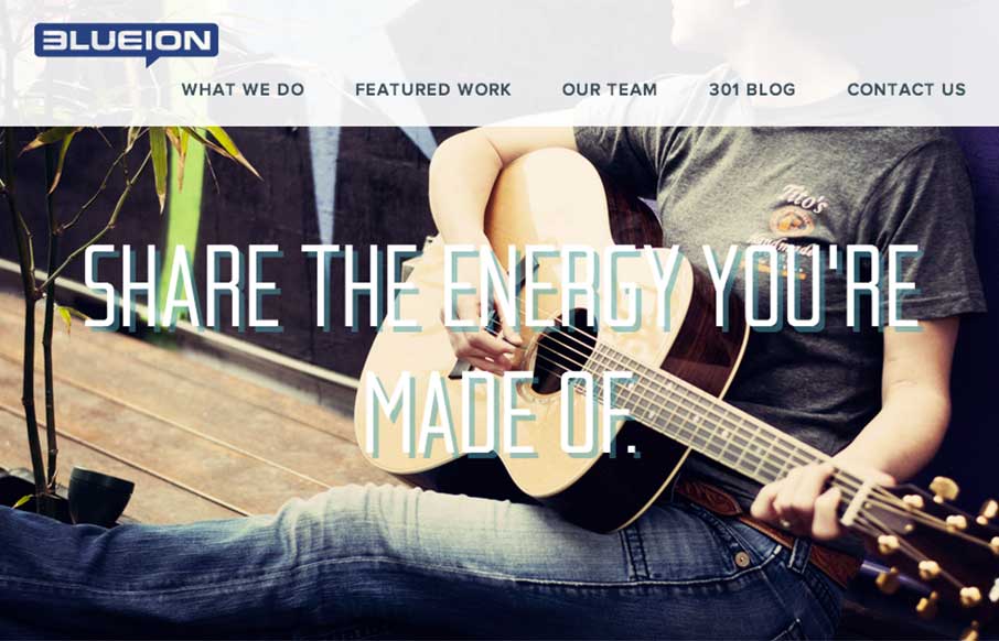
Blueion
There is some really great stuff here on the Blueion website design. I particularly like the 8bit looking illustration section for the team pics and some good video never hurts.
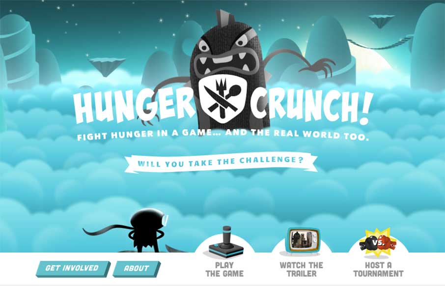
Hunger Crunch
Gio and I saw these guys talk in Greenville at Grok last year. Listen - the site is great. It has some subtle animation and appropriate parallax, making you feel like you're in the game. But.. the point of the Hunger Crunch site is not just the game attached to it -...
EMAIL NEWSLETTER
News & Articles
Book Club: Ethan Marcotte – Responsive Web Design
 It’s the first Book Club author discussion, with Ethan Marcotte. Talking all about his book and thoughts on some fundamental issues regarding RWD.
Draft Episode 04: Daniel Burka on Empathy
 Draft is a podcast about the craft of designing for the web, in this episode we discuss Empathy and how Daniel Burka helped us understand what it really means.
DotNetNuke – Redefining the CMS: Cloud. Mobile. Social.
 Clint Patterson tells us all about the DotNetNuke content management system and why we should maybe give it another look.

HARD WORK. CLEAN FUEL. NO EXCUSES
Use “WARRIOR2023″ for 10% off.