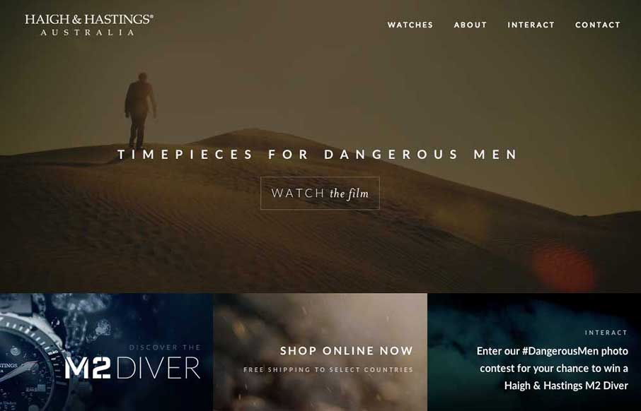
Very different vibe than what i’m used to seeing with the Haigh And Hastings website layout. I really like how the overall layout changes for the different screen widths. There’s some dramatic layout changes – check it out.
Glassmorphism: The Transparent Design Trend That Refuses to Fade
Glassmorphism brings transparency, depth, and light back into modern UI. Learn how this “frosted glass” design trend enhances hierarchy, focus, and atmosphere, plus how to implement it in CSS responsibly.


Nice to see the Milkable team’s work on Haigh & Hastings site.