Web Design Inspiration Curated
BigPixel
We've seen this hero/image area pattern before, but I like the animation used in this one, it stands out to me. I also really dig the tight illustration work used down the page here. It's also a single page layout which I like much for this application. From the...

Hutch Law
Really solid, well designed client website for Hutch Law. Does just about everything right. I like the bold colors and placement of certain useful elements for the company on the page. From the Designer: New Media Campaigns recently redesigned the website for Hutch...
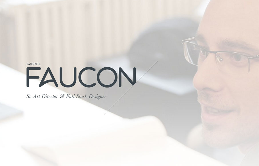
Gabriel Faucon
Very solid, subtle, well designed portfolio website for Gabriel Faucon. I love the subtle details, the way each image fades in slightly as you scroll over each section. Brilliantly minimal yet not at the same time. Good stuff. From the Designer: Gabriel Faucon, Senior...
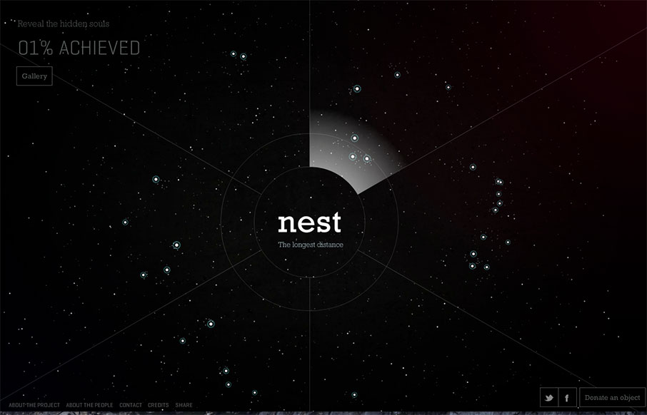
Nest 100 Project
It's very rare that we look at a Flash site, because for some reason people decided that Flash sites don't work / aren't cool / won't work on your iPhone / whatever. We feel there is still a place for sites like this, especially when you're combining elements to make...
Beat Box Academy
I am not a good beatboxer... but I can now practice my skills (or lack of) on BeatBoxAcademy. A quick, fun, interactive site up top - and really love the parallax image work as you go down the page - nothing too flashy, just right. (BF PF, BFPF... Beastie Boys the...
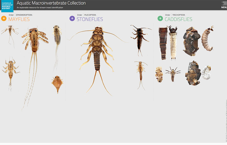
Aquatic Macroinvertebrates
Wow - this is an information architect's dream site - the Aquatic Macroinvertebrate Collection site from the Carnegie Museum of Natural History out of Pittsburgh. IA's will love the structure of the order of classification of living things - plus this site has a lot...
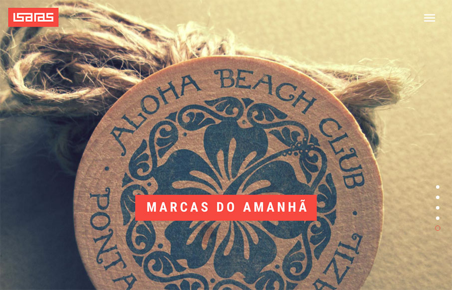
Isaias Mulatinho
Portfolio of Isaias Mulatinho out of Brazil - I like the red and white on the black - and the cool logo. From the Designer: This is a release of my works during the last years, branding, designing and marketing. Thank you for appreciating. Submitted by: Isaias...
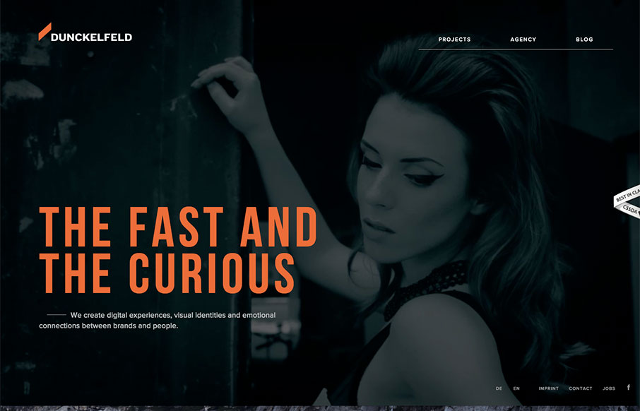
Dunckelfeld
There is some rather interesting interaction/animation on this site. I like the way the elements load up the first time you visit. It can be a bit slow to react to you as you make your way through it, which I could see may lead to some confusion on the user's part....
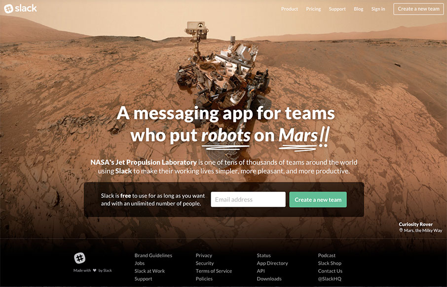
Slack
Be sure to refresh a few times - very cool images and typography - but we like Slack's site because it cuts to the chase - the one thing they want you to do here is "Create a New Team" - CTA is key - looking good is smart too.
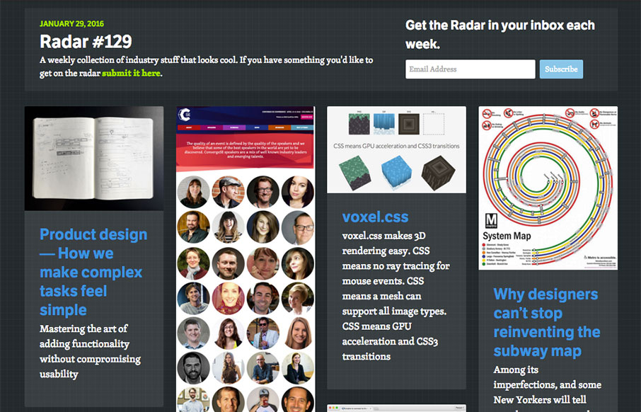
Radar 129
Each week, we do a round up of curated "stuff from the interwebs" that we call Radar. In this week's 129th Radar: Product design — How we make complex tasks feel simple Mastering the art of adding functionality without compromising usability ConvergeSE 2016 – Second...
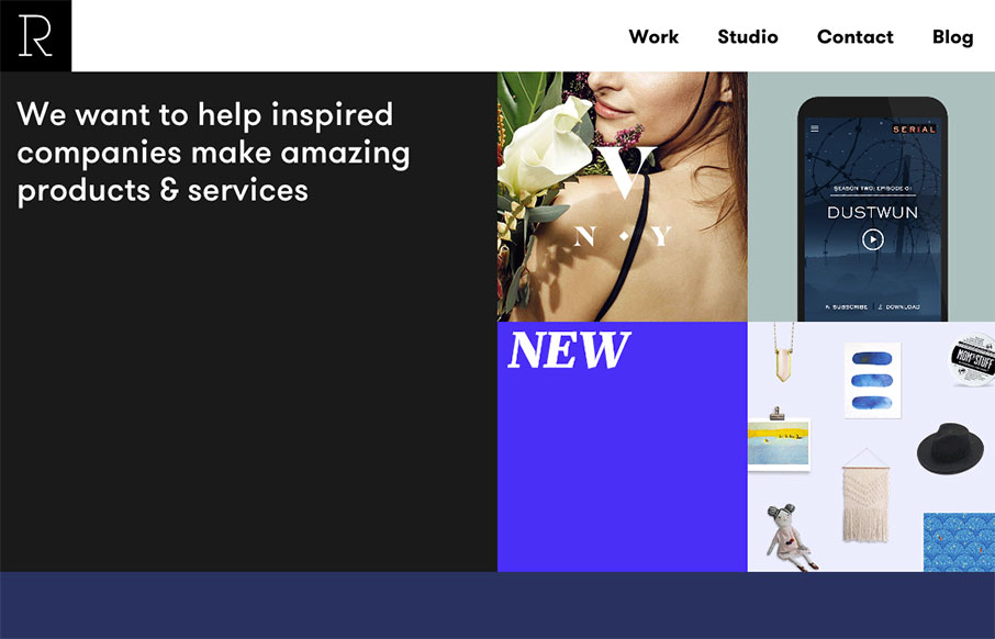
Studio Rodrigo
Pretty slick looking layout for Studio Rodrigo. I really like the big open areas matched up with smaller product images in a small grid like it has. Pretty solid design as you scroll down the home page too. Love this site.
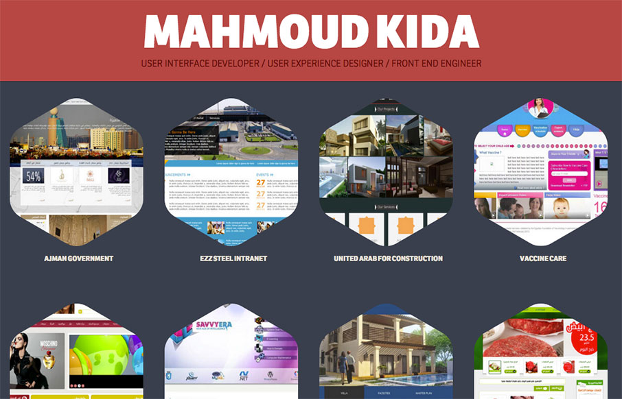
Mahmoud Kida
Pretty nifty single page style portfolio website. The tightness of the details all work well together visually and I really like the interaction design on the main project images. Good work! Submitted by: Mahmoud Kida Twitter: @mahmoudkida Role: Designer Country:...
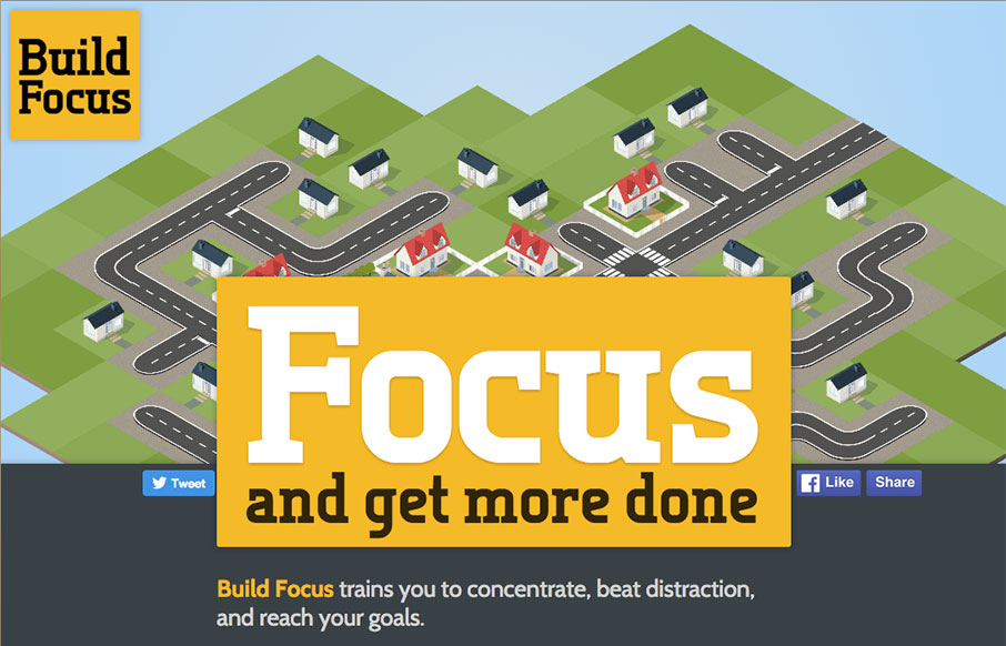
Build Focus
I really like the simple approach of just centering the design here. The illustration is spot on and makes me want to see what this app will look like. Solid construction. From the Designer: This is the pre-launch landing page for a new productivity startup: Build...
Blackbeltmonkey
I dig the oversized image scroll and large text. I also like the navigation fly-out design too. Pretty nifty looking work to boot.
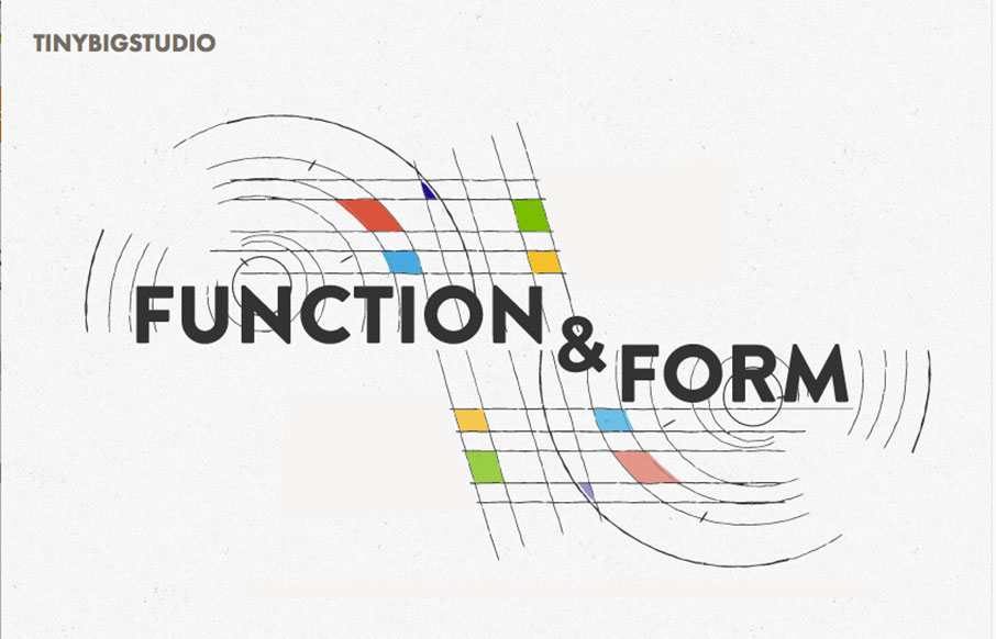
Tinybigstudio
Really nice layout, it immediately draws me in with the animated illustration and the nav being in the lower left corner(ish). I also like the soft color palette and a lot of the asymmetric layout decisions. Beautiful work. From the Designer: New iteration on my...
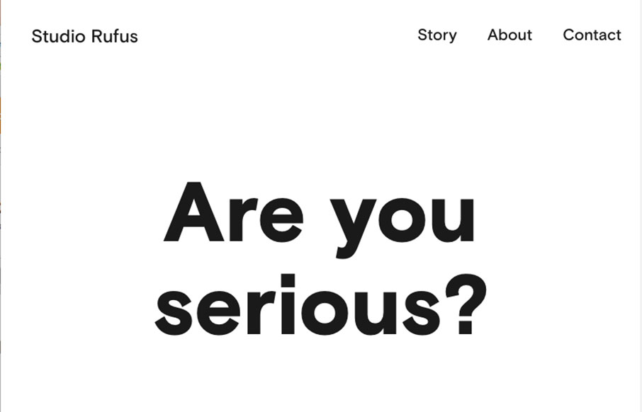
Studio Rufus
Seriously good minimal layout here. I extra love the selection choice to display the work links in line or with images. The bold typography displayed next to simple project images is always a good choice and it's worked to perfection here. From the Designer: Studio...
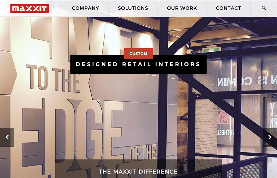
Maxxit Systems
It's a pretty standard looking layout, I like most things about it too. What I like most is the 2nd section, the card/block design of the individual project focused part. Strong. The bold read color really helps give things weight too. Submitted by: Jonathan Ryan...
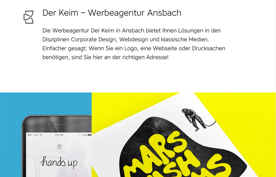
Der Keim
I love the off balance feeling of this layout. The header area is very light visually then below is a heavy image and colorful work section. This immediately draws my attention where it needs to go. Solid looking work too. From the Designer: Clean and colorful...
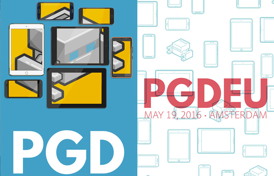
PhoneGap Day
Really solid yet simple conference website layout. I really like the big header area with the mobile device illustrations that scroll through/over the PG logo. Then I notice that the entire page scrolls over the logo. Neato! There's clearly some love and care put into...
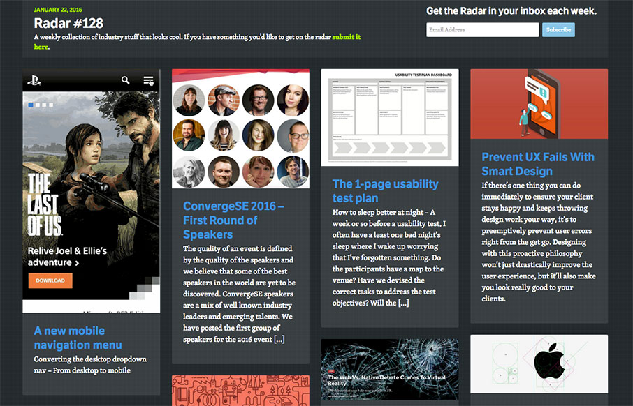
Radar 128
Each week, we do a round up of curated "stuff from the interwebs" that we call Radar. In this week's 128th Radar: A new mobile navigation menu Converting the desktop dropdown nav – From desktop to mobile ConvergeSE 2016 – First Round of Speakers The quality of an...
EMAIL NEWSLETTER
News & Articles
Draft Episode 31: Rapid Prototyping
 In this episode of Draft we discuss the concept of Rapid Prototyping. Approaches, usefulness and other related prototyping stuff.
Kickdrop Code Sample: Form Wizard
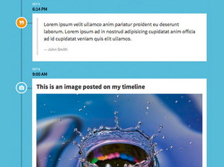 Ditch the multi-input fields and try this single input conversational wizard instead. Free to download and use in your next project.
A to Z CSS: Auto
Auto is a CSS value that has a number of uses. It’s the default value for a lot of properties but can be used for horizontal centering and is a handy tool to have in the box when dealing with responsive design.

HARD WORK. CLEAN FUEL. NO EXCUSES
Use “WARRIOR2023″ for 10% off.