Web Design Inspiration Curated
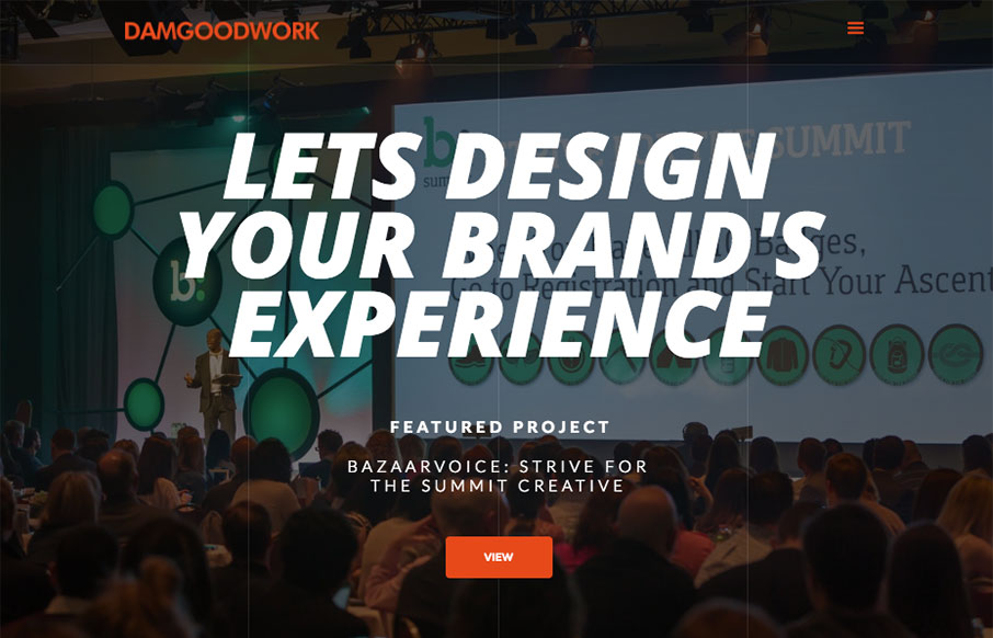
Damgoodwork
Shoot, I like this site, a lot. I dig the tall rectangle project sections. It's such a simple change from the standard stuff we see all the time. But, dang is it effective. I'll remember that for a long while. Very nice! I've redesigned my website ( again ). I'm still...
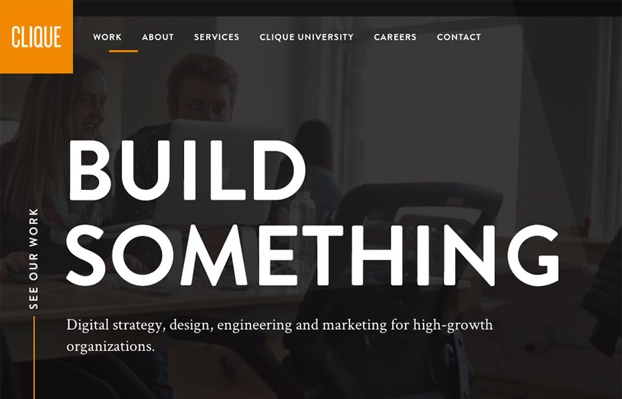
Clique
Whew. I loved making my way all the way to the bottom of this home page. The way the copy plays with the headlines and sections is brilliant. I love it. I also really dig the overall design. Colors, layout, etc... for each section, it changes up enough to show that...
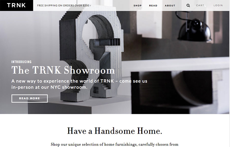
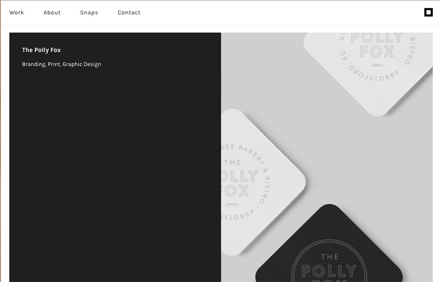
TRNK
Very nice grid based layout and a design that takes advantage of that grid and escapes it for good impact lower down on the page. I love the main nav and how it fills in with the overall grid beautifully, with that mega-drop-down design. Solid work here.
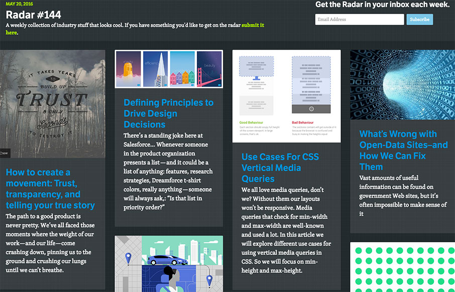
Radar #144
Each week, we do a round up of curated "stuff from the interwebs" that we call Radar. In this week's 144th Radar: How to create a movement: Trust, transparency, and telling your true story The path to a good product is never pretty. We’ve all faced those moments where...
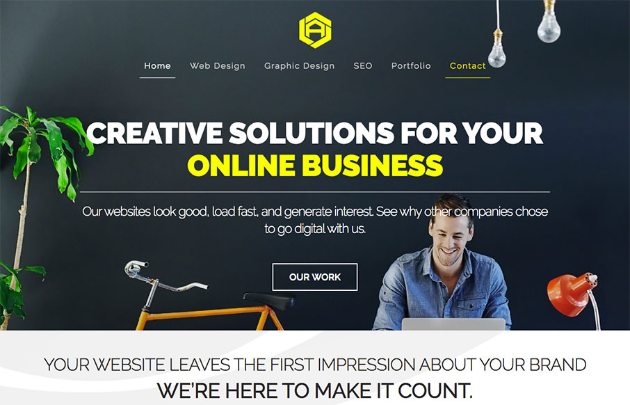
David Arias
I love this simple portfolio site for David Arias. It's simple yet impactful design like this that gets me going. I love the interaction that's in place on each work sample and the way the work just slides up into the header area as you scroll just gives me a nice...
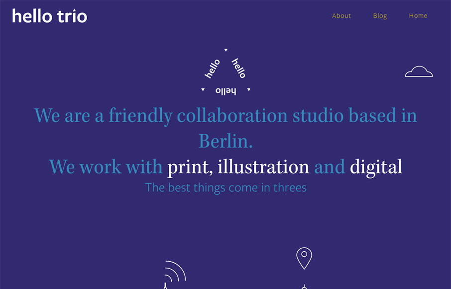
hello trio
Pretty cool vibe to this site. I dig the hero area and the slight parallax/apple movement technique. I also really dig the visual break down of each section as you scroll down the page. Solid work.
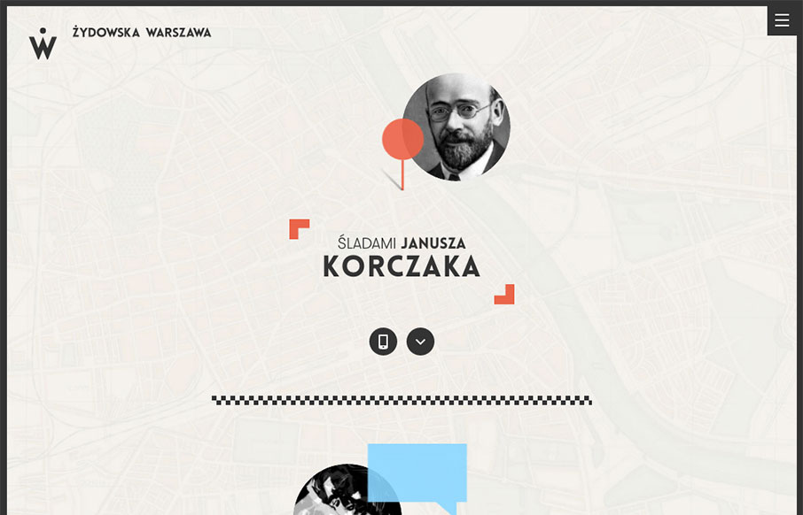
warsze.polin
Really great mix of illustration and interactive work. It's a fairly fixed design but it's fun even if I don't read Polish. The menu design is also pretty clever too, with the little back arrow worked on there.
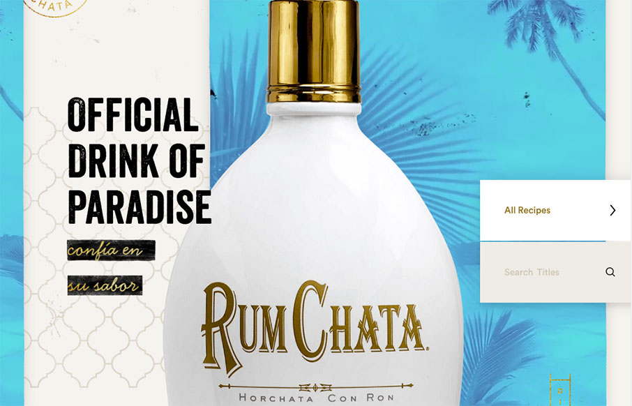
Rumchata
Some really crazy parallax and interactions on the Rumchata website to get you going.
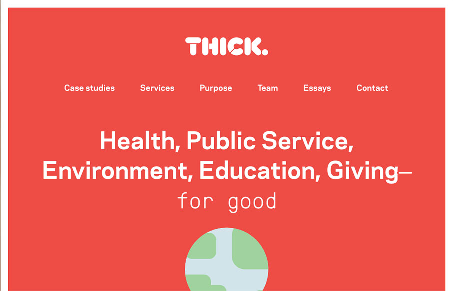
Thick
Nice structured design. I dig the density of content to design as you make your way down the pagescroll. Solid colors and solid visual brand too. Check the globe on the main hero area as you scroll. Subtle but cool.
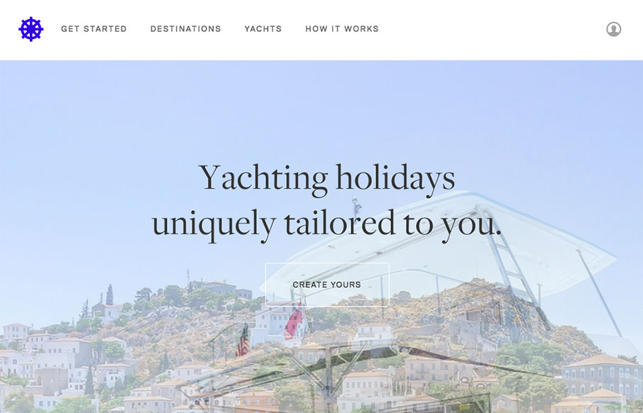
Helm.yt
I like how this design feels very open. The interactive parts are sort of placed on top of the imagery to make it feel like it's floating there. There is also a play between the back and forward arrows and the entire, oversized, image changing out too. Cool visual...

Nation
What a badass website. It's really the approach to the brand that drives this site design. From the animated background flag to each illustration and placement of content this website makes me happy. Bravo.
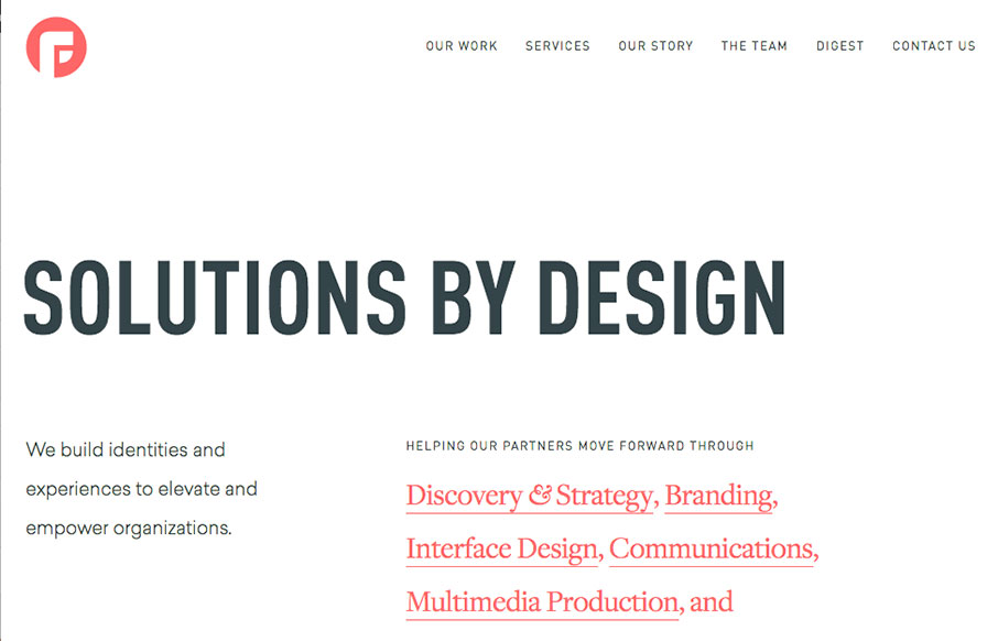
Focus Lab
Solid and clean site from Focus Lab out of Savannah, Georgia (just a hop and a skip from us). While I love the whole site - on thing that's really smart is the video links throughout the site - they are subtle, but pretty effective.
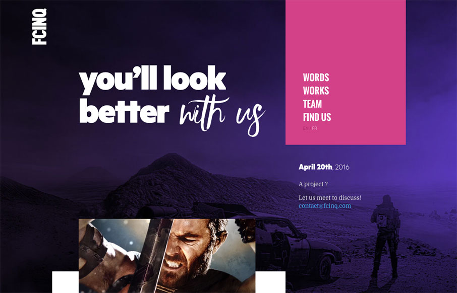
fcinq
Woah. That's what I said when I first loaded this site up. It's plenty full of visuals and good looking teaser imagery. It's pretty solid in execution too. I love that first moment when you start to scroll this site down the most. It's a nice little surprise as the...
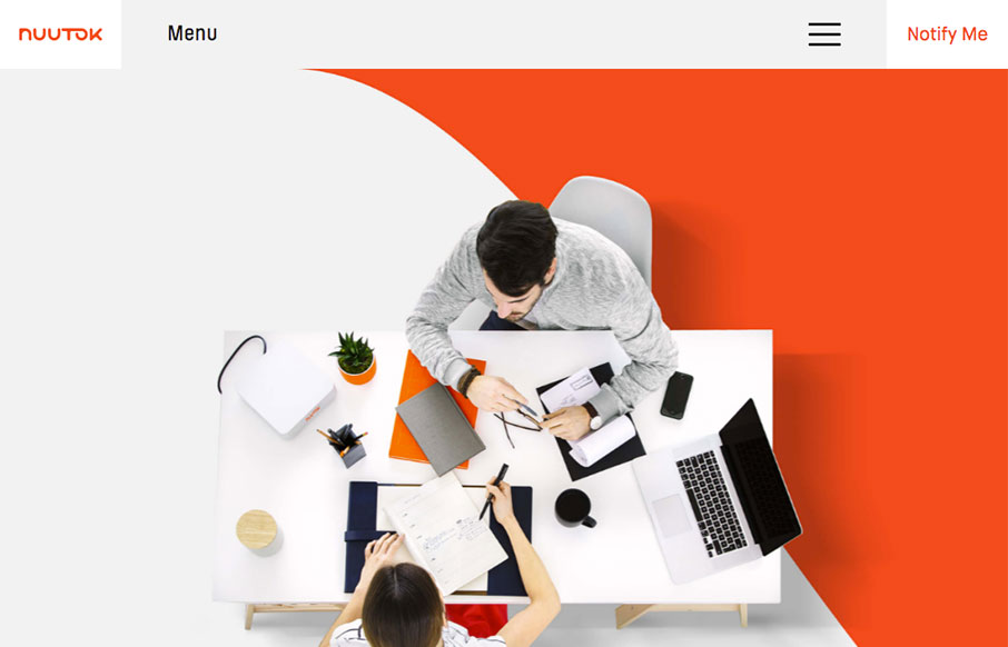
Nuutok
Nice solid branding and colors. I love the main nav interaction too, the little details really make it work for me here.
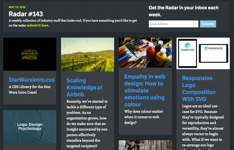
Radar #143
Each week, we do a round up of curated "stuff from the interwebs" that we call Radar. In this week's 143rd Radar: StarWarsIntro.css A CSS Library for the Star Wars Intro Crawl Scaling Knowledge at Airbnb Recently, we’ve started to tackle a different type of problem....
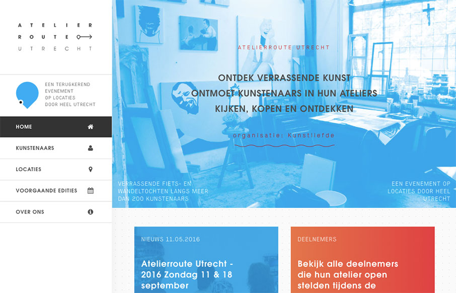
Atelierroute Utrecht
Nice left nav layout approach to this website. I dig the straight up hard angles and blockiness to it too. Asymmetry is a good thing!
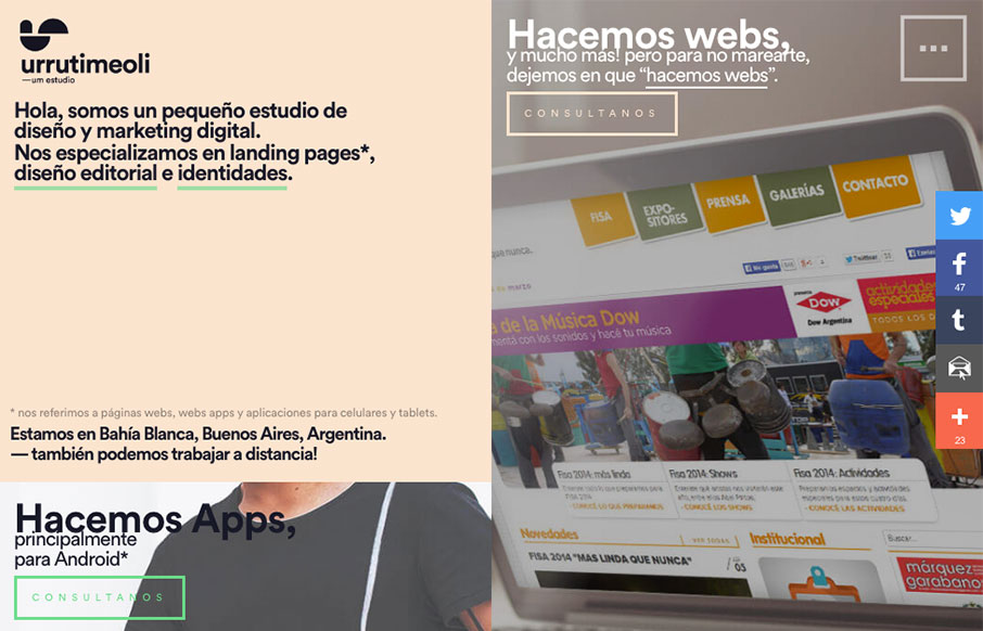
UrrutiMeoli Estudio
Cool grid layout to the UrrutiMeoli Estudio website. I dig the large square photos placed above the cut out style photos. It makes a nice presentation as you scroll. Giving the content good rhythm. Submitted by: Facundo Urruti Role: Designer Country: Argentina
Amazepress
There's a lot familiar with this layout and then there's parts that are fresh. I dig that balance. Taking that standard feeling bootstrap layout and changing it up a enough to make it hit home is nice. From the Designer: Amazepress is an international web design,...
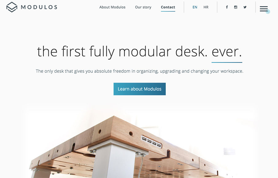
Modulos Desk
Very cool product here, and equally well done website. What i'm digging most is all the fiddly stuff in the main nav/logo area. I love how the logo changes out as you scale the page to different screen widths. I also really like the finishing touches put on the...

Interactive Red
Another really great looking web design company website. Super solid work here. I love just about everything about this as it walks the line well between creative and corporate. The best part are all the case studies like this one.
EMAIL NEWSLETTER
News & Articles
A to Z CSS: ID
 ID is a CSS selector that allows the styling of a single unique element. Their use in CSS is common and often a little controversial. In this video, I will outline some of the reasons why I prefer the `class` selector over `ID`, how CSS specificity works.
Atomic Design – by Brad Frost @ Beyond the Desktop Conference
 Atomic design by Brad Frost is a methodology used to construct web design systems. He has given this talk all over the place, but one that helped kick it off was at Breaking Development (BDConf) in 2013, here is the video and some notes about it.
Jenn Lukas – Interactions & Mobile Devices
 UMS Video Podcast: Giovanni talks with talks with Jenn Lukas about one of the most fundamental and often troublesome quirks: The lack of a hover state.

HARD WORK. CLEAN FUEL. NO EXCUSES
Use “WARRIOR2023″ for 10% off.