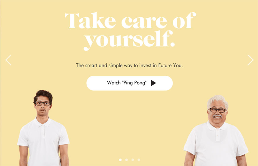
Wealthsimple doesn’t look like any other financial website i’ve seen before. Ditching the status quo corporate colors for a softer more non-traditional vibe they really get it right. Playing up the personalization feel to the tee. I love the typography on this site the most!


The Call to Action, Revisited
The Call to Action hasn’t changed in a decade, but the bar has. A fresh look at prominence, copy, mobile tap targets, and accessibility, with lessons from three major design systems.


0 Comments