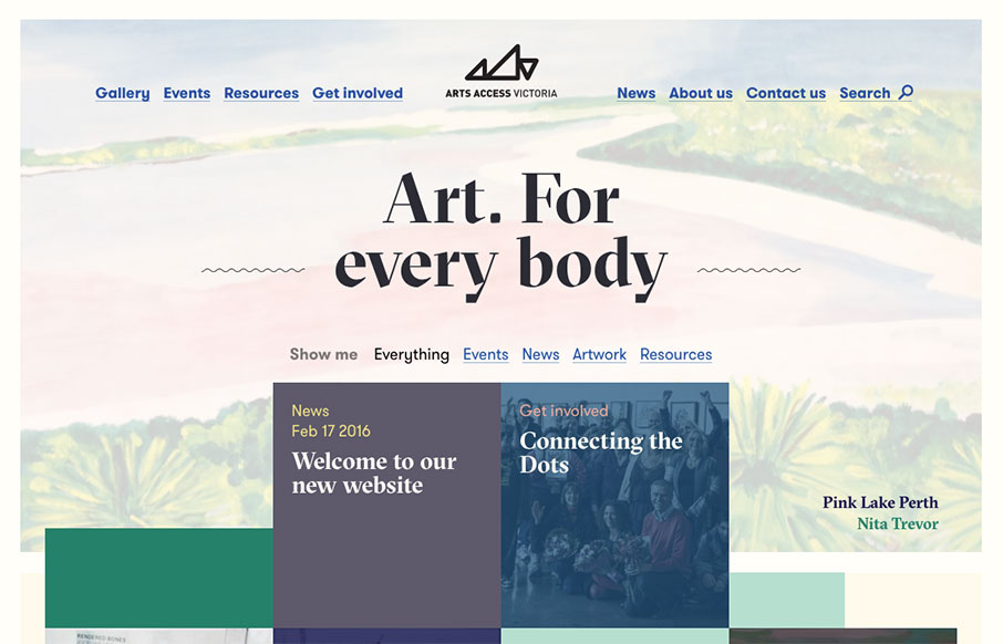
Generally intriguing and thought provoking layout to me. I love the asymmetry inherit in this layout. Balancing out a design with an offset approach like this is difficult but when done well is just beautiful. I think I actually love the simple blue + underlined links for the main navigation the best. I haven’t seen that in a loooong time like this and I love it.
Glassmorphism: The Transparent Design Trend That Refuses to Fade
Glassmorphism brings transparency, depth, and light back into modern UI. Learn how this “frosted glass” design trend enhances hierarchy, focus, and atmosphere, plus how to implement it in CSS responsibly.


0 Comments