Web Design Inspiration Curated
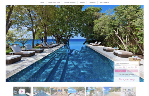
Hammerton Barbados – Luxury Villas
Modern clean website designed for use by a range of it competencies. Property listings put photographs and information front and centre with easy discoverability and use of CDNs for performance and a great UX for users on mobile devices.
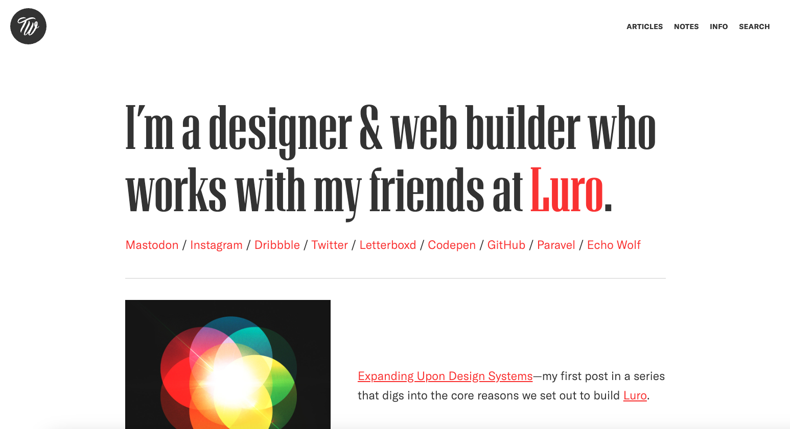
Trent Walton
Love the simple and minimal approach to Trent’s personal website and blog. Minimalism is very difficult to pull off well and this website gets it.
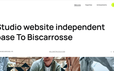
Cyril Gouv
https://youtu.be/N07dSzhxwKo A portfolio and professional design website for Cyril Gouv.
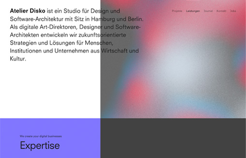
Atelier Disko
Website relaunch for Hamburg and Berlin based digital branding agency »Atelier Disko«.
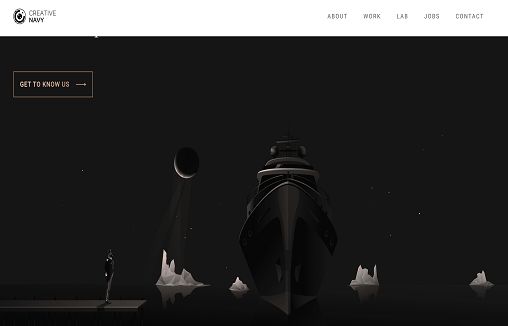
Creative Navy
The Creative Navy website uses a mix of typography and imagery to convey the maturity of the UX design agency. The focus is on the content, with case studies featured prominently. Visitors are guided through projects to a significant level of detail, including methodology , results and snapshots from the process.
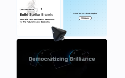
Xrilion
The rise of no-code software can be viewed as a natural evolution in the history of digital development. We are dedicated to helping new business and website owners get to MVP as fast as possible without a single line of code.
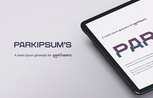
Parkipsum’s Generator
Designers, creatives and web architects; they are just some of the people who see ‘Lorem Ipsum’ daily. Yet many don’t realise it derives from the Latin ‘dolorem ipsum’, roughly translated to ‘pain itself’ . Two words that people living with Parkinsons know all too...
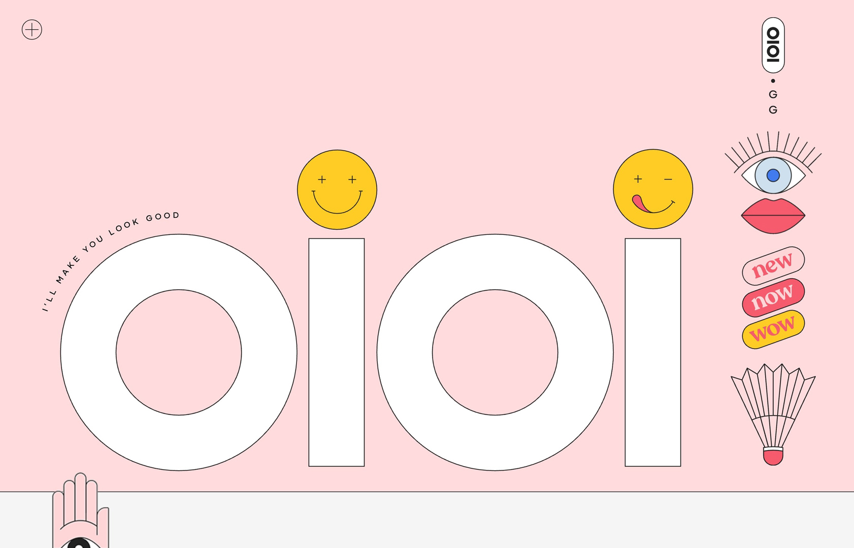
oioi.gg
Personal portfolio website featuring some of my recent work in creative consultancy, design and direction. After a decade of procrastination, turns out all I needed was a global pandemic and national lockdown to get my shit together.
Nimble
We are a team of software engineers, designers, and product managers building outstanding web and mobile applications for companies of all sizes, from 1-person startups to Fortune 500 companies.
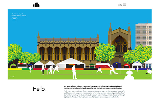
Dave Holloway
Portfolio website for Dave Holloway – a vastly-experienced full-service freelance designer and strategist based in Leeds (UK) specialising in strategic branding and digital design. Also features a cool Blog / Midjourney AI image gallery
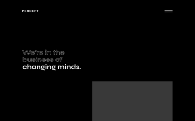
Percept
Percept – Branding, Design & Creative Agency in Sydney. Brand Identity, Packaging Design, Visual Communication, Advertising, Digital & Website Design.
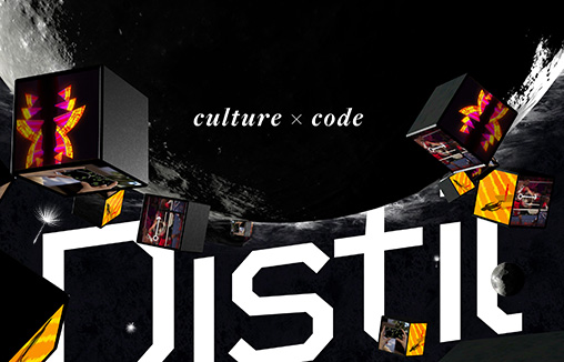
Distil Immersive
We are Distil Immersive, a multi-award winning studio forging a new approach to digital. One that brings stories and culture to the centre of a creative-technology process. Based in Sydney, Australia.
ainsley.dev
Coupling state-of-the-art technology with stunning designs, ainsley.dev creates bespoke websites & custom in-house software from startups to established brands.
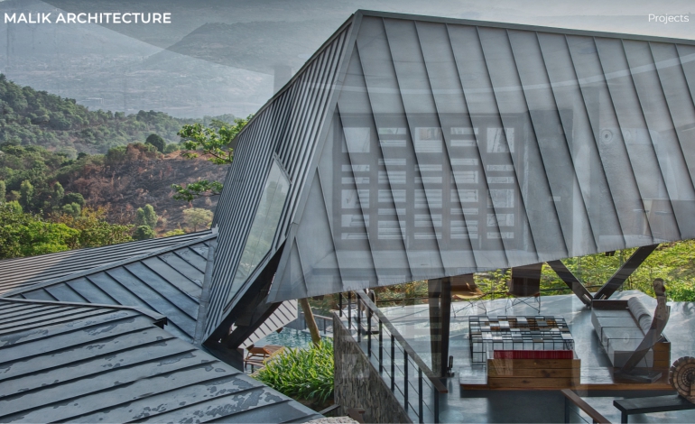
Malik Architecture
Malik Architecture is an esteemed architectural firm dedicated to creating innovative, sustainable, and visually striking designs. With a passion for pushing the boundaries of architectural creativity, Malik Architecture is committed to delivering exceptional...
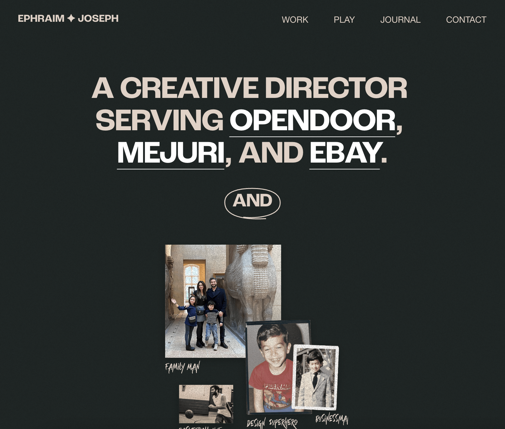
Ephraim Joseph
Modern design and easy to navigate!
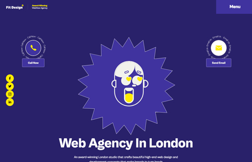
Fit Design
We are a creative web design agency in London, that specializes in bespoke and affordable website design, web development, SEO service, and eCommerce solution.
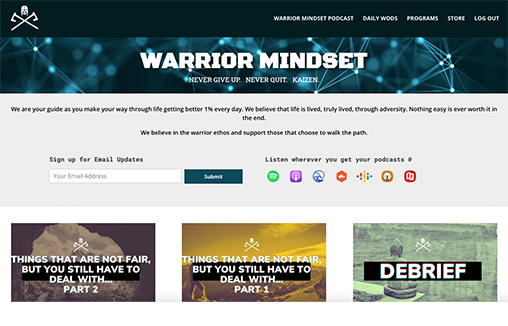
Warrior Mindset
https://warriormindset.us/
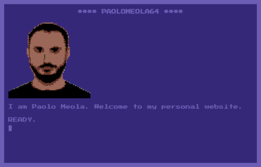
PAOLOMEOLA64
terminal-like navigation personal website inspired by Commodore64 monitor colors and design. Name: Paolo Meola Short Author Bio: I am a digital entrepreneur with a solid technical background. Role: Designer & Developer Twitter: @ymx1zq Country: Italy
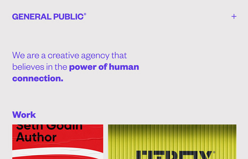
General Public
We are a creative agency that believes in the power of human connection. Name: Jim Richardson Short Author Bio: Designer with 20 years experience working on branding, print and digital projects. Your Role in this Website's Production: Designer Country: United...
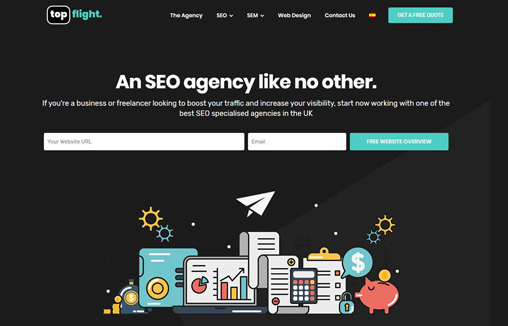
topflight SEO Agency
topflight is an SEO-specialised agency founded by marketers with a common dream: collaborate to bring the best digital services to customers. We cover several background areas from web design to SEO and SEM. Our website has been designed to provide a unique user...
EMAIL NEWSLETTER
News & Articles
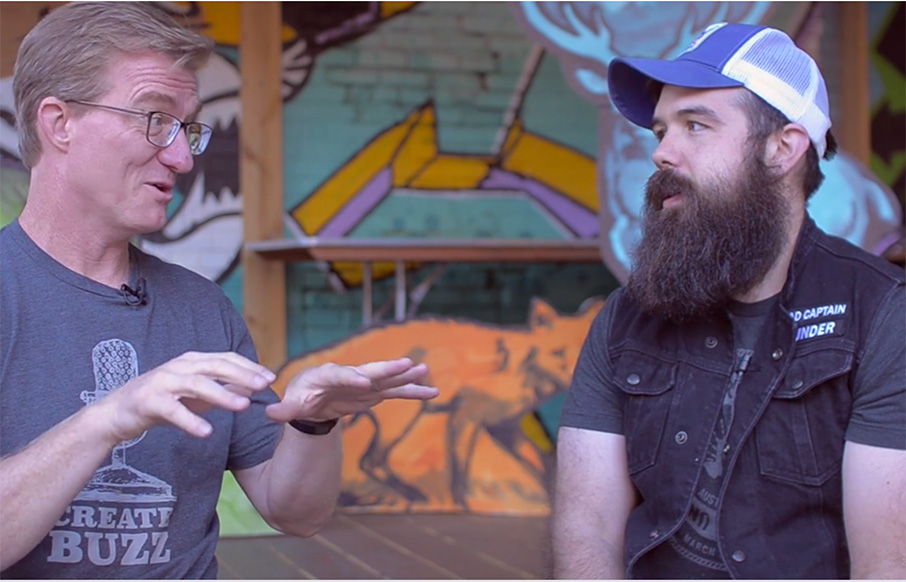
Carl Smith – Bureau of Digital Affairs
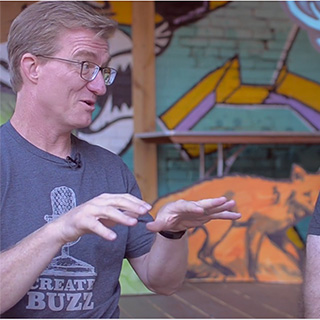 In an interview with Carl Smith, Giovanni found out more about The Bureau of Digital Affairs and Carl’s work.
How to deliver a good design critique (Part 1)
 A design critique is something we, as designers, have to learn and experience to truly be effective at it. Here are some tips to get you started giving better feedback.

Whiteboarding, sitemapping, and creating a user flow
 Clark Buckner of Technology Advice recently spoke with Astute Communications’ Anna Stout, a web designer and front-end developer with keen insight into building better websites.

HARD WORK. CLEAN FUEL. NO EXCUSES
Use “WARRIOR2023″ for 10% off.