Web Design Inspiration Curated
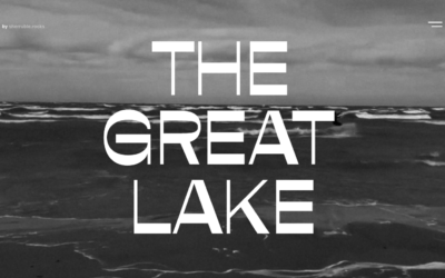
Consider The Great Lake
This online project shares interesting facts and stories in a storytelling format. Unlike some other projects, it takes a more conservative approach, aiming to be user-friendly. Using a strong HTML5 base, it includes cool features like animations, dynamic details,...
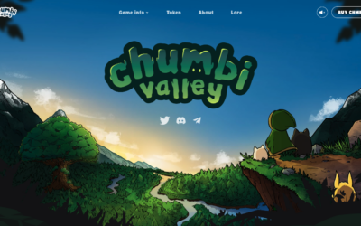
Chumbi Valley
Some serious illustration work to build this website on. That's one of the things I always love about gaming websites, they have such rich resources to pull from. Pretty solid layout and interactions help pull you into the visual adventure.
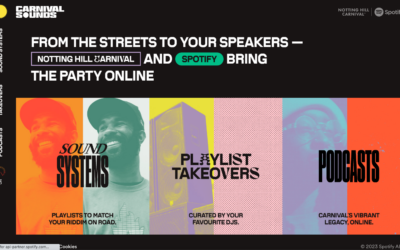
Carnival with Spotify
Carnival with Spotify, celebrates Carnival's culture and heritage, providing a delightful user experience that entertains and educates visitors about its rich history and fascinating facts.
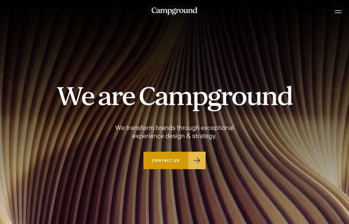
Campground
Campground is a design studio that specializes in creating brands and experiences for bold companies. As a hands-on creative partner, we strengthen and invigorate brands through effective strategy and thoughtful design.
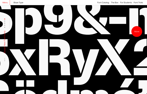
Blaze Type
Blaze Type is an independent type foundry designing retail and custom fonts for blazing hot projects.This website is our 2.0 version of the foundry release of 2017
Atomize
Nice dark background website design. I love the simple layout but subtle details. The little slider to light/dark for the samples is solid.
art4web
Art4Web has a neat parallax header, which looks impressive. The rest of the design is pretty straightforward, using stripes to organize text and images, with some nice animations for extra flair. It's simple but gets the job done.
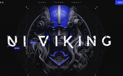
UI VIking
What a fun visual dynamic website. You don't see designers work with a concept like this very often and when you do it's just fresh and fun. Great work by the UI Viking here! "Do not go where the path may lead, go instead where there is no path and leave a trail."
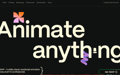
GSAP
Very cool details at work. Website for a javascript library but using their own stuff. Pretty neat.
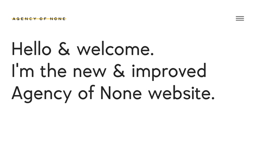
Agency of None
Design studio's websites often lack personality. So we've quite literally given our one. Come and chat to it to find out some secrets, hear some jokes and practice some wellbeing.
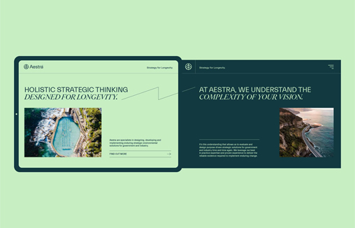
Aestra
Strategic branding by the brand designers at Percept reinvented this consulting firm. Strategic branding, brand positioning, brand naming, brand identity and marketing communications, including this corporate website design.
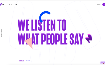
65db
Super interactive details, solid little illustrative visual moments too. I dig it. I'm not wild about the cursor take-over but I can look past it. The menu is brilliantly animated and as an agency website this is one of the better ones out there.
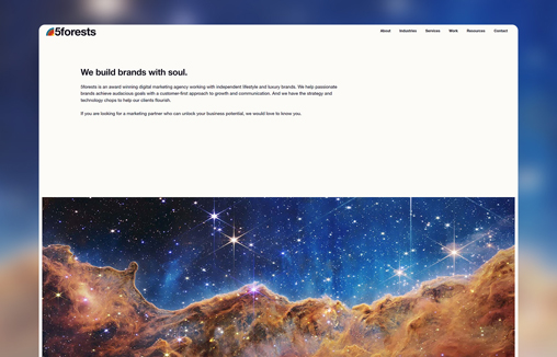
5forests
5forests is an award winning digital marketing agency working with independent lifestyle and luxury brands.
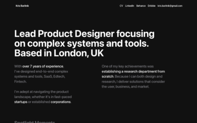
Kris Barilnik
Nice dark background single-ish page portfolio site. I like the way the discrete sections are handled on this. Solid layout and type treatments.
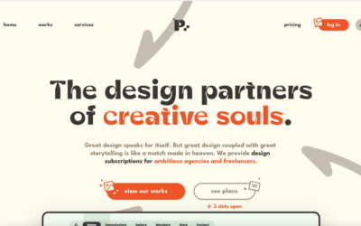
PixelEase
Interesting service offering, subscription web design services. Hmmm. What do ya'll think? As for the design, it's a quite nicely done website. I really dig most of the details here.
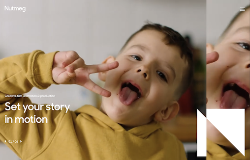
Nutmeg Productions
Nutmeg Production is a video production company that offers a range of film services to the charity, corporate, healthcare and food industries.
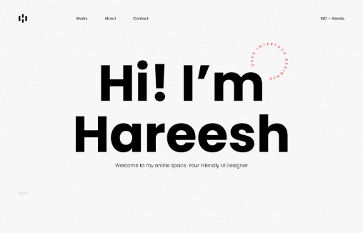
Hareesh
Personal website portfolio for Hareesh. I love the minimalism but deep interactions as you scroll. Nice attention to detail with the type and layering of imagery. Solid work.
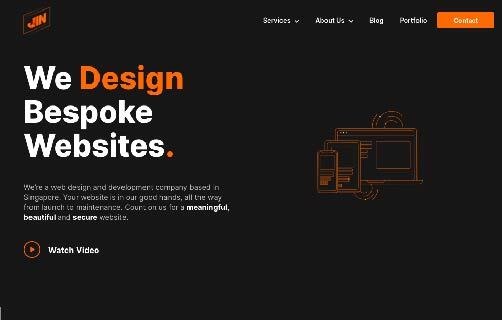
JIN Design
All the tiny details are important. We use the all the tiny motion graphic to create the feel of futuristic feel.
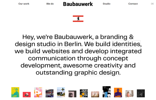
Baubauwerk
Baubauwerk is a branding & design studio in Berlin.
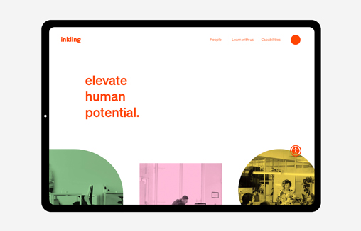
Inkling
In need of a revamp of their brand identity and website design, Inkling approached strategic branding agency, Percept. The result was more appropriate brand positioning and a brand identity that represents the personality of the organisation.
EMAIL NEWSLETTER
News & Articles
7 key tips to help you become a productive web designer
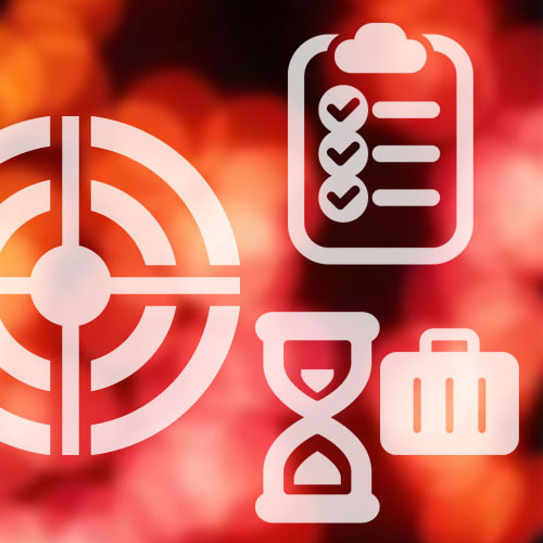 Here are 7 key tips to help you in becoming more productive and boost your career in web design.
Dribbble’s of the Week – 08/27
 Each week we’d like to show you some of our favorite Dribbbles from some people we think are doing awesome work.
Free Download: Multimedia Icon Set by DryIcons
![]() Thanks to the fine folks at DryIcons we’re able to give you guys a free set of their Multimedia Icons. Go get e’m and enjoy.
Thanks to the fine folks at DryIcons we’re able to give you guys a free set of their Multimedia Icons. Go get e’m and enjoy.

HARD WORK. CLEAN FUEL. NO EXCUSES
Use “WARRIOR2023″ for 10% off.