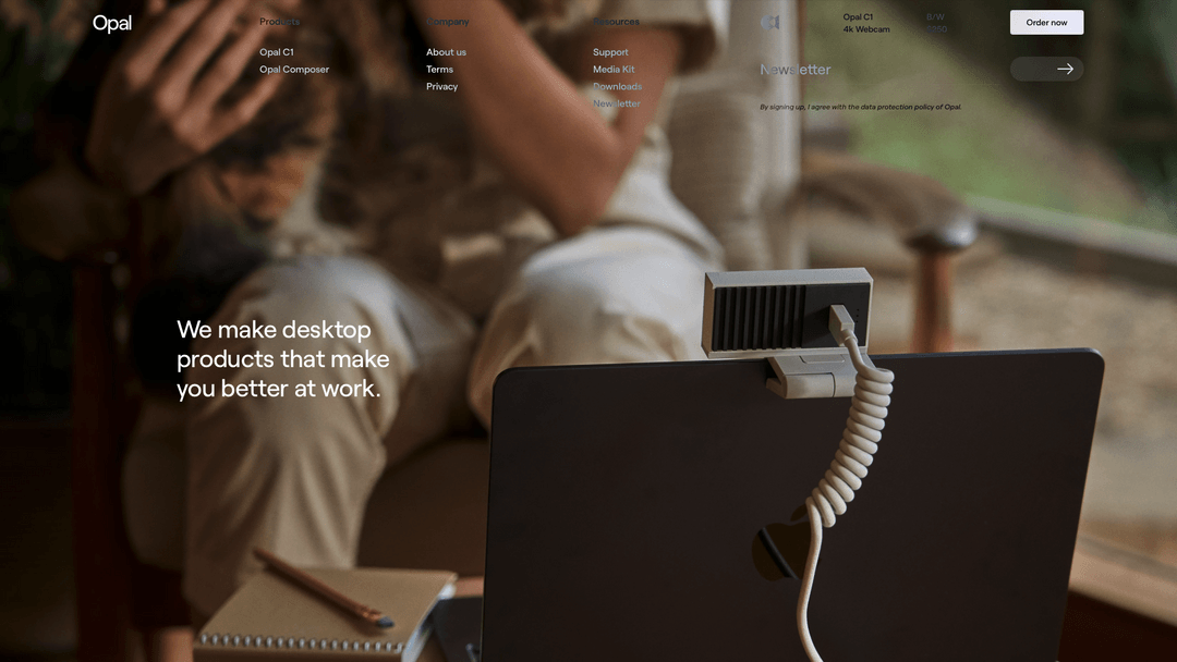
Very nice use of large imagery to tell a story. You immediately know what they’re about just by the image alone. I like the main nav and how it shows the sub-options but when you scroll they go away. Nice. Not wild about the gray on top of the image but it still works well enough.


The Call to Action, Revisited
The Call to Action hasn’t changed in a decade, but the bar has. A fresh look at prominence, copy, mobile tap targets, and accessibility, with lessons from three major design systems.


0 Comments