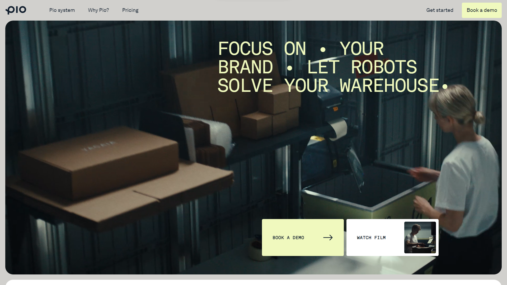
Neat effect with the image being “blocked” n by the gray background. I like the big button looks too. Not the most optimized mobile view but it’s going to still work for most people. I like the “tech” vibe and colors most of all.


The Call to Action, Revisited
The Call to Action hasn’t changed in a decade, but the bar has. A fresh look at prominence, copy, mobile tap targets, and accessibility, with lessons from three major design systems.


0 Comments