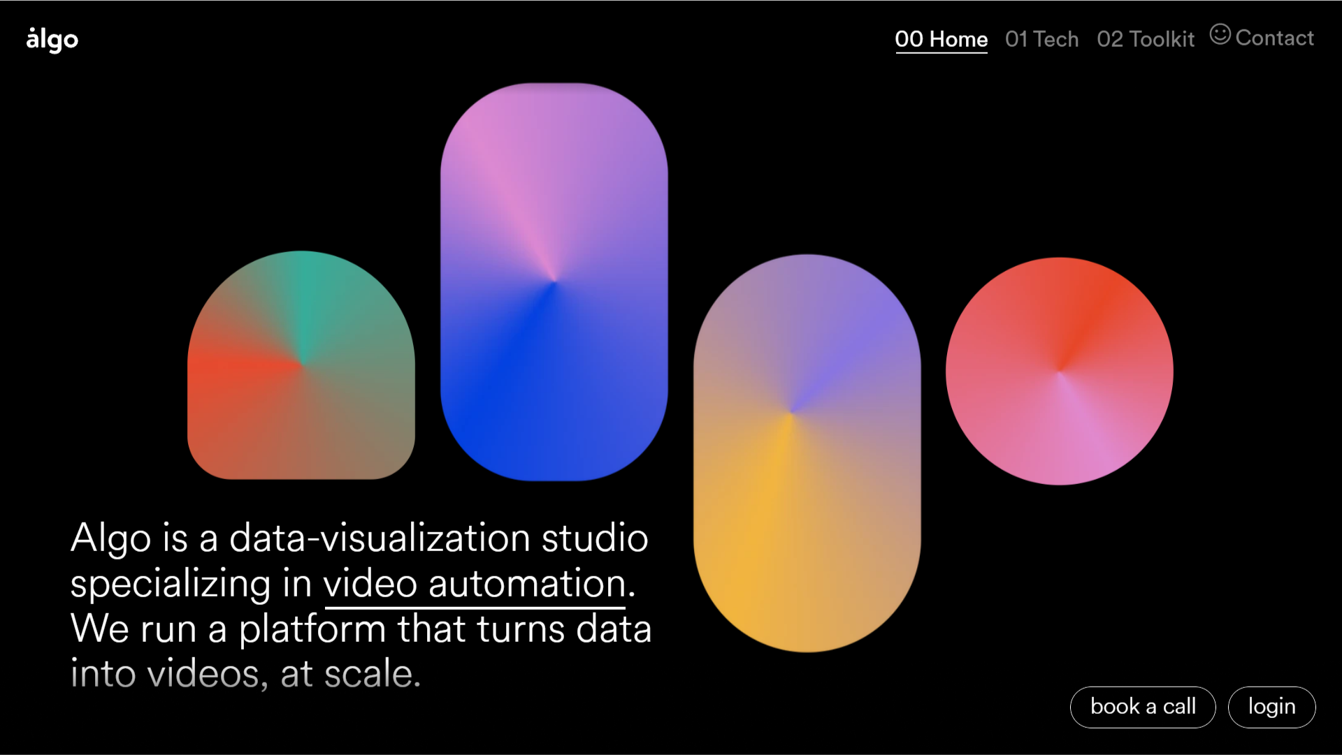
Interesting visual look to the layout. I dig the big shapes and colors and the horizontal nav with the numbers in front of the pages/sections. Go check it out, there’s some interesting things going on with the sub pages interaction wise as well.
Glassmorphism: The Transparent Design Trend That Refuses to Fade
Glassmorphism brings transparency, depth, and light back into modern UI. Learn how this “frosted glass” design trend enhances hierarchy, focus, and atmosphere, plus how to implement it in CSS responsibly.


0 Comments