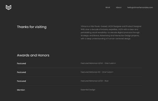
Cool looking portfolio website for Vilmar Fernandes. I like the scroll effect and the other little details here and there. I also like that it’s a dark background website but it’s not just straight up black.


The Call to Action, Revisited
The Call to Action hasn’t changed in a decade, but the bar has. A fresh look at prominence, copy, mobile tap targets, and accessibility, with lessons from three major design systems.


0 Comments