Web Design Inspiration Curated
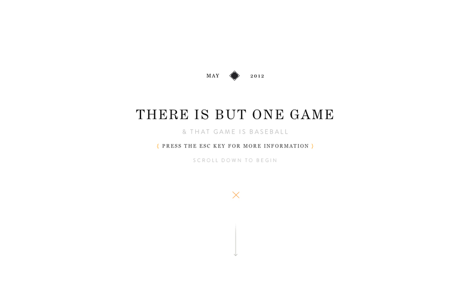
The Eephus League Magazine
Holy wow, Eephus League Magazine: eephusleague.com/magazine/(via this @dribbble drbl.in/ecEd)— Dan Cederholm (@simplebits) May 21, 2012 Re: the previous tweet, now that's how you publish a magazine on the web. Embrace the vertical scroll (which is the web's...
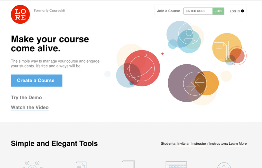
lore.com
Lore previously known as coursekit (this subsite is a beautiful experience in it's own right - check it.) is a simple looking layout, but is very well balanced and packs a punch impact wise. It's both subtle and complex at the same time wich just makes me smile.
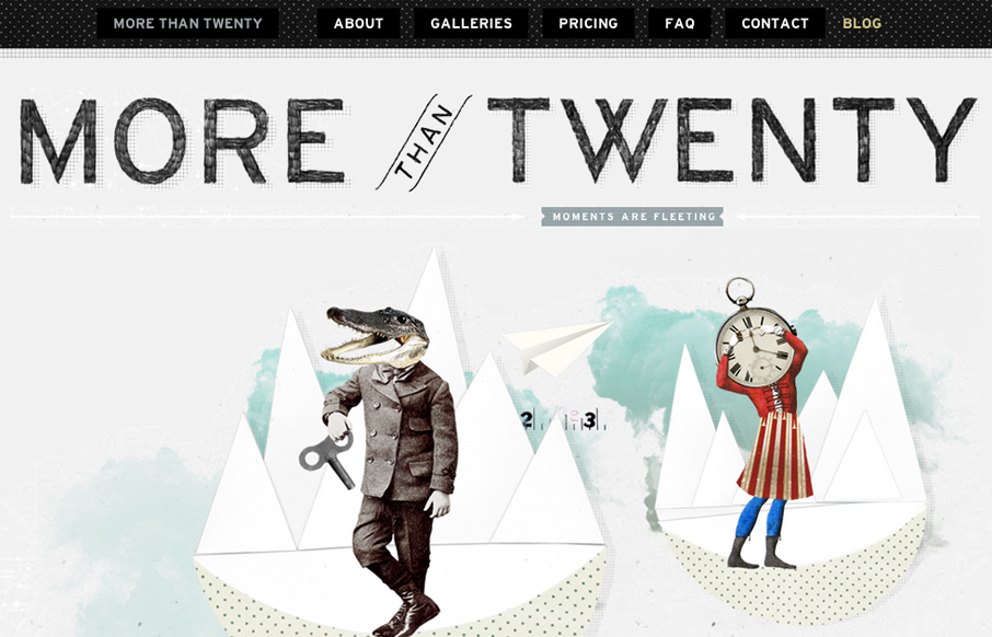
morethan20.com
Submitted by: Paul Mosig @r_a_c_k_e_t Role: Designer & Developer Very simple website execution, the fixed header/navigation bar does give it a level of interest interaction wise, as well does the FAQ section. It's the illustration work that sets this site off for me....
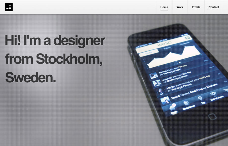
jeda.se
Nice clean portfolio site design. I like the minimal approach that really focuses on the work and interactions. The main nav bar flips out from white to black when you scroll or click a link, it's not much but with the overall design approach it really has an impact...
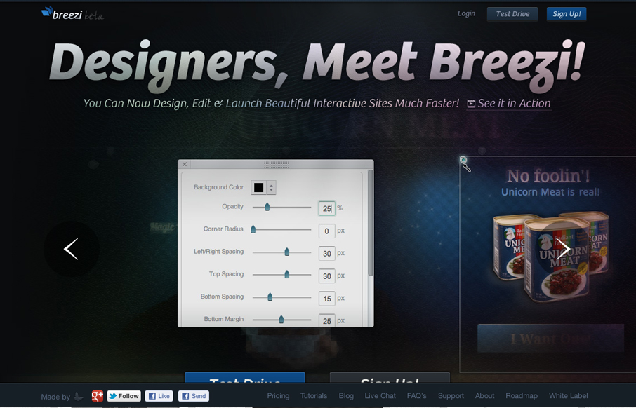
breezi.com
Well, we've been working on this product for about 1.5 years so it means to a lot to us. We spent a good deal of time on its homepage as well. We hope you like it. Submitted by: Navid Safabakhsh @breeziapp Role: Product Manager Beautifully executed website for Breezi....
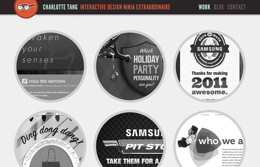
charlottetang.com
Wonderfully bold and yet delicate feeling site design. The circles add a lot to keeping it looking/feeling accessible and the type choice gives it that bold edge. I love the glasses logo/icon too.
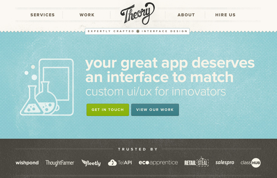
theorydesign.ca
A one-pager with loads of subtle texture and a gentle worn vintage look. The landing page utilizes HTML5/CSS3 and a bit of javascript to engage users and showcase the interface design work. Really wonderful design, with some super nice details. I love the fixed header...
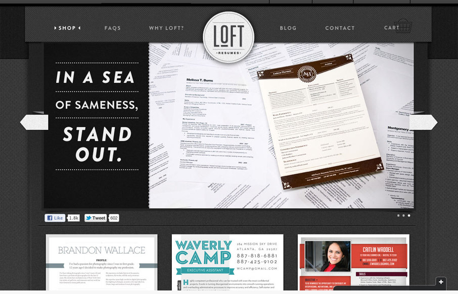
loftresumes.com
We're trying to bring great visual design job seekers' resumes to help them standout. It's a document that normally doesn't get a lot of design love. We built the site on Shopify but we've done some nice little customizations - some custom CSS animations on the js...
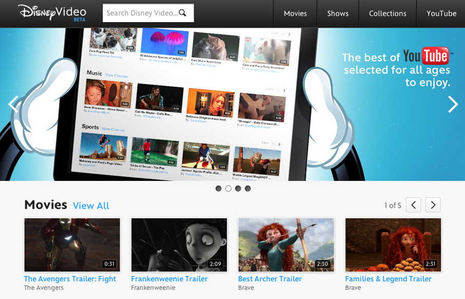
video.disney.com
Well hello there, newly responsive video.disney.com — you’re lookin’ *fine*. /via @simplebits— Responsive Design (@RWD) May 16, 2012 The Disney Video is pretty well done, nice large image slider and clean grid for other video views. It's responsive which is very...
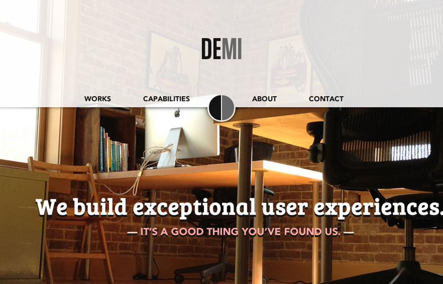
demicreative.com
Submitted by: Dan Spencer @demicreative Role: Designer & Developer I love this clean crisp layout. The "slide into" fixed header is a nice little interaction and surprise. It's moments like that when you fall head over heals for a site design for me. I like the...
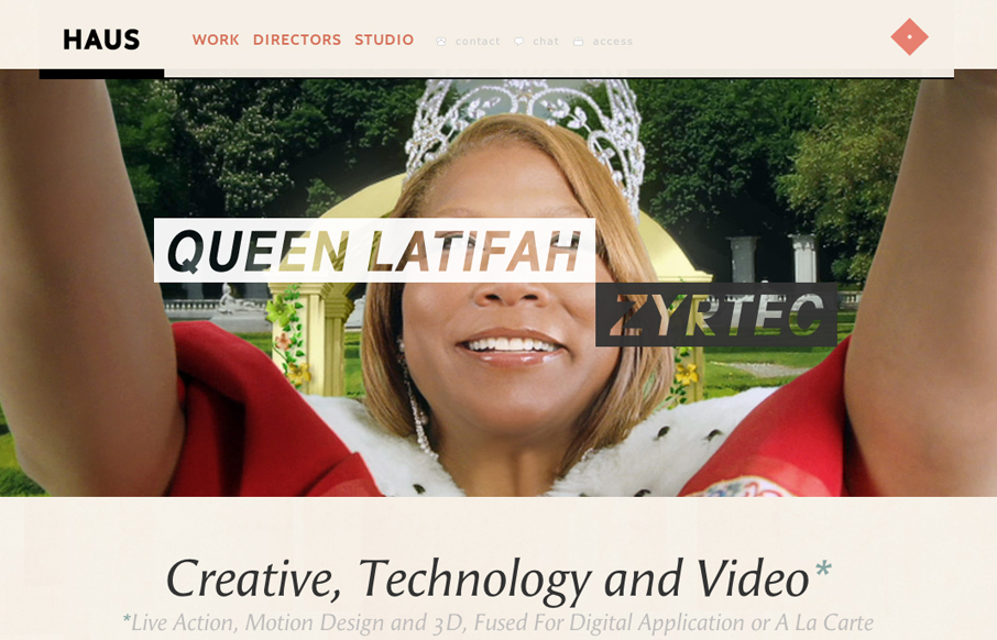
madeinhaus.com
I immediately love the content hierarchy on the home page, the shapes and spacing of the content groupings really let it ease into your view. The fixed header is a nice touch, especially the slight transparency as you scroll. Really loving the circle images and the...
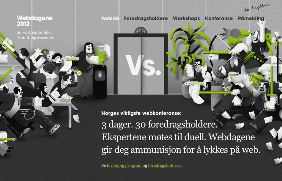
webdagene.no
Really fun responsive conference website design. I love how the main illustrations interact differently with the other screen sizes. The illustrations are also really fun too. Overall it's a lovely website for a conference and if the show is as good as the site they...
mikaelnorling.se
Really smart simple clean design. Love the color transformations with the background and footer area. Responsive layout too FTW.
pixelmess.com
Awesome effects, cool scrolling, one page design. Has a very friendly feel about it. Humanizes the studio. Submitted by: Sean Geng @seangeng Role: Designer & Developer Really fun website concept. The sidescroller layout with the illustrations is brilliant. The cloud...
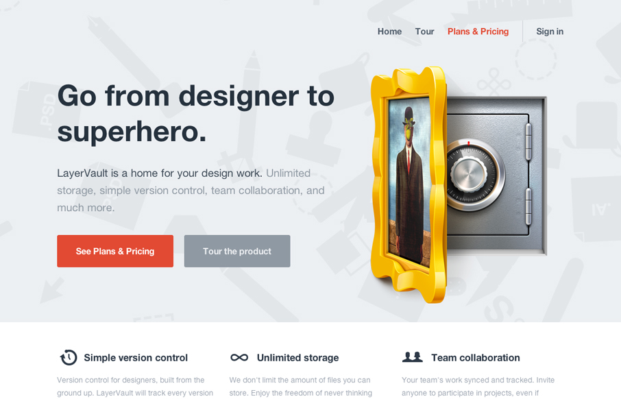
layervault.com
Lovely little site for the brand new version control product for designers, LayerVault: layervault.com (nice work @kellysutton et al)— Daniel Burka (@dburka) April 24, 2012 Really clean and simple layout with some great additions like the rotating background on...
gobeyondpixels.com
The Go Beyond Pixels website is clean and minimalist, yet it's beautifully designed with excellent elements throughout the site. The site uses customs fonts which make it that much more unique. The use of icons and clear copy makes it a site that you want to continue...
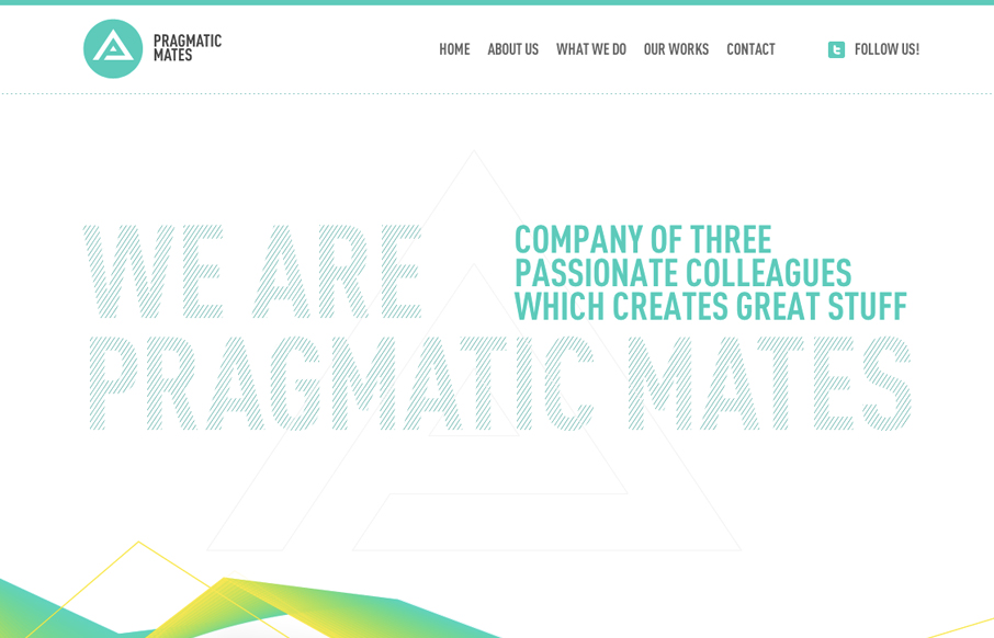
pragmaticmates.com
Submitted by: Lukas Vinclav Role: Developer What a great scrolling site design. I really like the interaction of the main navigation and the targeting of the content section on the page. The slight movement and readjustment is a very nice touch. The colors are really...
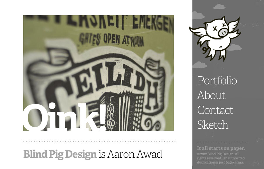
blindpigdesign.com
I love websites like this one. It's simple but the work and details speak for themselves. The mouseover on the pig/logo is brilliant. For such a minimal design I spent a lot of time looking over this site. You win!
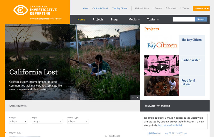
cironline.org
Ooh, redux! The Center for Investigative Reporting is sporting a sexy new responsive look, too: cironline.org /via @kleinmatic— Responsive Design (@RWD) February 15, 2012 A fairly complex layout to start with the cironline.org handles as well on the smaller...
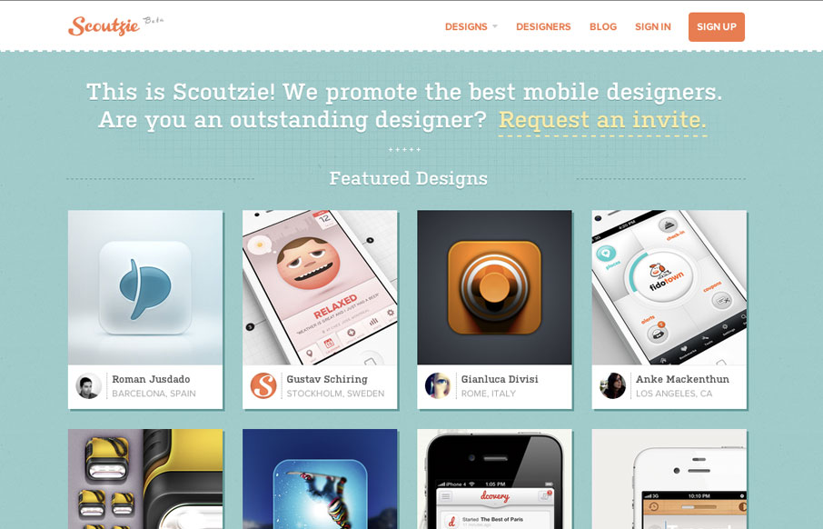
scoutzie.com
Cool concept and a cool design. I love the colors, the orange just kicks it off too. I like the content hierarchy of the home page, from featured designs, to designers to public content it's nicely stacked. I'm not super hip to the invite link being just an email, i'd...
EMAIL NEWSLETTER
News & Articles
unmatchedstyle
Great post about being a Grizzly and passion. http://bit.ly/h2CwH #ums
unmatchedstyle
http://welovetypography.com (via @squaredeye) #ums
The Specification Document: Critical for Effective QA Testing
You click the submit button. No errors. Check. Is that all there is to testing? That's only half the battle. Is there a confirmation step? Should it go to a Thank You page? What should the thank you page say? Does any of the data on the form, such as dates, phone...

HARD WORK. CLEAN FUEL. NO EXCUSES
Use “WARRIOR2023″ for 10% off.